I emphasize high quality content often on the Elle & Company blog, and for good reason: it gives visitors a reason to return, increases shares and traffic to your website, builds trust with your audience, and in turn increases bookings and sales.
I also highlight the benefits of a streamlined client process, share posts on SEO (which, by the way, is the focus of this week’s Elle & Company newsletter), and stress the importance of an intentional social media strategy to funnel people back to your site.
But all of the above loses value if users can’t quickly and effectively find what they’re looking for on your website.
And that’s where today’s post on user experience design comes in.
Definition of User Experience Design
User experience (UX) design isn’t synonymous with graphic design and web design, although the 3 relate to each other and often intersect. Graphic design and web design focus on visual appearance and aesthetics, while UX design deals more with the functionality, usability, and efficiency of a computer-related experience (website, software, etc.).
“User experience (abbreviated as UX) is how a person feels when interfacing with a system. The system could be a website, a web application or desktop software and, in modern contexts, is generally denoted by some form of human-computer interaction (HCI).” - Smashing Magazine
UX design is a field and profession in and of itself, but my aim today is to highlight why and how user experience design applies to you and your website.
Importance of User Experience Design
1 | UX design helps users quickly and effectively find what they’re looking for on your site.
In order to create a positive user experience for your visitors and help them easily find what they’re looking for, it’s important for your website to be functional and easy to navigate. Using your site should feel like second nature to visitors; there shouldn’t be a learning curve involved.
An example of what you don’t want to happen:
I’ve been to websites in the past that are filled with special features, interactive buttons and “hidden gems,” but the busyness of it all often makes it difficult to find what I’m looking for. Many times I give up searching for the information I came for in the first place and leave the website frustrated.
Creating an experience for your visitors is important, but if the experience hinders visitors from getting to where they want to go on your website, you have a problem.
By focusing on user experience, you decrease the chances of someone leaving your site frustrated and increase the likelihood that visitors will be able to find what they’re looking for.
2 | UX design encourages visitors to return and suggest your site to others.
Sites that are frustrating, complicated, or difficult to use don’t often encourage others to return or spread the word about your business. But when users have a positive experience using your site, they’re much more likely to visit again and suggest it to others.
3 | UX design has the potential to increase inquiries and sales.
This is the end goal. Your site should be easy to navigate and create a positive experience so that users can turn into paying customers and clients. By easily accessing information and pages they’re seeking, visitors will are more likely to buy from you and book your services.
But as with most things, UX design is a lot easier to discuss than it is to implement. So today I have 8 actionable steps you can implement today to enhance your website’s user experience.
1 | Simplify your navigation menus
Too many items in your navigation bar can be both confusing and overwhelming for your visitors. Make your website easier and less confusing by cutting back on the number of items in your navigation bar.
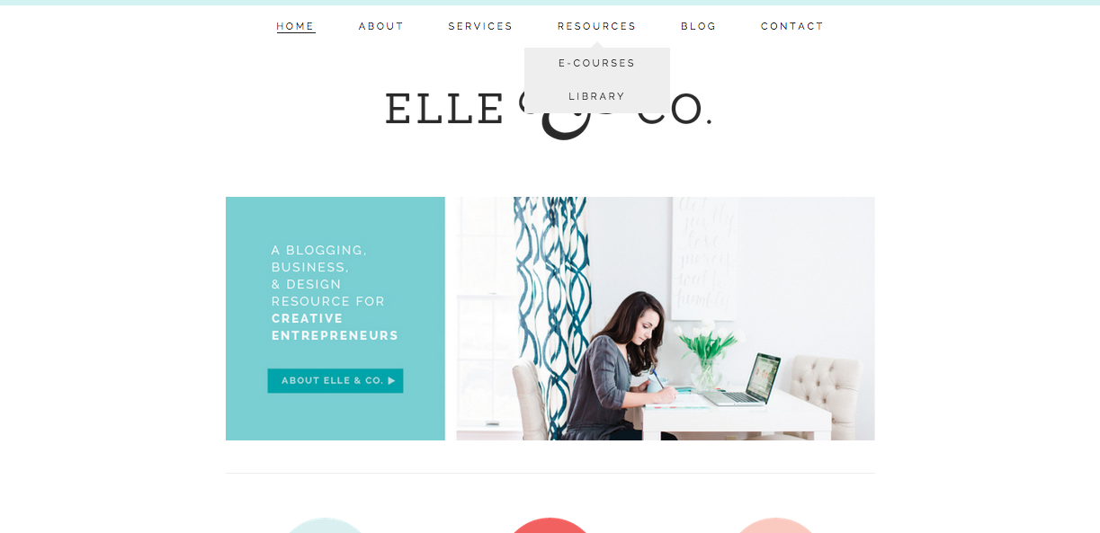
Group pages into drop-down menu, move items down to your footer navigation, or come up with a creative way to highlight some of those pages in other places on your website.
To keep things simple, I suggest having no more than 5-6 items in your navigation bar and no more than 4 pages in a drop-down menu.
Do you have more than 7+ items in your main navigation? Think of how you can organize and group those pages to create a better user experience for your visitors.
2 | Reorder the items in your main navigation
The order of the items in your navigation is also important for creating a positive user experience. It shouldn't be decided upon randomly or haphazardly; instead, the order of your navigation menu from left to right should follow the logical order of steps you want a user to take on your website.
Our eyes naturally move from left to right across a page, so it makes sense that there should be some order to how pages are listed in your main navigation.
This is why the order of most website navigation menus for creative businesses start with Home, About, Portfolio, Services, Contact. First-time visitors most likely want to learn about you, see your work, view your services, and then contact you, in that order.
Is your navigation out of order? Think through the steps you want a user to take on your website and rearrange them accordingly.
3 | Create a call-to-action on each page
There should be a flow to the steps a user takes on your site. Just as the order of items in your navigation should follow a natural progression from page to page, the content on each page should guide users around your site, too.
You can accomplish a better flow to your website by getting rid of “dead-ends” (pages that don’t contain any call-to-action).
For example, many about pages contain a couple paragraphs of text and a handful of photos, but they drop off at the end and fail to tell visitors where to go next; there’s no call-to-action. They miss out on a great opportunity to point viewers to their services, portfolio, or contact page (especially when a user has just taken the time to read about their experience and their business).
Do you have dead-ends on your website? Instead of dropping off at the end of page, create a simple call-to-action to keep users moving through your site. For example:
About page: “Are you interested in learning more about [name of business]? Visit the portfolio to see my latest work, browse my services page for details on my offerings, and read the blog for business resources and tips.”
Portfolio page: “Do you like what you see? Visit the services page and take a look at our different design packages.”
Services: “Let’s work together! Visit my contact page and reach out to me for more information.”
4 | Implement a homepage
A homepage acts as a starting point for your website. It should highlight the most important items and direct visitors around your site.
Until a couple months ago Elle & Company went without a homepage. Instead, visitors who typed in our site’s URL were automatically routed to the blog.
But not having a homepage resulted in confusion for many people who were visiting the site for the first time. The blog didn’t do a great job of explaining what Elle & Company does and it wasn’t efficient for guiding visitors around the site.
Since implementing a homepage, we’ve had more newsletter sign-ups, Library subscribers, e-course inquiries, and design inquiries. Users are now landing on important pages of the site that were poorly highlighted before we had a homepage.
Does your website have a homepage? If not, I would highly encourage considering one. If so, revisit the items you've included on your homepage to make sure you're highlighting the most important features on your site.
5 | Make search bars easily accessible
Help users easily find what they’re looking for by placing search bars in prominent areas on your site.
For the Elle & Company website, we have one search bar at the bottom of our homepage, one at the top of our Archives, and another toward the top of our blog sidebar. There’s also a search bar at the bottom of our Instagram landing page.
Are the search bars on your website easily accessible? Consider placing them on landing pages and other pages of your website that contain a lot of information (like archives, blog sidebars, etc.).
6 | Place important information above the fold
It’s always wise to fit as much important information above the fold as possible (“above the fold” refers to the part of a webpage that’s viewable before a user is forced to scroll).
By placing information above the fold, you’re able to call more attention to it and provide an easier user experience for your visitors.
Please note that trying to cram photos and text on a page in order to fit it above the fold isn’t always a wise decision. Use the rules of hierarchy and provide enough space between different sections of the page to make things easy on the eyes and more legible.
Do the images on your homepage drop below the fold? It might be best to rearrange items or downsize them in order to fit as much above the fold as possible.
7 | Roundup popular information
Just like search bars make it easier for users to find information, features like blog archives and categories allow users to easily find what they’re looking for.
For example, those who come to this site looking for Squarespace articles and tutorials can easily see all of them at a glance by clicking the Squarespace category button in our blog sidebar.
Do you roundup popular information on your site? Consider creating pages to house categories and large groups of information, and link to them in prominent places on your site.
8 | Create landing pages
Do you offer several products, services, e-courses, etc? Create a landing page for each overarching group to provide users with information and point them to individual offerings.
This helps create a system and an order to your website; it organizes groups of information and helps with the "flow" I discussed a few points ago.
For example, Elle & Company currently offers 2 different types of e-courses. Instead of linking to each individual e-course under the Resources tab in our main navigation, I created an e-course landing page to give visitors overarching information about our online classes. I also provide a brief summary of each course and link to each individual offering.
It's also helpful to create landing pages for items on your site like newsletters and events that are often only seen in a blog sidebar or homepage.
Brainstorm ways that you can utilize different landing pages within your site, whether it's by creating a Services page to provide overarching information and link to your different services, creating a Newsletter page for information and a form submission, or creating an Event page to help people keep up with important dates within your business.
Are you struggling with improving the flow and organization of your website? Get a second opinion by reaching out to friends and colleagues. Ask them to take an objective look at your site and provide constructive criticism. They may see some problems or come up with some clever alternatives you may not have considered before.
By taking some time to implement the steps above, you'll create a better user experience for your visitors, help them find what they're looking for on your site, and encourage them to visit again (and hopefully buy from you and book your services).
Have you put time into your website's user experience? Were any of these suggestions new to you?


