Home Suite Home

Home Suite Home Updates!

If you've been following along with Elle & Company over the past few months, you know that I've been really excited to work with my friend, Michaela of Michaela Noelle Designs, on the design of our cozy home that we lovingly refer to as "The Suite." Each week Michaela has been sharing her inspiration and design plans for each room in our space, and we've been asking your feedback for some of the design decisions. While we're still in the process of transforming the Suite, we thought it would be fun to show you a couple sneak peeks of our progress. And oh my, it's already so different!

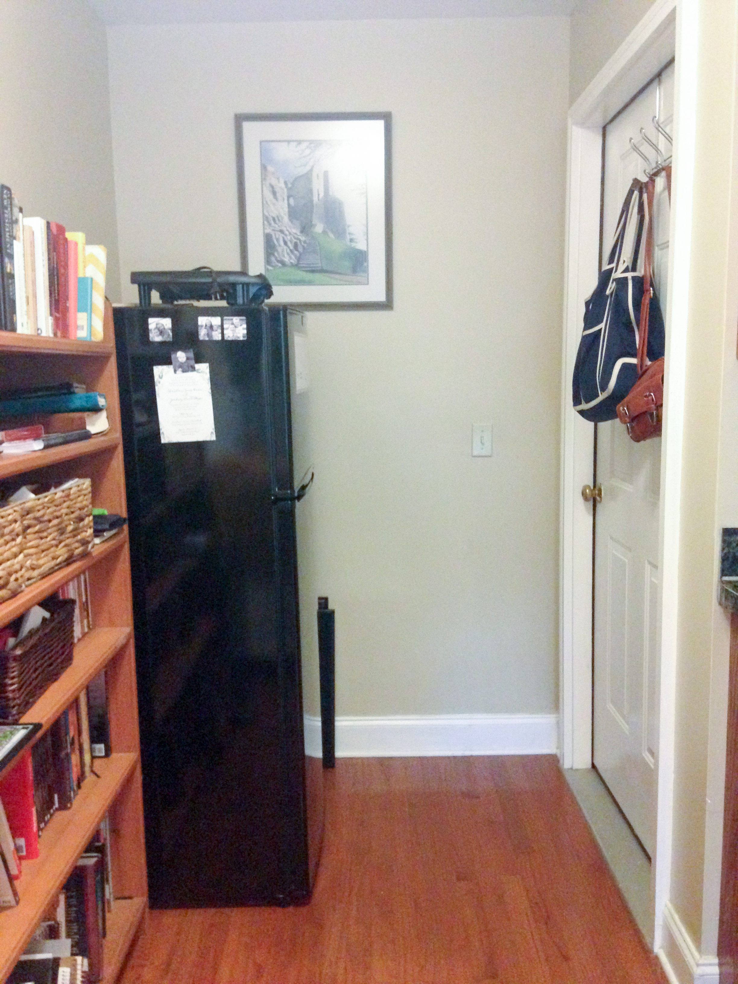
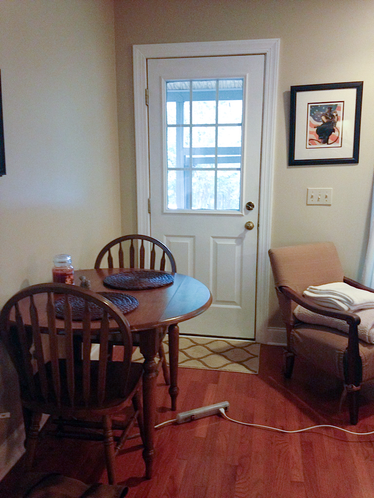
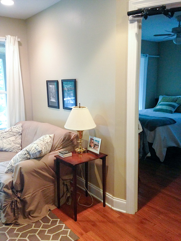
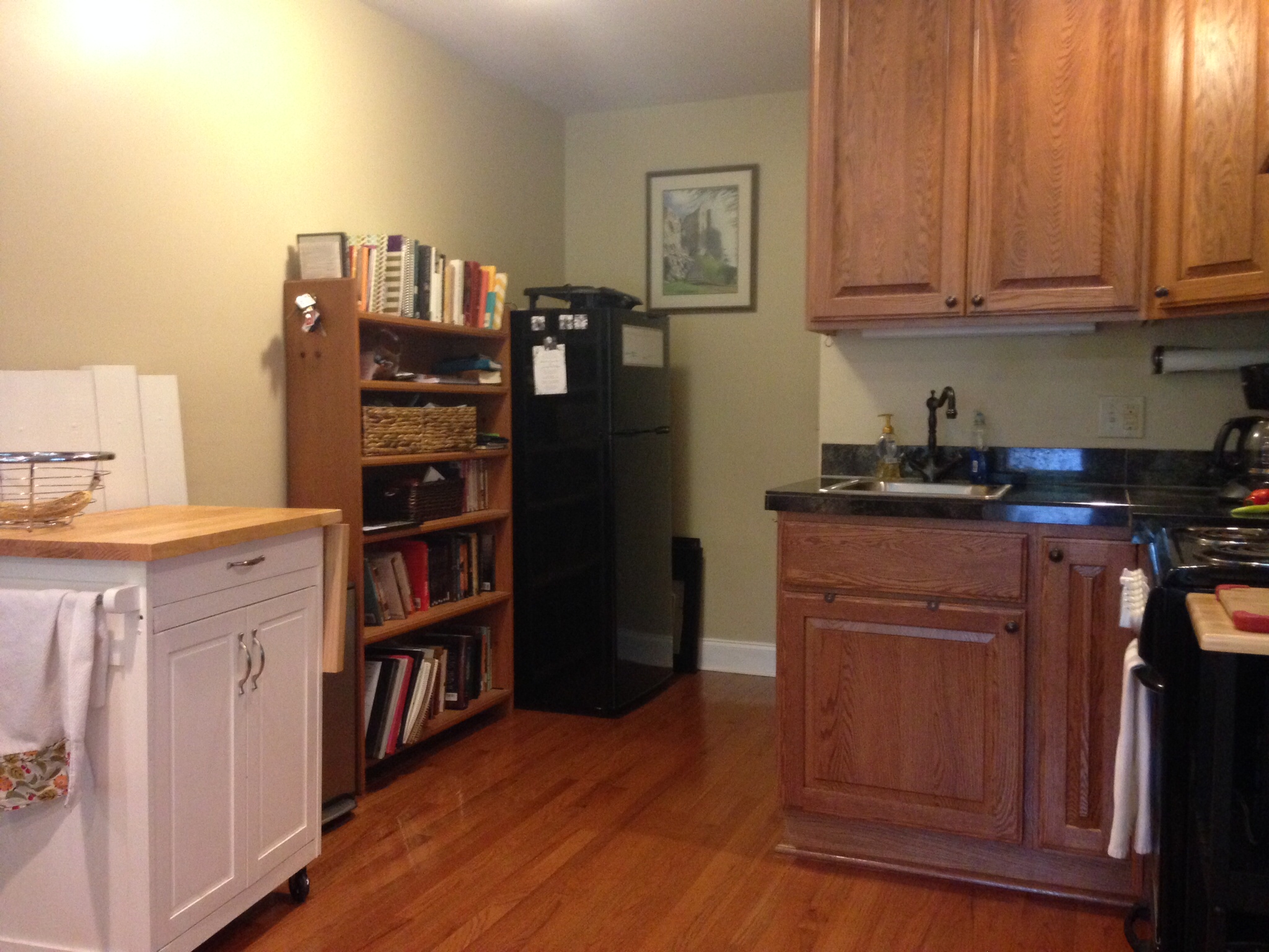
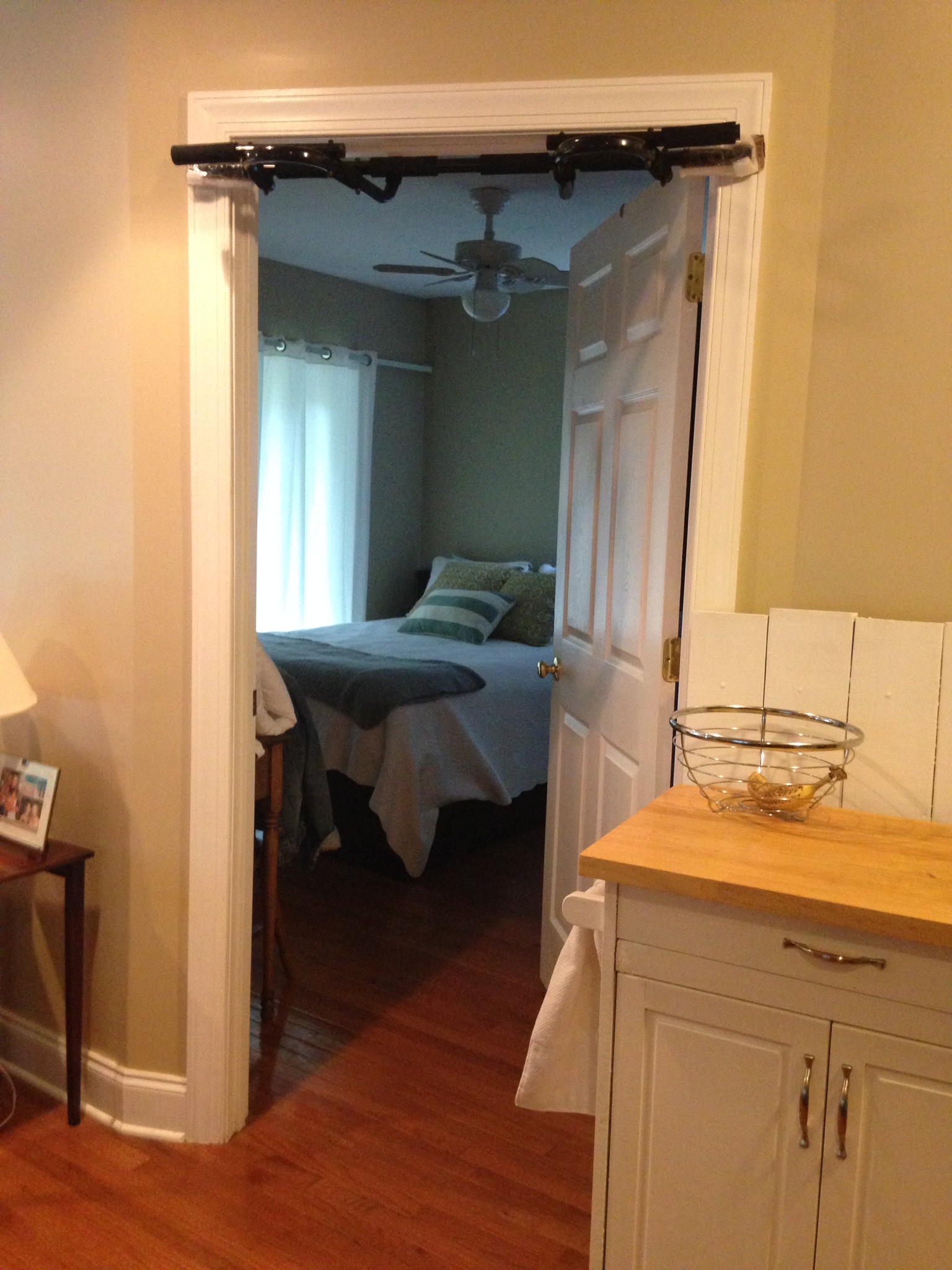
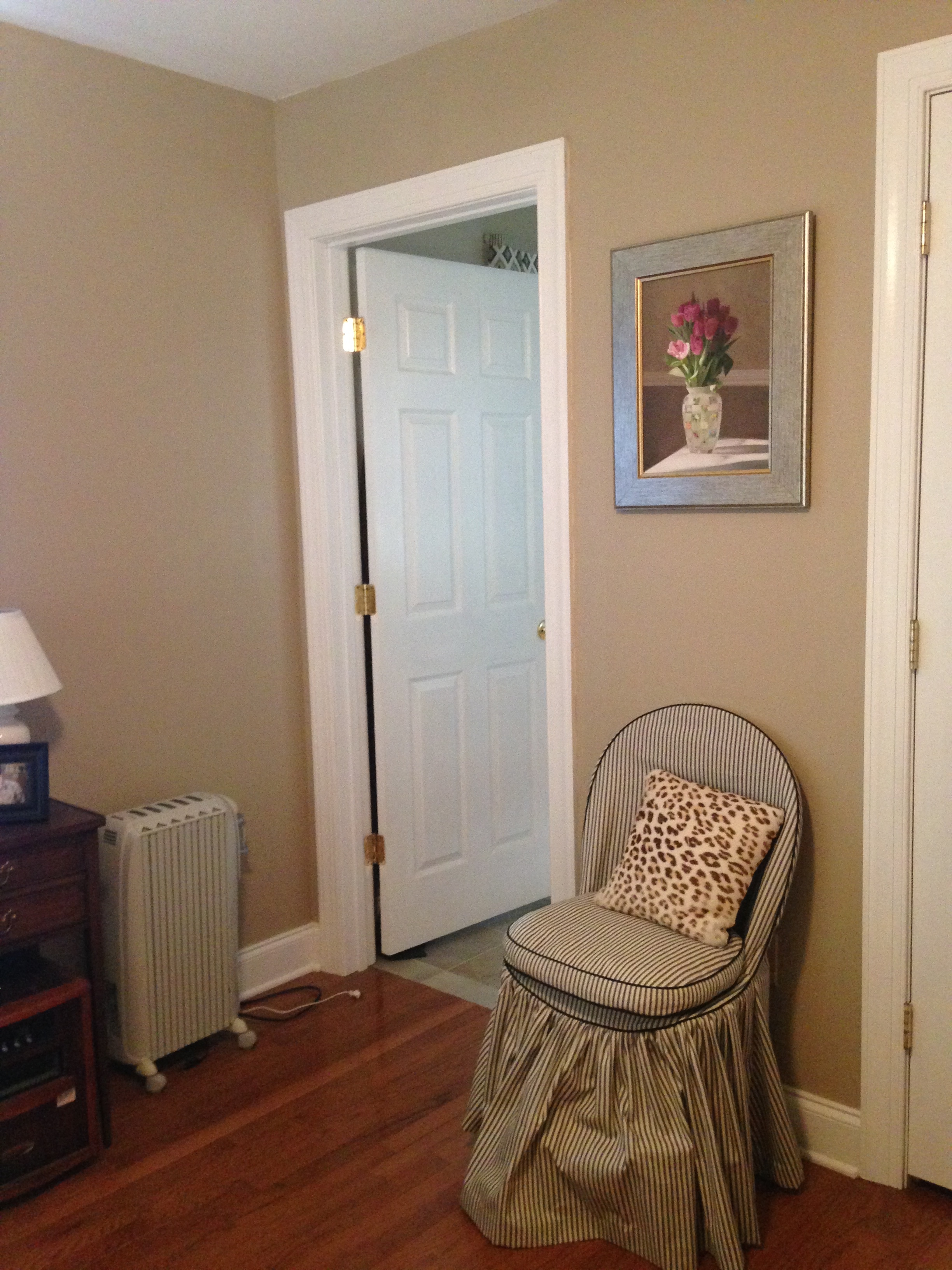
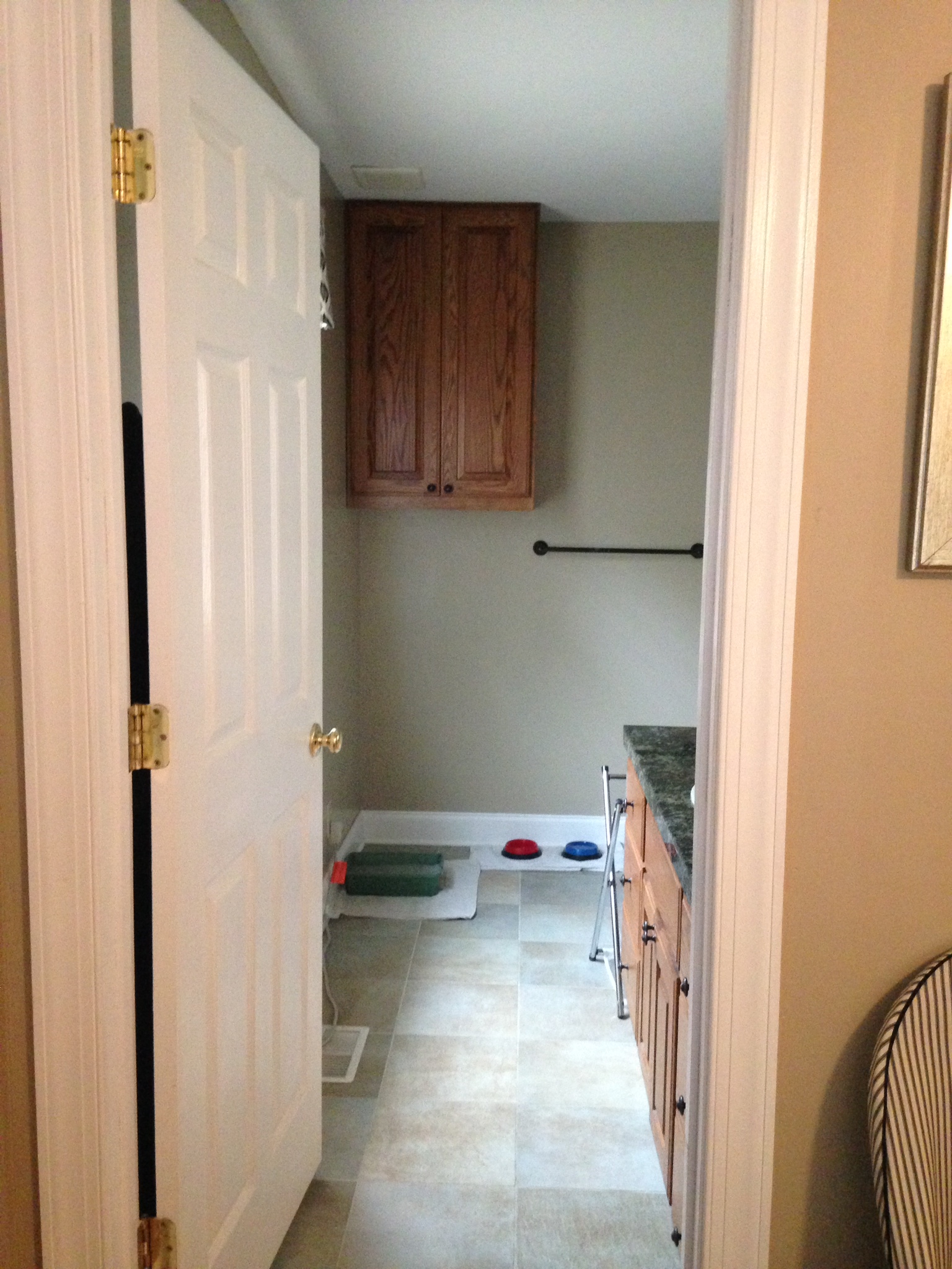
Just in case you missed it, here is a peek at the before photos: 

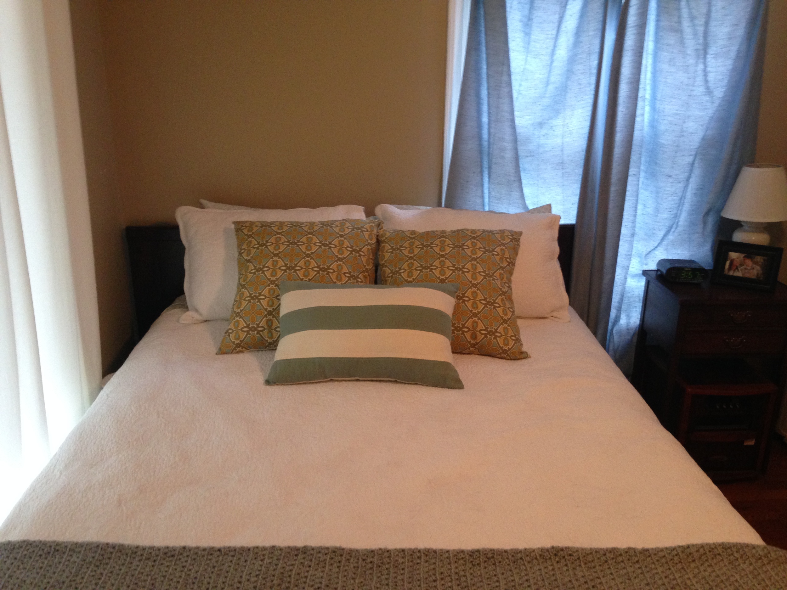
And now for a couple progress photos!

A new soft gray on the walls, some new pieces of furniture, and a new layout in the bedroom have made such a big difference! I smile and pinch myself each time I wake up in the morning, walk into the living room, and make a cup of coffee in our new coffee nook. Our bedroom feels so much more cohesive, and the new kitchen table and chairs make me excited to work from home. We still have more pieces of furniture and accessories on the way so the transformation isn't complete, but the space already feels so different and much more "us." Michaela has done such a wonderful job! I can't wait to reveal the finished product with you.

Sources

West Elm Scribble Curtains
West Elm Parson's Table
Dining Chairs
Entry Wall Chalkboard
Coffee Table
Paint color: Agreeable Gray

Visit Michaela's blog today to learn more about her design plans and see her past posts in this series. What do you think about these changes?!


More posts in the Home Suite Home series


Home Suite Home - The Bedroom

Today I'm partnering up with Michaela Noelle Designs for another post in the Home Suite Home series! Michaela is helping us put some design touches on our cozy Suite to make it feel more like home, and we're sharing the transformation with you on our blogs each week. Our hope is that you'll join in, help us make some design decisions, and hopefully be inspired to make the most out of your current space, too!

In case you missed it, here is the story behind our Suite,  a look at our living room, and a peek at our kitchen nook

Next up: our bedroom. And oh goodness, it could use a little help. 

IMG_0160.jpg

See those mismatched curtains? That's a result of my spur of the moment idea to buy new curtains at IKEA and my inability to count the number of windows in the Suite . So the sliding doors beside the bed are hidden by simple white curtains, and the other is (somewhat) covered by the blue curtains that were already in the Suite when we moved in. It's embarrassing, but it makes for better "after" photos, right?

I like the idea of having all-white bedding with pops of color in the pillows, and I do love our bed frame. The dark wood is pretty and the large drawers underneath are clever storage for our small space. 

And then there's the awkward wall that I'm at a loss of what to do with:

The dresser is great for storage and we're thankful to have desk space, but it's hardly used for anything other than catching mail, books, and random items. The printer on the dresser doesn't belong, my jewelry box looks lonesome, and our teeny "filing cabinet" is falling apart. It's a mess. I think this area could be functional for us, but I have no clue how to make it more cohesive. 

IMG_0158.jpg

And that's where Michaela comes in! She has some great ideas for how to transform this space and make it a little more functional (and a lot more lovely). She's sharing the plans on her blog today and, as always, she's asking for your feedback to help us choose between a couple different design options. Be sure to visit her blog post today and join in!

There are a lot of exciting things coming up in the Home Suite Home series in these next few weeks. We've ordered a few new pieces of furniture, lamps, curtains, and fun accessories, and Jake and I are painting the walls this weekend. It's starting to feel real! I'll continue to share sneak peeks of the progress on Instagram, so be sure to follow along.

What color do you expect to see on the walls for the final reveal?! What color do you think would look best?

Are you excited to keep up with this transformation? Follow along with us!

Michaela Noelle Designs

Bloglovin'   |   Pinterest   |   Instagram

Elle & Company

Bloglovin'   |   Pinterest   |   Instagram

Home Suite Home - The Kitchen & Eating Nook

Home Suite Home - Elle & Company and Michaela Noelle Designs

We're back with another installment in the Home Suite Home series! Michaela Noelle Designs is helping us put some design touches on our cozy little Suite to make it feel more like home, and we're sharing the transformation with you on our blogs each week. Our hope is that you'll join in, help us make some design decisions, and hopefully be inspired to make the most out of your current space, too!

In case you missed it, here is the story behind our Suite and a look at our living room

Today we're taking a look at our kitchen.

IMG_0174-2.jpg

This is probably one of the areas that I need the most help with. While I love the tall cabinets, the pretty countertops, and my helpful kitchen carts, the space seems mismatched and pieced together. I've had trouble knowing how to pull in all of the separate pieces without getting rid of anything or putting a big dent in our budget. 

IMG_0130.jpg

We're always trying to find creative ways to use our space wisely around the Suite, so the kitchen carts come in handy for extra storage. I hide pots, pans and silverware in one, appliances under the other. The kitchen carts also provide more counter space, which is really important since we eat in most nights (I love to cook!). The bookshelf isn't super attractive at the moment, but it's a must-have for storing all of Jake's books from seminary. I would love to find a way to maintain (and even add!) storage in this space while making it a little more cohesive and easy on the eyes. 

We also have a little eating nook with a kitchen table that doubles as a workspace for my design work and Jake's studies. It's looking a little lonesome and out of place at the moment, so I would love to find a way to make more sense of that space, too. 

In terms of design, I'm hoping that we can brighten things up a little bit and put some personal touches on our kitchen. Thankfully Michaela is coming to my rescue! She's come up with some creative solutions for this space and she's sharing them on her blog today. Head on over to check out what she has up her sleeve and vote on which option you like best!


Are you excited to keep up with this transformation? Be sure to follow along with us!

Michaela Noelle Designs

Bloglovin'   |   Pinterest   |   Instagram

Elle & Company

Bloglovin'   |   Pinterest   |   Instagram

Home Suite Home - The Living Room

Last week I shared the story of the Suite, a cozy little mother-in-law apartment that we've been blessed with for the 3 years that Jake is in seminary. While our living arrangement is perfect for the season we're in, I need a little help putting our own design touch on the Suite to make it feel like home. And that's where this fun new series comes in! My dear friend Michaela, from Michaela Noelle Designs, is working her magic on our space over the next few weeks by bringing in some style and functionality. We're sharing the design process with you each week so that you can join in and hopefully be inspired to make the most out of your current space, too!

Today we're taking a look at our living room. 

And "living room" could not be a more appropriate term, because we spend a large majority of time in this small area of the Suite. Since the iMac serves as my computer and our TV, it sits on our coffee table, which means our hang out space is also my office. Now that I'm working from home full-time, I'm learning that it's crucial for me to have a designated workspace separate from where we hang out and relax. 

Most nights the living room also functions as our dining room. Although we have a small table with two chairs, it's normally cluttered with projects, books, and mail, so sadly we eat meals in front of the TV. Jake and I would love to make more use out of a little eating nook and let the living room function as a space solely for us to unwind and hang out.

In terms of design, I would love to add some color. The living room is looking a little brown at the moment, and I'm usually drawn to white space and pops of color. Some fun patterns would also be a great addition.

Thankfully, Michaela has a gorgeous plan for this space! She's sharing two ideas for our living room today and we're asking you to help us choose which one you like best. So click over to her blog and give us your feedback! And if you're excited to keep up with this transformation, be sure to follow along with us:

Michaela Noelle Designs

Bloglovin'   |   Pinterest   |   Instagram

Elle & Company

Bloglovin'   |   Pinterest   |   Instagram


How have you managed to juggle the functions over your small space? And maybe more importantly, does your husband insist on having a pull-up bar in your living room? ;)

Home Suite Home - Introduction

Jake insisted that our first home together needed a name. So as soon as we returned from our honeymoon just over 2 years ago, we took one look at our frumpy little rental and came up with the most generous name we could think of: The Cottage.

Like most typical recent college graduates/newlyweds, we filled our home with a mix of items from our wedding registry, old furniture that our families were willing to donate, and a rambunctious not-so-little black lab puppy. It may have been a far cry from an HGTV dream home or a Southern Living magazine spread, but it sure was homey. And it was ours. For a year and a half those rooms housed many Saturday Netflix marathons, Thursday night Bible studies, and Sunday morning pancake breakfasts. The back porch heard a lot of laughter, the kitchen saw a lot of dance offs, and the front yard is probably still scarred from Tebow's squirrel-chasing path. The Cottage was well-loved by the two of us and all of our friends and family.

Then late last fall, things puzzle-pieced together perfectly for Jake to pursue seminary three and a half hours away from our hometown. This new chapter brought with it an internship for Jake at a sweet little church right outside of Charlotte, and a warm couple in the congregation offered to let us stay in their fully-furnished apartment throughout Jake's three years in school. So we packed up those wedding gifts, donated our furniture to newlywed friends, and waved goodbye to our first home together. 

This time I was the one who insisted that our second home together needed a name. So as soon as we pulled into the gravel driveway that Saturday afternoon, we took one look at our new place and came up with the most sophisticated name we could think of: The Suite.

We consider ourselves blessed to call the Suite our home. It has a cozy living area with a kitchenette, a bedroom with a walk-in closet for Jake and I to share, and a large bathroom that puts the Cottage to shame. Our hosts, Hudson and Deborah, are an added bonus; not only are they kind enough to share the Suite with us, but they invite use over each Monday night for dinner (and if we're lucky, some funny story-telling). We love them dearly.

We've been official North Carolina residents for just over 8 months now and we're still in the process of putting our touch on the Suite and making it our own. Its size is perfect for the two of us, but I know that we could be using the space more efficiently. And now that I'm working from home full-time, it's even more important for me to stay productive and inspired in our space. We know that this residence is temporary and borrowed so we don't want to go overboard with changes, but we do want it to be functional and put together. So I called in the expertise of my dear friend and interior designer, Michaela from Michaela Noelle Designs, to help me come up with design solutions for our Suite. Michaela has an eye for all things lovely, and for the next several weeks she will be working her magic on our space. We'll both be sharing the transformation on our blogs so you can follow along, too!

One of the biggest things that I hope both you and I can take away from this series is that no matter what your living situation is, you can always find ways to make it yours. It doesn't take a large budget or even a great amount of space - just a little creativity, a thankful heart, and a fun name.

Michaela is sharing her design plans for our Suite on her blog today and they have me swooning! Head on over to see her inspiration for the space and the ideas she has in store.

I have a feeling we aren't the only ones who have a habit of naming their homes (and cars... and bikes...) Do you have a name for your home? I would love to hear about your one-of-a-kind living situations, too. How have you made the most out of your space?


Would you like to keep up with our Home Suite Home project? Follow along with us!

Michaela Noelle Designs

Bloglovin'   |   Pinterest   |   Instagram

Elle & Company

Bloglovin'   |   Pinterest   |   Instagram