“What makes a viral campaign?”
It’s a burning question every entrepreneur should be asking, especially when it comes to the visuals they’re using to promote their products and services.
In an effort to answer that question and spark some ideas for your own visual marketing campaign, I’ve rounded up 14 genius, effective examples for your viewing pleasure.
1 | Dove: Campaign for Real Beauty
For the longest time, companies fed on women’s insecurities by telling them how to improve their attractiveness. Campaigns like “Always a Bridesmaid, Never a Bride” were commonplace and seemed to be effective.
Until Dove.
They took the opposite approach and asked women which of their current qualities made them beautiful. It began with a simple survey they conducted in 2004, where they discovered that only 23% of women felt they were responsible for influencing their own definition of beauty. They conducted a similar survey in 2014 and found half of women believe social media has a greater influence in defining beauty.
The company used that research to build one of the most successful visual marketing campaigns of the century. Through videos and photos on social media, Dove’s visuals highlighted real women of all different shapes, ethnicities, and ages, highlighting the qualities that made them beautiful.
Dove’s approach to celebrating beauty rather than defining it built consumer trust and confidence, and the 10-year campaign fit right into Dove’s existing brand attributes of honesty and transparency. It gave women a cause to rally behind, changed the conversation about self-image, and boosted sales for their products in the long-run.
Takeaway: What are other businesses in your industry getting wrong? Instead of taking an old familiar approach with your visual marketing campaign, get to know your audience. Consider ways that you can build them up while building trust in your brand.
2 | Chipotle: Back to the Start
Chipotle’s famous “Back to the Start” campaign was a happy accident. It was originally intended to be an introductory video for their loyalty program, but it went viral after it was posted to YouTube.
So they put it in theaters. And when they learned that people were applauding in the theaters, they took a chance and put the 2-minute commercial up during The Grammy’s.
The response was huge. In 9 days the film had 5,071 relevant mentions across blogs, Twitter, news, forums, and Facebook and earned 11,024,870 impressions via Twitter alone.
The claymation video was not only entertaining; it was insightful, exposing issues in the fast food industry and highlighting Chipotle’s efforts to serve fresh, sustainable food from local farmers. Like Dove, Chipotle gave consumers a cause to support and rally behind, building their trust and loyalty to the brand.
Takeaway: While the graphics of Chipotle’s campaign were fantastic, their message was the most powerful aspect. Concept is key, so start there. Then, once you have a one-of-a-kind concept, consider which visuals can carry out that message to completion.
3 | Dos Equis: The Most Interesting Man in the World
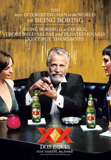
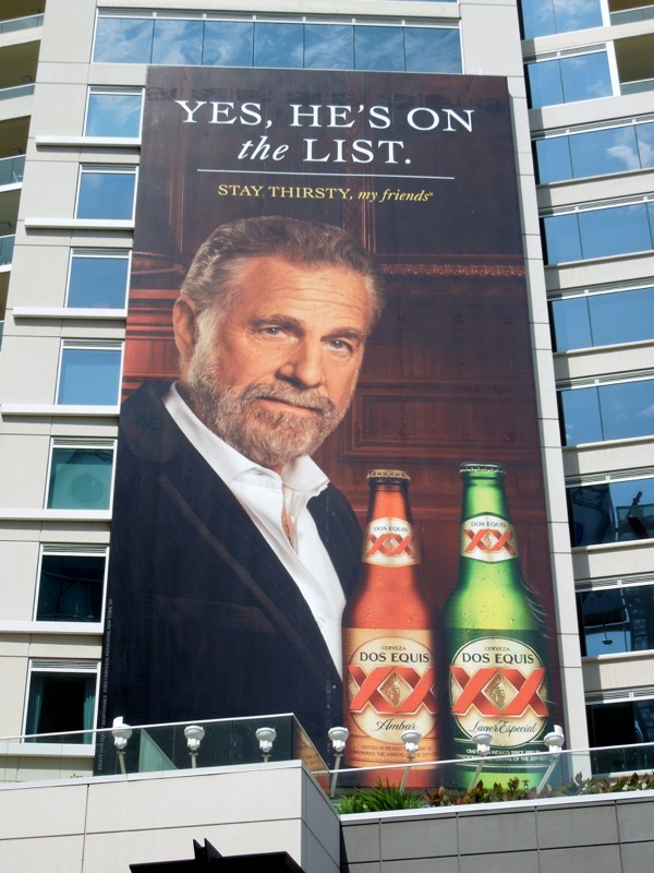
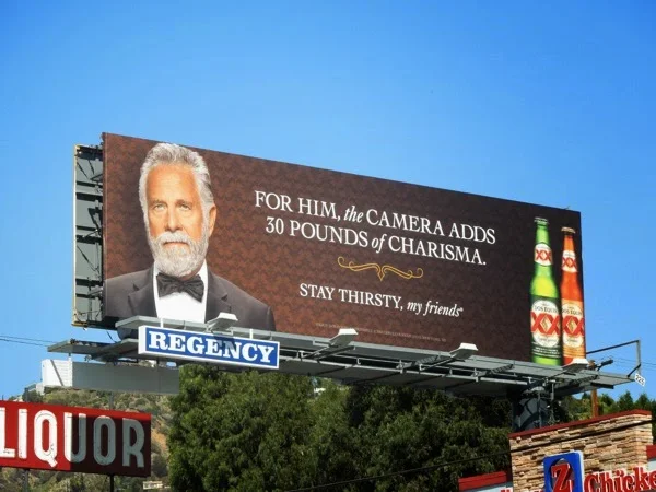
Most beer campaigns feature men in their 20s and 30s, so Dos Equis’ suave, wordly, gray-haired gentleman was an unexpected twist in 2007.
The campaign was conceived after conducting some research among young, male bar frequenters and finding out that their greatest fear was being considered boring. In response, Dos Equis decided to give them “an interesting wingman” along with “something to talk about.”
And that’s when the Most Interesting Man in the World was born.
The Most Interesting Man in the World is an interesting and fitting protagonist, because Dos Equis audience doesn’t “see him as a threat or as a reminder of accomplishments they hadn’t achieved yet.” Instead, the character is “every guy’s fantasy” and “an illusion of things past.”
The tagline - “I don’t always drink beer, but when I do, I prefer Dos Equis. Stay thirsty, my friends” - has become a cultural phenomenon in and of itself, following the brand statement that Dos Equis doesn’t expect you to marry their product.
Ands a result, Dos Equis has gone from a low-profile company to one of the fastest-growing beers. Not too shabby.
Takeaway: The Dos Equis campaign works because it positions their product as a novelty item. They researched their audience, learned their greatest fear, and created a character that they would look up to. How can you make your product a novelty? Acknowledge that your product isn’t the only choice and position it in a way that makes it the best choice.
4 | Old Spice: The Man Your Man Could Smell Like
Some simple research also led Old Spice to a clever, viral visual marketing campaign.
After looking at their sales in 2009, they discovered that the majority of body wash purchases are made from women. In order to clear out their inventory, they started brainstorming ideas. They need a concept that would speak to women without alienating men.
The final concept came when one of the men working on the campaign uttered the words, “Hello, ladies.” The team thought it was funny and got to work coming up with visuals. A day or two later, they broke advertising’s golden rule: saying what you’re seeing.
“Wouldn’t it be funny if the guy said, ‘I’m on a horse,’ and suddenly he was?” Old Spice was sold on the idea and one of the most recognized visual marketing campaigns was created.
As a result of their videos and photos for the campaign, Old Spice was able to strengthen its market position and became the No. 1 brand of body wash and anti-perspirant in both sales and volume, with growth in the double digits. Hello, profits.
Takeaway: Sometimes the simplest ideas can be the most successful. Don’t try to overcomplicate your visual marketing campaign. Instead, fill a couple pages in a notebook with the first ideas that come to your mind. Brainstorm with some other people. You never know; you might hit the jackpot with an off the cuff “hello, ladies” comment like the marketers behind Old Spice.
5 | Metro Trains: Dumb Ways to Die
Public service announcements are known for being boring, so Melbourne Metro Trains decided to liven things up a bit with their visual marketing campaign in 2012.
But how do you liven things up when your gloom-and-doom message involves preventing deaths caused by trains? Cute cartoons, a catchy tune, and some humor, of course.
Metro took the entertainment route, coming up with some hilarious lyrics about several dumb ways to die - getting your toast out with a fork, doing your own electrical work, keeping a rattlesnake as a pet, selling both your kidneys on the Internet, to name a few.
It’s no surprise that the campaign went viral. Within 24 hours of its launch, the song reached the top 10 on iTunes. Today, 3 years later, the video has over 118 million views on YouTube.
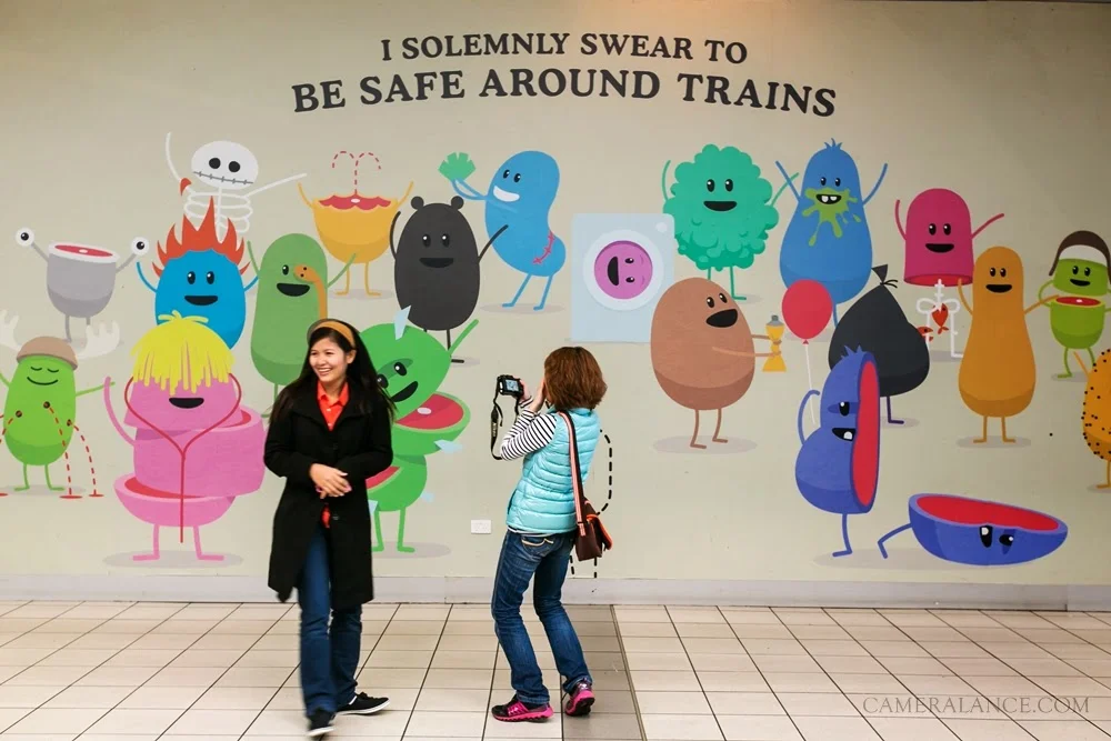
The visual campaign didn’t stop with the song and the video; it also included posters and displays throughout the metro station. Stuffed animals of the characters, a mobile app, an educational book, and a mobile game were also created as a result of the campaign’s popularity.
Even better, Metro Trains noticed a 21% reduction in accidents and deaths on its network. Genius and effective.
Takeaway: If a public service announcement can be spiced up, anything can be spiced up. For those of you whose message may seem boring at first, get creative and think of engaging ways to attract the attention of your audience.
6 | ALS: Ice Bucket Challenge
What if, instead of producing the visuals themselves, a company had their audience produce their campaign visuals for them?
That very thing happened in 2013 with the ALS Ice Bucket Challenge, where individuals filmed themselves dumping ice water on their heads to fundraise for the ALS Association.
However, you might be surprised to learn that the ALS Association didn’t plan that campaign.
In fact, it started after Chris Kennedy, a golfer from Florida, nominated a friend to participate in the Ice Bucket Challenge, which had nothing to do with ALS at the time. The campaign wasn’t associated with any specific charity; participants could choose where the donations went.
Chris had a relative who suffered from ALS, so he chose the ALS Association as his charity of choice. From there, the challenge started to spread quickly among his family and friends, and soon they couldn’t keep track on the number of videos that were posted as a result of his initial video.
Eventually Chris got in touch with individuals in the ALS community and the campaign continued to take off.
The result? An unheard of response and a national phenomenon that brought in over $15 million for the charity. It may not have been an intentional marketing effort by the ALS Association, but it sure was effective.
Takeaway: Make your visual marketing efforts easier (and possibly more effective) by involving your audience in your campaign. Ask others to participate by posting videos, sharing photos, and using a specific hashtag so you and your audience can keep up with it all.
7 | Kmart: Ship My Pants
When you thought of Kmart a few years ago, you probably thought of the store your grandma visited every once in awhile to purchase pajamas and Christmas lights.
Or at least that was their brand image before their Ship My Pants YouTube campaign launched a few years ago.
With a little bathroom humor, they highlighted their online shipping and saw a huge response: 22 million YouTube views, 400,00 Facebook comments, 890,000 Facebook likes, and nearly 600,000 Facebook shares.
Takeaway: In a sea of photos, graphics, and videos, it’s easy for people to gloss over your content. That is, unless you follow Kmart’s lead and take the unexpected route. By using humor that wasn’t necessarily associated with their brand, they caught their audience off-guard and caught their attention. If your brand is coming across a little bland and outdated, you might consider taking a similar approach and visually market your product in an entertaining, shareable way.
8 | Apple: Get a Mac
Who said a successful marketing campaign needed to be complicated?
In keeping with their simple brand identity, Apple took a no-frills approach to their marketing campaign in 2006 by personifying their product and creating a witty, side-by-side comparison with their competitor, PC.
The set of 66 commercials featured the two men in front of a white background, putting the greatest amount of focus on the differences between the two and exemplifying Apple’s special functions, easy user experience, and security features. It almost seemed like a comedy sketch.
In order to appeal to their audience in all areas of the world, Apple selected different actors that embodied nerdy/cool qualities. The simple, country-specific commercials went viral because of Apple’s fresh, humorous, and informative approach to their campaign.
Sales increased by 12% after the first few commercials aired. In the last quarter of 2006, Apple sold a record breaking 1.6 million Macs, a 39% increase, and sales continued to spike throughout the entire 4-year campaign.
Takeaway: Apple’s campaign never includes images of a Mac, and yet they were able to highlight the best qualities and benefits of their product through their campaign. How can you cleverly demonstrate the positive qualities and benefits of your offerings?
9 | Allstate: Mayhem
Like the Get a Mac campaign, Allstate utilized personification in their Mayhem campaign. But instead of personifying their product, they personified the “mayhem” their products protect people from and dressed it up as a mischievous man in a suit.
“Mayhem” takes many forms, from an oblivious teenage driver to a poorly fastened Christmas tree on the top of an SUV, and he reeks havoc everywhere. By adding some humor, Allstate was able to remove the gloom-and-doom of the need for insurance while still highlighting the importance of their products.
Aside from the commercials, Mayhem also has his own Twitter account and Facebook page, with nearly 2 million followers between the two.
Takeaway: By creating a character within their visual marketing campaign, Allstate gave their audience a memorable “mascot” that their audience enjoys following along with (most likely because they want to see what he’ll be up to next). Which face could you put on your campaign to make it more memorable and engaging?
10 | Squatty Potty: This Unicorn Changed the Way I Poop
How do you visually market a stool that helps beat constipation without coming across too crude? Why, you demonstrate its effectiveness with a friendly unicorn who poops ice cream and add in a narrator dressed as an English prince, of course.
At least that’s what Squatty Potty did with their baffling, disgusting/brilliant marketing campaign, This Unicorn Changed the Way I Poop.
The men behind the video knew the product would be a tough one to sell, given the awkwardness surrounding its use. They don’t want to gross people out by showing them how the product functions, but they wouldn’t be able to sell it if the audience couldn’t understand its benefits.
So they chose to beat the awkwardness by making it even more awkward, and their comical approach went viral as a result. In less than 2 months after the launch, the video gained over 10 million views and catapulted to #1 on Amazon’s “Toilet Training Potties & Seats” category.
Takeaway: If there’s a way to successfully market a product like Squatty Potty, there’s a way to successfully market anything. Do you have an awkward product or service? Don’t try to avoid the awkwardness; get creative and face it head-on like Squatty Potty. Your campaign will be a lot more engaging and memorable as a result.
11 | Buzzfeed: Tasty
Imagine getting over 1 million likes for every video you post on Facebook. Come up with a clever idea like Buzzfeed’s Tasty campaign, and that dream could be a reality.
The Facebook page, with over 17 million followers, posts short videos of easy recipe hacks, like Slow-Cooker Peach Cobbler and Baked Garlic Parmesan Potato Wedges.
There isn’t much to the videos - just an aerial view of the workspace in the Tasty kitchen and step-by-step instructions included throughout the clip - but that’s the point. Because the videos are fast-paced, instructional, and digestible (ba-dum), they’re able to capture and hold the attention of their Facebook audience.
Buzzfeed wanted to demonstrate how simple their recipes are and encourage their audience to give them a try, too.
Takeaway: What’s your audience’s biggest hesitation when it comes to purchasing your product? Confront it head on by demonstrating how it works in an engaging, visual way.
12 | Burberry: Snapchat Testino
The future of marketing could quite possibly look like Burberry’s Testino campaign on Snapchat this past September.
The brand gave fans a behind-the-scenes access to its Spring 2016 campaign photoshoot over Snapchat, which was a first for the fashion industry. Their audience was able to tune in live and watch professional photographer Mario Testino in action.
A visual marketing campaign revolving around how they’re producing their visual marketing campaign. Genius.
By giving viewers an exclusive look at the line in such a new way, Burberry was able to generate excitement about their products and raise anticipation for their release.
Takeaway: Think outside of YouTube and Facebook and highlight your content where your audience can be found. Don’t underestimate livestream apps like Periscope that allow you to engage with your audience in real time.
13 | Google Chrome: Dear Sophie
You wouldn’t expect an ad from Google to get your waterworks going, would you?
As the company expanded and gained more competitors, they realized they needed to communicate a different message. One that was different from “here’s what our products are and here’s how to use them.”
So they tugged at people’s heartstrings and demonstrated how their products could leave a lasting impression on their users with their Dear Sophie campaign.
The video tugged at viewers’ heartstrings while demonstrating how each of their products could be utilized.
Not surprisingly, the Dear Sophie campaign went viral and resulted in greater usage of Google’s products.
Takeaway: How does your product benefit your audience long-term? How does it help others? Consider creating a time-lapse and tell a story that involves your product and its features.
14 | Coca Cola: Share a Coke
Coca Cola never seems to disappoint with their visual marketing campaigns. We all remember the polar bear commercials at Christmas along with the jolly Santa illustrations.
But their latest campaign may just be the most creative.
The company wanted to give their consumers a way to express themselves through their product and make it more personal. And how can you get more personal than allowing them to put their name on it?
Lacey Austin, one of the executives involved in launching the campaign, says, “At the end of the day, our name is the most personal thing we have. It’s our fingerprint.”
Not only did they make their campaign personal, but they invited their audience to share their product with others. They made it interactive.
Takeaway: Coca Cola a call to action for their consumers and centered their visual marketing campaign around them. What action do you want your consumers to take? How can you make your campaign more personal and interactive?
There are 2 things that each of these examples have in common: a clever concept and strong visuals.
While many of these companies and brands are large and well-known, any business has the potential to create an effective visual marketing campaign.
If you’re excited but a little overwhelmed at the thought of creating a visual marketing campaign for your products and services, I have great news for you.
Elle & Company's newest course walks you step-by-step through creating a campaign from start to finish.
Which of these visual marketing campaigns is your favorite? Which one is the most creative? And just for fun, which one did you watch/share the most?

