Branding

Laying the Groundwork for a One-of-a-Kind Brand

Laying the Groundwork for a One-of-a-Kind Brand

What is it that makes the Starbucks brand so distinct?

It isn’t their logo, although the siren mark is definitely different from any other coffee chain out there. 

It isn’t their fonts, because Helvetica is hands-down the most popular brand font among large brands.

And it definitely isn’t their products; you can find a caramel mocha and even a pumpkin spice latte just about anywhere these days.

The thing that makes a great brand like Starbucks so distinct is that they’ve considered the entire experience a customer has with them and they’ve branded every single interaction. 

My Step-by-Step Process for Creating a Streamlined Brand

My Step-by-Step Process for Creating a Streamlined Brand

"When you brand yourself properly, the competition becomes irrelevant." Dan Schawbel

Too many people approach their brand as simply a logo and a color palette. 

They overlook the bigger picture and the humongous impact their brand can have on differentiating themselves and standing out from the crowd.

But a brand is much more than just a logo; it’s the entire experience people have when they interact with your business. 

It’s the tone of your marketing content, the icons you use on your website, the names of your products. 

Finding, Choosing, and Pairing Brand Fonts

Finding, Choosing, and Pairing Brand Fonts

There are a couple designer secrets that aren’t often shared when it comes to choosing brand fonts.

The first: Steer clear of using your logo font throughout the rest of your brand (unless it’s a secondary font that you’ve used for your tagline). This makes the logo distinct and keeps it from getting lost among other text on your website and collateral items.

The second: Give each brand font a “job.” Choose one font for your headers, one font for your body text, and maybe one other accent font (maybe). This streamlines your brand by creating consistency.

But even after learning these secrets, you might still have some questions about brand fonts.

How do you go about finding, choosing and pairing fonts that will accurately represent your business and appeal to the right customers?

I’ve got you covered.

Ellechat Recap: 3 Simple Ways to Improve Your Brand Photos with Brit Chandler

Ellechat Recap: 3 Simple Ways to Improve Your Brand Photos with Brit Chandler

Let me let you in on a little branding secret.

You can spend tons of time designing a beautiful logo.
You can choose the best color palette, fonts and patterns.
You can even pull out all the stops creating an eye-catching website.

But if your photos are amateur and inconsistent, every collateral item and page of your website will fall short. 

The same is true for your blog posts, promotional items and social media accounts.

Great photos not only elevate a brand, but they make it appear professional and build recognition with your audience. 

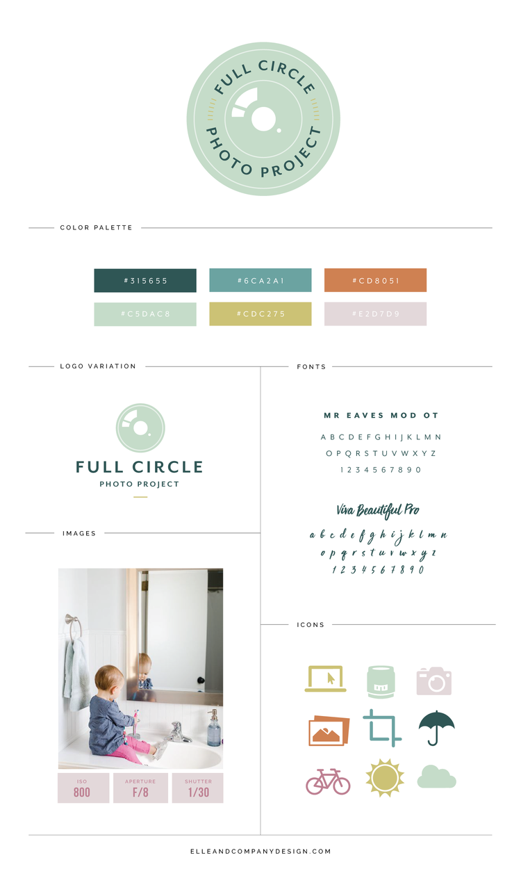
New Brand + Website Design for Full Circle Photo Project

New Brand + Website Design for Full Circle Photo Project

If I had to choose one thing I love most about designing brands and websites, I don’t know if I would be able to do it.

  • But I do know that somewhere near the top of the list of favorites would be differentiating each individual brand.

    It’s a fun creative challenge to make each client’s brand completely distinct and unique.

    And it helps when the mission behind the brand is unique and special all on its own.