Design is all about communication. While every graphic designer strives to make their work visually pleasing, creating pretty things shouldn't be the only goal. Even more important is effectively communicating the right message to a viewer, and as designers we have several tricks up our sleeve to do just that.
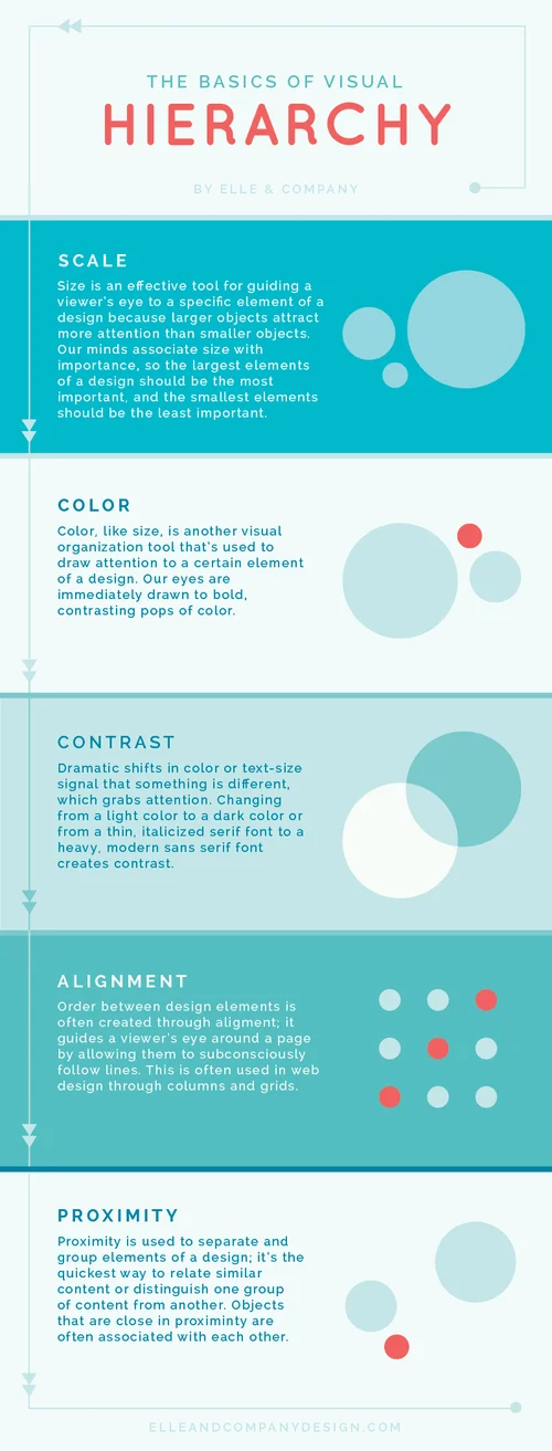
One of those 'tricks' is hierarchy. This tool helps us call attention to the things we want you to look at first and bring less attention to the things we want you to look at last. You may not realize it, but each time you look at a website or a menu, your brain ranks the elements of the page in order of importance based on visual cues. Those rankings guide your eye around a page.
There are a 5 basic design principles that we use to help us achieve proper hierarchy: scale, color, contrast, alignment, and proximity.


