Your Weekly Truth Favorites

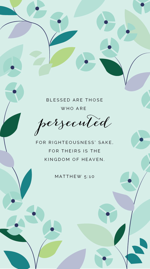
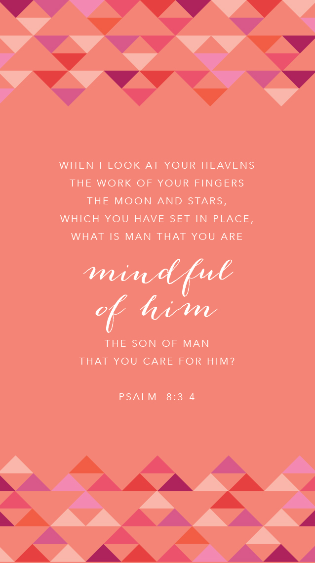
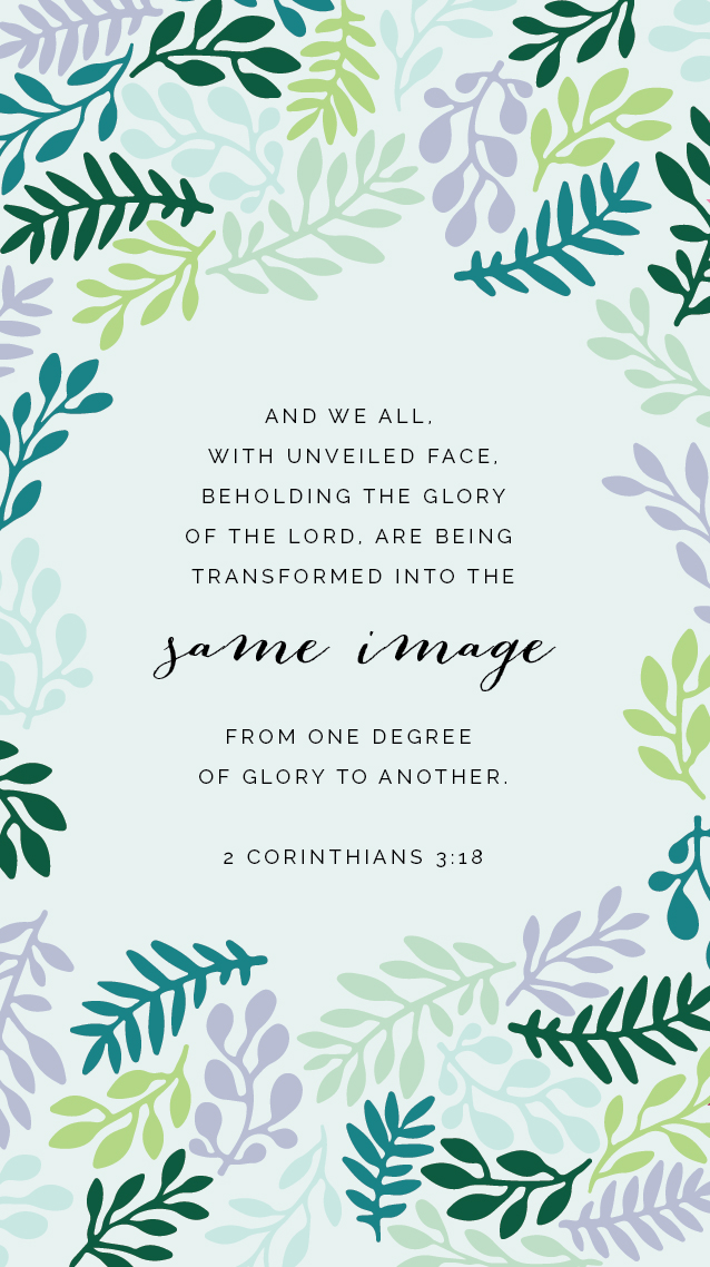
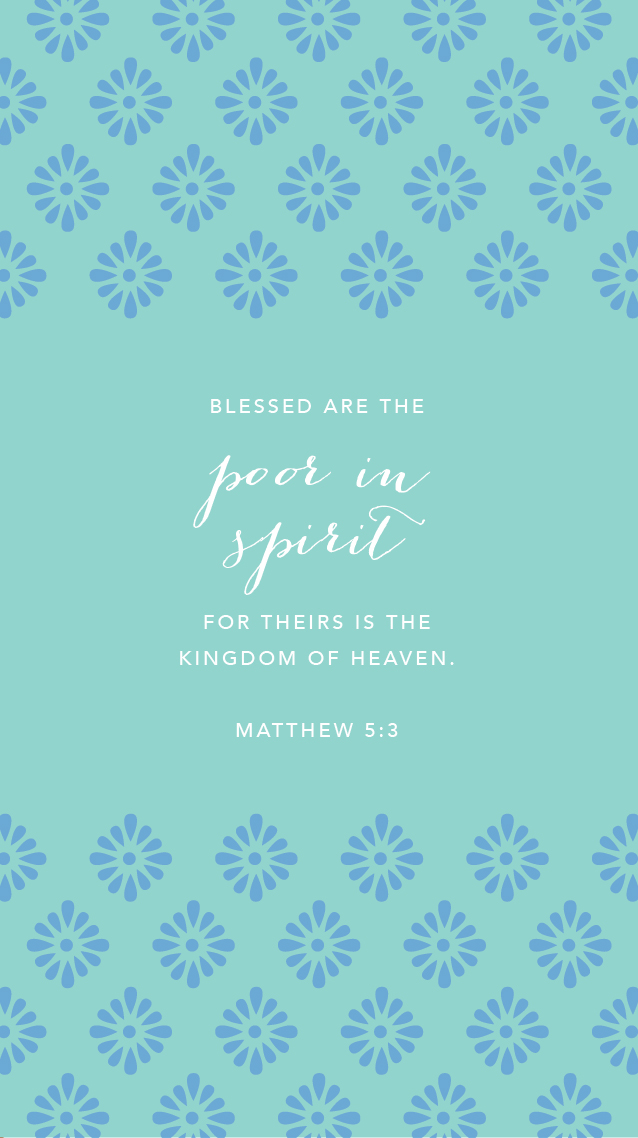
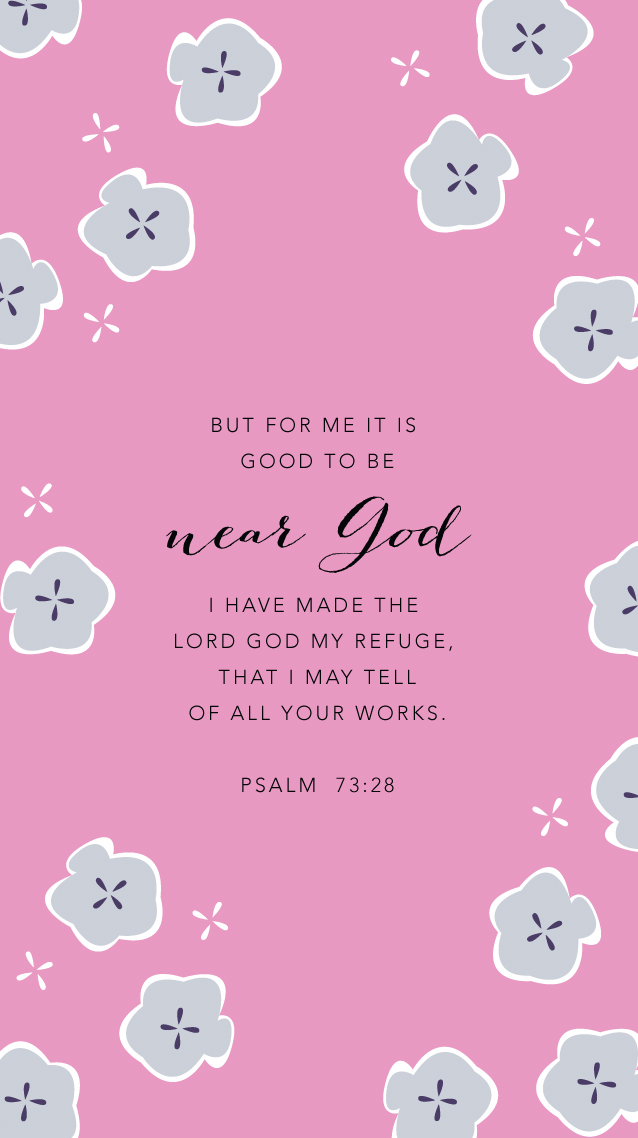
The Weekly Truth series has allowed me to combine two things of great importance in my life: design and Scripture. I don't know about you, but I have a habit of checking my phone more often than I open my Bible throughout the day, so I started illustrating these colorful weekly wallpapers to help me memorize verses and remind me of truth during the week. It also doesn't hurt that they make my phone a little prettier, too!

Today I'm rounding up some all-time favorite Weekly Truth backgrounds so that you can easily access the posts and download them from one screen. Feel free to download, share, and pin these as many times as you would like!

Read   |   Download


Read   |   Download


Free scripture backgrounds for your phone each week from Elle & Company!

Read  |  Download


Free Weekly Truth wallpapers from Elle & Company

Read   |   Download


Read   |   Download


Read   |   Download

Read   |   Download


Read   |   Download


New verses and new iPhone backgrounds each week! -- Elle and Company.jpeg

Read   |   Download


Free Weekly Truth wallpapers from Elle & Company

Read   |   Download


Read   |   Download


Read   |   Download

Read   |   Download


Read   |   Download


Free scripture backgrounds for your phone each week from Elle & Company!

Read   |   Download


Free Weekly Truth wallpapers from Elle & Company

Read   |   Download


Read   |   Download


Read   |   Download


Here's where I need your feedback: I would love to know your thoughts on this Weekly Truth series! Do you enjoy these posts each week? Do you look forward to a new background and a new verse on Tuesdays? Did you enjoy the Beatitudes study or do you like random verses? While I enjoy creating these backgrounds and writing short messages, this space is ultimately for you - I want to create content that's helpful and beneficial for you. Your comments and suggestions would be so appreciated. Thanks in advance and happy Tuesday!

P.S. Do you need help setting one of these as your phone background? For iPhones, simply click the "download" link beneath the wallpaper you would like to use. When the new window opens, hold your finger down on the image and save it to your photos. Then follow these instructions to set it as your phone background. For Android, follow these instructions.

6 Reasons Why I Blog (and why you might want to, too!)

Last month I stepped back from projects and posts and had a little Elle & Company brainstorm session. It's good to have a business checkup once in a while, reevaluate, and ask the simple questions: What am I doing? Why am I doing it? How could I be doing it better? I thought through areas like my branding services (which are getting an update this week!), the 2015 planner (which is coming out in 2 weeks!) and the blog. And the more I started thinking through the Elle & Company blog, the more I realized how fundamental it's been for my business. Here's why.

1.  Blogging allows me to share my design work

This seems obvious, but blogging is a great way for me to share recent projects and Library additions with readers and prospective clients. When followers see my work on the blog, they become more aware of my services and there is a greater chance that they might work with me down the road. I receive at least 2 design inquiries on the days when I post a new project, and most of the design inquiries I receive are from ladies who keep up with this space. Posting about recent Library additions also allows subscribers to see what's new in their printable collection and allows non-subscribers to see what they might be missing out on. 

2.  Blogging allows me to connect with other bloggers and business owners

There's a great little community in this blogging world. This outlet has given me so many great opportunities to connect and partner with other creative women, whether it's by cross-promoting, featuring, or just lending a word of encouragement. 

3.  Blogging is free marketing for my business

Technically it isn't "free" - time is money - but the hours I spend blogging during the week are well worth the great marketing that it provides for my business. Blogging allows me to post sharable content, create hype about new product launches and business events, and share new projects and Library additions, all of which keep visitors coming back to my site. My husband, Jake, said something a few months ago that continues to stick with me. Most storefront businesses don't have the same people coming into their shop day after day. Blogging keeps hundreds of people coming back through the Elle & Company "doors" day after day. 

4.  Blogging validates my credentials

My About page will tell you that I have a degree in graphic design, but this space allows me to prove my skills and my background. Readers and followers can see my experience for themselves when they see my posts on projects, design, and business. 

5.  Blogging gives me an outlet to share resources and content

My favorite bloggers are always willing to share what their talent/knowledge/creativity to benefit others in some way. This space gives me an awesome opportunity to do the same thing and "pass the baton". Tools and resources aren't meant to be hoarded; my blog is an outlet for sharing my gifts with others. 

6.  Blogging allows my clients, customers, and readers to get to know me

I was surprised to see the results of my reader survey a few months ago and see how much my readers love personal posts. But it makes sense - I love reading about the normal day-to-day lives of the people I follow along with. Blogging allows me to connect with my readers; it feels more personal than a quick "about me" section. It builds trust and friendships, and it always makes my day to receive feedback from readers who can relate with me in some way.


It's your turn! Why do you blog?  How could a blog be helpful for your business?

How to Use Pinterest to Increase Your Blog Traffic

As a designer and blogger, Pinterest has been one of the most powerful tools for increasing the amount of people who visit Elle & Company. Over half of my readers have been referred to my site by Pinterest these past 3 weeks. Fifty percent! That's a crazy percentage. So today I'm sharing tips that have helped me use Pinterest successfully as a business owner and blogger. Here are some simple ways that you can increase your readership and blog traffic through Pinterest, too. 

How to use Pinterest to increase your blog traffic // Elle & Company

1 | Join Pinterest as a business

Creating a business account has many benefits as an entrepreneur and blogger. With a business account, you can verify your site (which allows Pinterest users to see that your site is trustworthy source) and you are able to use Pinterest Analytics. These analytics allow you to see what is being pinned from your site, how many people are repinning your images, and you're even able to discover the other interests of your pinners. Using these statistics helps you refine your content and produce more of the things that your readers will enjoy and share.

Follow this link for more information about creating a business account on Pinterest.

2 | Allow readers to pin directly from your site

Make it as easy as possible for visitors to pin from your site by installing a Pin-It Button. This small hover link makes your site "Pinterest friendly," helping readers share and distribute your content to their audience. From there, the growth is exponential. 

For those of you who use Squarespace, you can enable the Pin It button under Settings > Share Buttons. For those of you who use Blogger or Wordpress, click here for instructions on how to add a Pin It button to your site. 

3 | Create original pin-worthy images and graphics

Pinterest is an image-driven social media platform. In order for Pinterest users to access your site from a pin, they have to choose one of your photos from among a sea of other images. Grab their attention and set your pins apart by adding original, well-designed images to each blog post. If your post is purely text, take time to create a graphic that includes the title. Some of my most popular pins are graphics that I created for my "How to Start a Blog" series. If I hadn't created images for those posts, Pinterest users wouldn't have been able to access that content. 

It may take a little longer to prepare your post, but the extra time spent on taking better photos or creating an eye-catching graphic is well worth free marketing through Pinterest shares.

Some quick tips for pin-worthy images: Because they appear larger in the Pinterest feed, vertical images have a higher chance of getting re-pinned. Statistics also show that colorful photos, images without faces, and pictures with a background are more likely to get re-pinned. 

4 | Name your images and photos

Did you know that the name of your image appears in the pin description when readers pin content directly from your site? Use this to your advantage! Come up with a descriptive sentence loaded with keywords and use it in place of the image name when you're uploading photos in a blog post. It also makes it easier on the readers who are pinning from your site because they don't have to worry about coming up with a description (or am I the only one who hates that?)

5 | Set up a board for each blog series or offering

This is a great way to drive content to old posts! I did this with my Weekly Truth series and I was stunned to see that an image from the series was repinned over 1000 times. A lot of people not only started following along with my Weekly Truth board, but they clicked through and visited my site. Get creative and come up with board ideas that highlight your products and your posts. 

6 | Pin selectively

Your social media accounts are also a reflection of your brand. As a designer, if I'm pinning low-quality, poorly designed images, even if the content is decent, it isn't the best representation of my design eye and taste. Choose pins and boards that are a good reflection of and coincide with your blog/business. 

I always love learning from your feedback! What Pinterest tips have been helpful for driving content back to your site? 


Brand + Site Design: Andrea Pesce Photography

Two years ago our wedding photographer sent her intern my way for brand design. I wasn't officially offering branding services at the time, but I happily accepted the project and set up a meeting with my newest client, Andrea Pesce, at a small coffee shop in my hometown. I had no clue that my first branding client would turn into my closest friend in this industry.

Over the past two years, we've collaborated together multiple times and watched each other's businesses grow and evolve. We've both discovered what we want to do and what we don't want to do in our creative fields, and Andrea's business has taken a great new direction over the past 6 months (she wrote this great blog post about it last week, and it is definitely worth reading!). Her first logo and brand wasn't a great reflection of this new turn in her business, so we've collaborated again to create a gorgeous new brand. And I must say, this one fits the new Andrea Pesce Photography to a T!

Andrea Pesce brand and website design // Elle & Company

If you look through Andrea's photos, you pick up on her light, simple style right away. She wanted to emphasize the story telling aspect of photography, catching those unposed moments between a couple on their wedding day. When we discussed her new logo and website, the words "light," "texture," "motion," "clean," "dreamy," "romantic," "classic," and "timeless" came up often. We took those words and visually represented them through her inspiration board. 

Andrea Pesce brand and website design // Elle & Company

Then we moved on to the logo. Andrea worked with talented calligrapher, Chelsea Petaju, on this gorgeous logo, and wow did she make my job easy! Isn't it lovely?

Andrea Pesce brand and website design // Elle & Company

Next, I came up with a couple alternate logos that could be used on collateral items. The branches tie in the motion that we had discussed in our initial meetings. 

Andrea Pesce brand and website design // Elle & Company

And then came my favorite part, the website. We kept it simple, clean, and easy to navigate so that her beautiful photos would be highlighted. 

Andrea Pesce brand and website design // Elle & Company

Andrea, it's always a joy working with you! Thank you for trusting me with the new direction of your brand and website. It's been so fun watching your business change and grow, and I can't wait to see where this new chapter takes you. Best wishes and happy launch day, sweet friend!


Follow along with Andrea

Website   |   Instagram   |   Facebook

The Most Difficult and Time-Consuming Step in My Creative Process

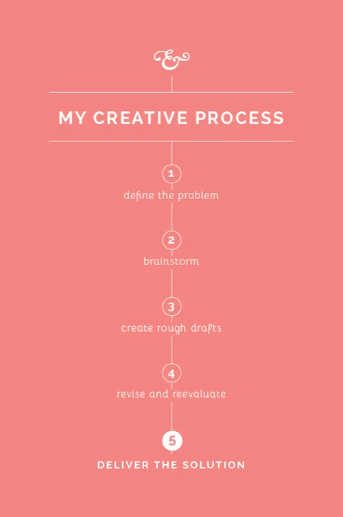
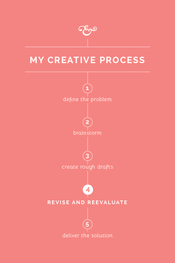
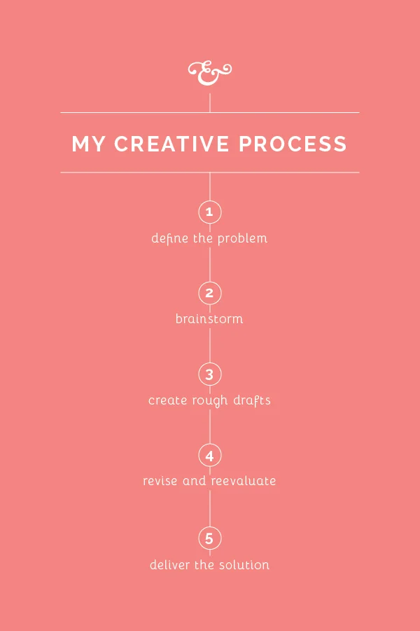
Like most occupations, it's helpful to have a process in place as I go about my work. I haven't seen many creatives approach this subject, so I thought it might be helpful to spend the next few weeks sharing my own creative process. While my method may not work for everyone, my hope is that these posts will encourage you to streamline your own process and think through the steps you take as you go about your work.

The most difficult and time-consuming step in my creative process // Elle & Company

The biggest fear of any perfectionist/designer is being unable to come up with a great solution that a client will love, which is why this step of my process always makes me a little nervous. Creating rough drafts is the most difficult and time-consuming part of my creative process, and the final design hinges on what I come up with during this step. That's why I spend so much time in steps 1 and 2, compiling information and preparing for this step in particular. So why does it take so long and how do I go about creating rough drafts? Here's a peak into what this step looks like for me.

Set aside uninterrupted time.  In the 4+ years that I've been designing for clients, I've learned that I can't sit down for 30 minutes and crank out 3 concepts. I've also learned that I don't work well when I divide my time and create rough drafts for the same project on different days. I have to have at least a 2 hour window of time to dig in and get lost in Adobe Illustrator, and for most of my projects, I set aside an entire workday to create my initial concepts. 

Set the mood.  It may sound a little ridiculous, but creativity doesn't come easily to me everywhere. I work best sitting at Starbucks with coffee shop tunes playing in the background and a vanilla latte at the ready (or, if I have to, I recreate that atmosphere at my kitchen table with Spotify and my coffee maker). For some reason that "mood" helps me concentrate and inspires creativity. 

Refer back to steps 1 and 2.  There's a reason behind each design decision I make when I'm creating rough drafts, which is why this step is the most difficult for me. I keep all of my client meeting notes and my inspiration board on hand so that I can refer back to them as I design. I'm careful not to choose a typeface or add an illustration without making sure that it's in line with the scope of the project.

Self-edit.  Before I show any concepts to my clients, I revisit and revise the designs I've created. I try to give myself a day or two away from those rough drafts before I make revisions so that I can see them with a fresh perspective (because after you've been looking at them on your artboard for hours on end, it all begins to run together). I check for oddities in spacing and composition, I clean up illustrations and fonts, and I double-check colors in my Pantone book.


That's step 3 in a nutshell! What does this step look like for you? Do you have to set the right "mood" in order to be the most productive? 
More posts in this series