While there's no right or wrong way to blog, great content is the key to blogging success. But share-worthy content isn't always easy to come up with or create, is it? Today I'm coming to the rescue with 50 blog post ideas that you can use to provide your readers with quality content and keep them coming back for more.
The Final Step in My Creative Process
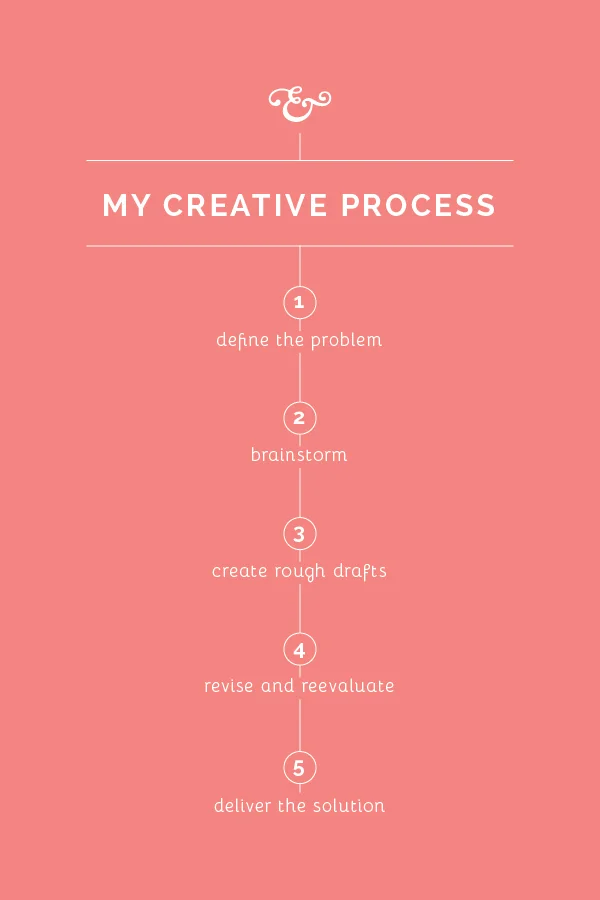
Graphic design isn't only about creating pretty things, although that's definitely one of my goals as a designer; it's about problem solving to visually communicate an idea. For the past month I've been going through my creative process step-by-step, sharing about what visual problem solving looks like behind the scenes.
Top 10 Design Mistakes to Avoid
You've probably heard the popular quote "creativity is allowing yourself to make mistakes." Or perhaps you've heard "mistakes are proof that you are trying" or "every mistake can create a beautiful solution." While there is an element of truth in each of those sayings, it's wise to be well-informed and intentional about design if you're a blogger or a business owner. Visual mistakes have the potential to make you appear unprofessional and untrustworthy to your audience.
Today I rounded up my top 10 design mistakes that everyone should be aware of. While some of these rules have been broken and the result wasn't terrible, it's best to be educated on why these mistakes are bad and make them on purpose instead of by accident.
My Branding Field Guide

Create a streamlined visual brand with my free Branding Field Guide!
1 | Comic Sans
This is the number one no-no among graphic designers. Comic Sans is never ever ever a good idea. Why? Read this entertaining article.
2 | Too many typefaces
Using too many typefaces in a logo, website, etc. can make a design appear busy, non-cohesive, and unprofessional. Play it safe and stick to the KISS principle on this one; settle on 2-3.
3 | Lack of hierarchy
Hierarchy determines which items you see first in an image. Designers pay attention to hierarchy and use it to their advantage by varying the size of their fonts (titles and headers should always be more prominent than body text), using color wisely (pops of color draw attention to text and images that should stand out), and paying attention to shapes (which give a design movement and lead your eyes around the design). The use of several different fonts, colors, and shapes have the potential to mess with hierarchy, resulting in an image that is visually displeasing and complicated.
4 | No Contrast
Contrast also helps with hierarchy. A lack of contrast can alter legibility and make an image appear washed out and undefined. A mix of both light and dark colors creates balance.
5 | Dizzy color pairings
When objects with similar color values are placed near one another, it can sometimes have a dizzying, vibrating effect. Use contrast and be cautious of color pairings, especially when you are layering colors on top of each other.
6 | Lack of negative space
The negative space around an object is often just as important as the object itself; it provides a cushion and a place for your eye to rest. Avoid cramming objects and text into a design and be aware of the entire composition, not just the main components. Check out these 25 clever and creative uses of negative space!
7 | Centered paragraph text
Large amounts of text should never be center aligned. It alters legibility, making text harder and more frustrating to read.
8 | Failing to align objects/no grid system
Haphazardly placing objects on a page without rhyme or reason is never a good idea; it has the potential to make a design seem random and unintentional. Use a grid system and align objects to create order.
9 | Using display fonts as text fonts
Again, this is a legibility issue. Script, hand-drawn type, and other display fonts should be used for headers and small amounts of text. It's always a good idea to use a simple font for large groups of text.
10 | Upside down text
It's simply hard to read. Don't do it.
My Branding Field Guide

Create a streamlined visual brand with my free Branding Field Guide!
It's your turn! What are some of your biggest design pet peeves?
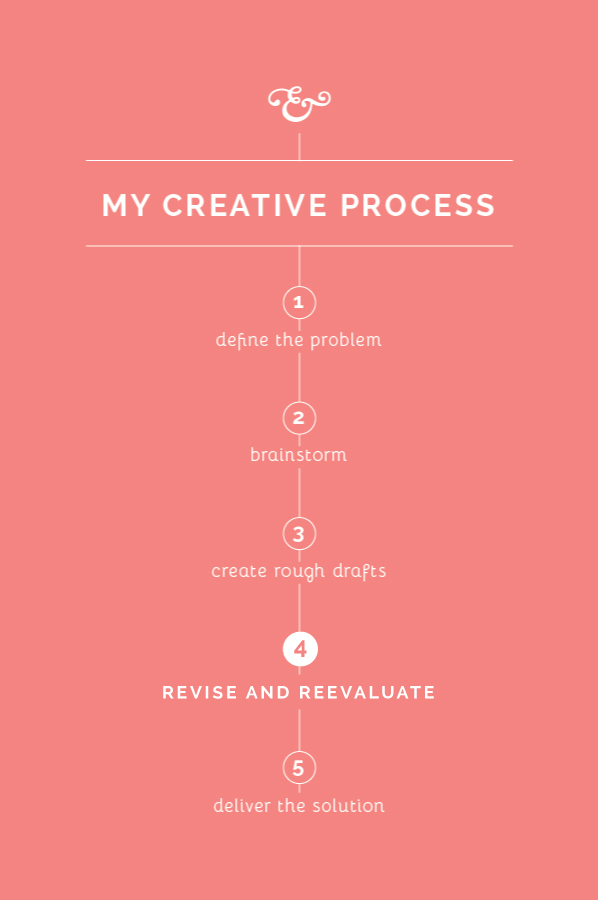
Back to the Drawing Board (Step 4 of my Creative Process)
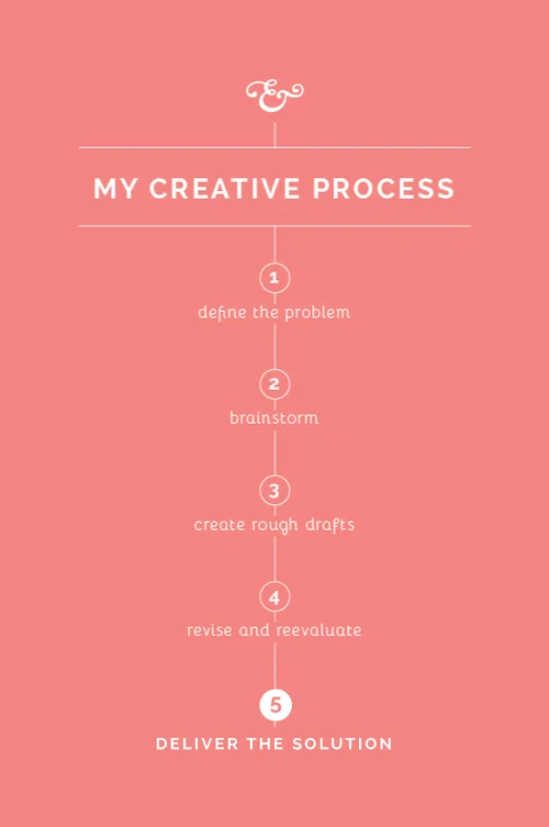
Like most occupations, it's helpful to have a process in place as I go about my work. I haven't seen many creatives approach this subject, so I thought it might be helpful to spend the next few weeks sharing my own creative process. While my method may not work for everyone, my hope is that these posts will encourage you to streamline your own process and think through the steps you take as you go about your work.
In a perfect world, first drafts would be the only drafts and no revisions would have to be made. But that isn't usually the case in the design world. It isn't always the most fun step, but revising and reevaluating allows me to refine my work, challenges me to become intentional in making design decisions, and results in an even better solution for my client. Here's a look at how Step 4 plays out for me in my creative process.
Self-edit
Before I reveal any work to my clients, I spend some time making revisions to my rough drafts. It's important for me to take a step back and evaluate so that I'm giving my clients the best representation of my work right out of the gate. I check for errors in spacing and composition, I double check colors in my Pantone book, search for any typos, etc. If this step is overlooked and mistakes are seen in the client meeting, it can make you look careless and unprofessional. Self-editing is a strong trait of any good designer.
Separate yourself from the project
In college, I dreaded critiques with a passion. I would walk into the studio after having spent countless hours working on a project, pin my design on the board, and shrink in my chair when my professor and classmates critiqued it to pieces. I can probably attribute my misery to my people-pleasing and perfectionist tendencies, but I think that every person struggles somewhat with taking criticism.
It's easy to get wrapped up in your work and become attached to what you create, especially when you've spent time and energy coming up with a great solution. But I've learned that in order to give your client your best work, you have to emotionally detach yourself and receive feedback and criticism with grace. As much as I hate to admit it, taking the feedback to heart from those class critiques in college always made my work stronger and challenged me to think through my design decisions.
Clearly communicate with your client
I wrote on this subject a couple weeks ago in Step 1, but it's important throughout the entirety of each project. When I reveal drafts to my clients, I walk them through my thought process and explain why I made each design decision. I've learned that educating my clients is a large part of communicating well.
Then it's my turn to listen and receive feedback. I take it to heart and ask a lot of questions along the way for clarification, just to make sure we're on the same page.
Go back to the drawing board
Once I've met with the client and discussed what they like and don't care for about my first drafts, I go back to the drawing board. I make small edits, change one typeface for another, explore other options - whatever needs to be done to meet the needs of my client while staying true to the elements of good design.
More posts in this series
6 Reasons Why I Blog (and why you might want to, too!)
Last month I stepped back from projects and posts and had a little Elle & Company brainstorm session. It's good to have a business checkup once in a while, reevaluate, and ask the simple questions: What am I doing? Why am I doing it? How could I be doing it better? I thought through areas like my branding services (which are getting an update this week!), the 2015 planner (which is coming out in 2 weeks!) and the blog. And the more I started thinking through the Elle & Company blog, the more I realized how fundamental it's been for my business. Here's why.
1. Blogging allows me to share my design work
This seems obvious, but blogging is a great way for me to share recent projects and Library additions with readers and prospective clients. When followers see my work on the blog, they become more aware of my services and there is a greater chance that they might work with me down the road. I receive at least 2 design inquiries on the days when I post a new project, and most of the design inquiries I receive are from ladies who keep up with this space. Posting about recent Library additions also allows subscribers to see what's new in their printable collection and allows non-subscribers to see what they might be missing out on.
2. Blogging allows me to connect with other bloggers and business owners
There's a great little community in this blogging world. This outlet has given me so many great opportunities to connect and partner with other creative women, whether it's by cross-promoting, featuring, or just lending a word of encouragement.
3. Blogging is free marketing for my business
Technically it isn't "free" - time is money - but the hours I spend blogging during the week are well worth the great marketing that it provides for my business. Blogging allows me to post sharable content, create hype about new product launches and business events, and share new projects and Library additions, all of which keep visitors coming back to my site. My husband, Jake, said something a few months ago that continues to stick with me. Most storefront businesses don't have the same people coming into their shop day after day. Blogging keeps hundreds of people coming back through the Elle & Company "doors" day after day.
4. Blogging validates my credentials
My About page will tell you that I have a degree in graphic design, but this space allows me to prove my skills and my background. Readers and followers can see my experience for themselves when they see my posts on projects, design, and business.
5. Blogging gives me an outlet to share resources and content
My favorite bloggers are always willing to share what their talent/knowledge/creativity to benefit others in some way. This space gives me an awesome opportunity to do the same thing and "pass the baton". Tools and resources aren't meant to be hoarded; my blog is an outlet for sharing my gifts with others.
6. Blogging allows my clients, customers, and readers to get to know me
I was surprised to see the results of my reader survey a few months ago and see how much my readers love personal posts. But it makes sense - I love reading about the normal day-to-day lives of the people I follow along with. Blogging allows me to connect with my readers; it feels more personal than a quick "about me" section. It builds trust and friendships, and it always makes my day to receive feedback from readers who can relate with me in some way.
It's your turn! Why do you blog? How could a blog be helpful for your business?

