Archive pages are a great way to categorize and round up your past blog posts. They make it easier for new visitors to take a look through your previous content, and they allow regular readers to quickly find and refer back to posts that they've read in the past. The more that stay on your site and look through your previous posts, the more likely that they will get to know you, like you, and follow along with you.
On Tuesday I blogged about 9 Ways to Make the Most Out of Old Blog Content, and I put an emphasis on the importance of a well-designed blog archive. Since then, I've been surprised by the number of readers who have asked me how to set up an archive page in Squarespace. Today I thought it would be beneficial to walk you through 3 different ways to showcase your archives using Squarespace blocks.
To start, add an archive page to your site just like you would any other page. Simply go into your main Squarespace menu, click on Pages, and add a new page in either your Main Navigation, Footer Navigation, or Not Linked section. I chose to create my archive page within the Not Linked section so that it doesn't appear in the top navigation of my website, and I link to it within my blog sidebar instead. It's up to you and your personal preference.
For more information about setting up pages in Squarespace, visit this previous Elle & Company post: Setting Up Pages and Navigation in Squarespace
Once you have the new page set up, you have a couple different options for how you can display your previous content.
1 | Setting Up Archives Using the Summary Block
The Summary Block first option for showcasing your past blog posts on your archive page. You can add the Summary Block to a page just like you would add any other block: by hovering over the left-hand side of any existing block and clicking the insert point that appears. The summary block allows you to showcase old blog content in 4 different layouts: Wall, Carousel, List, and Grid.
The Wall Summary Block presents your blog content in a masonry-style grid like Pinterest. It positions the items in the best layout based on the space that's available on your page, and it moves things around and reduces gaps without cropping your images.
The Carousel Summary Block presents your blog content in a slideshow format, showcasing a set number of items at one time with arrows for navigation. This block is a great option for separating your archive page into categories. (This is also the block that I use to highlight related content at the end of most of my blog posts.)
The List Summary Block displays blog content within one column, usually with thumbnails on one side and text on the other.
And the Grid Summary Block showcases your content in an even grid. Unlike the masonry-style Wall Summary Block, the Grid Bloack doesn't account for gaps and spaces among rows of content.
There are many options within the Summary Block's pop-up menu that allow you to change how many posts appear on the page, how large you want the text and image of each post to appear, the number of items you would like to display, etc.
2 | Setting Up Archives Using the Calendar Block
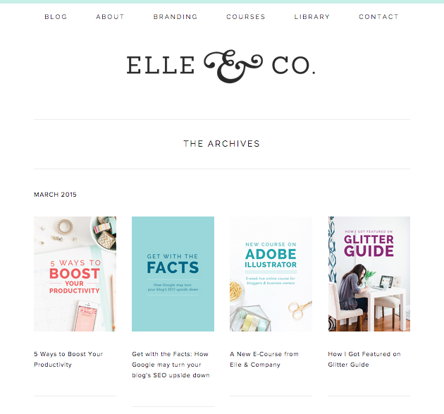
You can also display your previous blog posts by adding a Calendar Block to your archive page. This option allows you to display posts in a monthly calendar.
While the Calendar Block is a great option for displaying your content in a monthly view, there isn't quite as much flexibility and customization for the appearance of this page like there is for the Summary Block.
The above image is what the Calendar Block will look like if you don't upload thumbnail images under the Options tab in your blog post editor. If you're diligent about uploading a featured image within each post, your calendar will look more like the image below.
3 | Create and Update a Custom Archive Page
I use Image Blocks and Line Blocks to manually build and update the Elle & Company archive page. This option has to be updated with each new post, as opposed to being automatically updated once a post is published like the Summary and Calendar Blocks, but it allows me to move the images around and choose the exact layout of the page. It takes a couple minutes out of each day to add an image to the page, link it to my blog post, and save it, but I like having complete control over the page's appearance.
The drag-and-drop interface of Squarespace and its wide assortment of blocks makes it easy to customize your archives and find a solution that works best for you. You can sort posts by categories and tags, you can choose to remove the post titles altogether and just display an image, you can make your archives look like a Pinterest board through the Wall Summary Block - there are so many options for you to get creative with!
Which one of these options do you like best? Have you come up with any other ways to feature past content through Squarespace?
If you would like to see the creation of an archive page in action, visit the Webinar page and view my latest recorded session on Blogging with Squarespace. And for more posts on the Squarespace platform, be sure to take a look at all of the posts in Elle & Company's Squarespace series.


