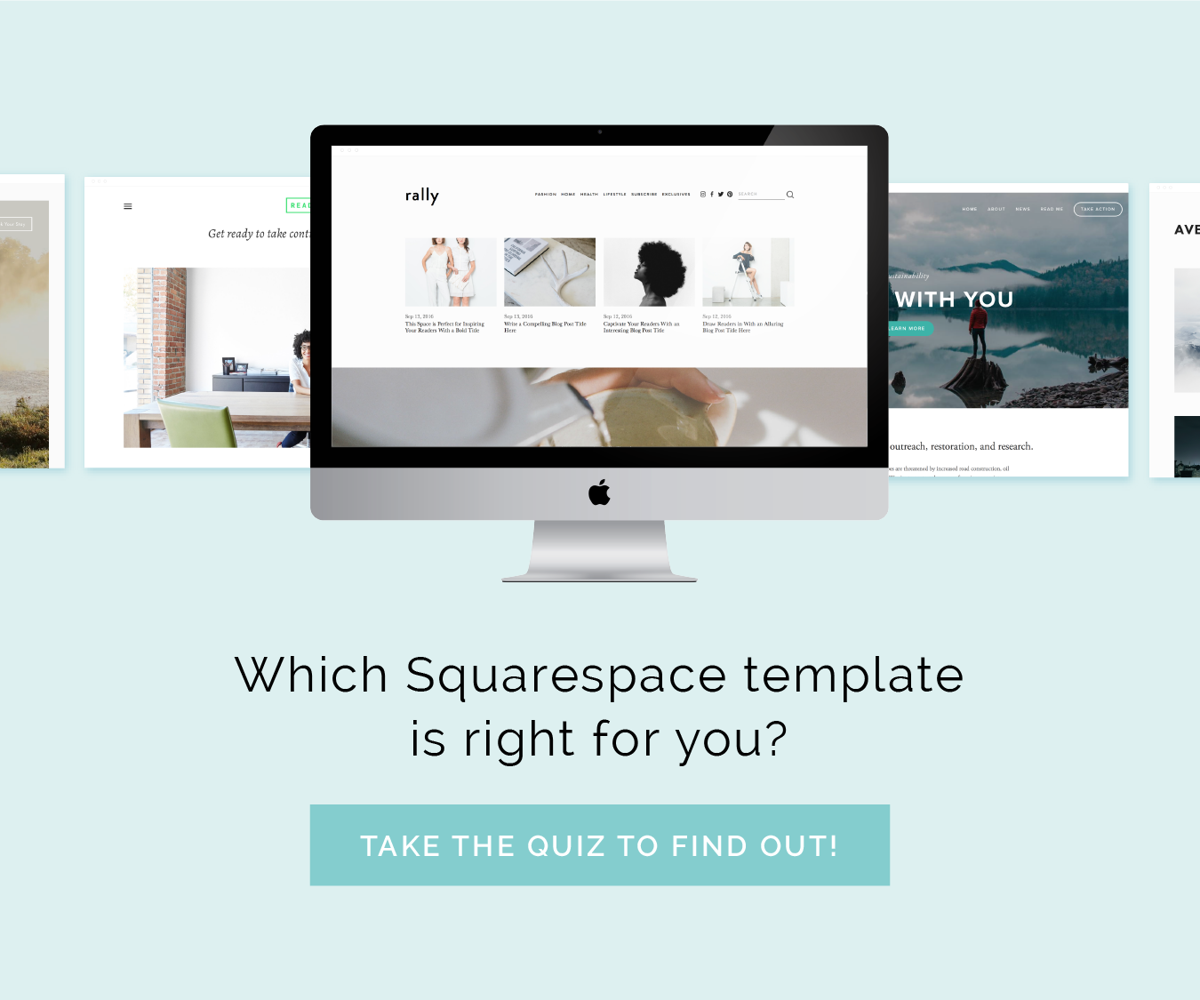
Beautiful templates are one of the many benefits of using Squarespace for your website.
I like to joke around with clients and peers that it’s hard to create an ugly site with Squarespace for that very reason.
But with so many great templates to choose from, it can be overwhelming to determine which one will work best for your website. Or you may even find it difficult to choose just one.
Over the past 3 ½ years, I’ve spent countless hours researching and testing out different Squarespace templates for my design clients, and I’ve discovered some favorites along the way.
I’ve rounded up 8 of my go-to Squarespace templates to help you in your search and hopefully make this stage of the website-building process a little less stressful.
1 | Hayden
Hayden’s large photo banners, clear-call-to-action buttons, and multiple navigations make it a great option for businesses, portfolios, blogs, and shops.
It’s contemporary, chic, and modern.
It shares the same underlying structure and functionality of the Bedford template because it’s in the Bedford “family” (just like the Anya and Bryant templates).
So if you want to create a site that is photo-heavy, professional, and have long scrolling index pages that highlight both images and content, Hayden, Bedford, Anya, and Bryant are all great options.
Personally, I like the look of Hayden more than the other 3. In fact, I love this template so much that I actually use it for the Elle & Company site!
Favorite features:
Large banner images - Hayden allows you to add full-bleed banner images and videos to your pages. You also have the ability to create slideshow banners at the top of any regular page or blog post page.
Navigation buttons - The last item in your main navigation menu can be displayed as a button, which draws more attention and creates a clear call to action. This is especially helpful if you’re trying to point people toward your shop, blog, contact page, or even a content upgrade.
Index pages - Index pages have a long vertical layout, so you can scroll through all the pages on your website at one glance. The result is one long, unified page that showcases all of your content.
Sidebar navigation menus - Anytime you create a folder in your primary or secondary navigation menu, the Hayden template will automatically create a sidebar navigation menu on every page in that folder with links to the other pages in that folder. (You can see an example of this on my Archive pages.) A similar category navigation also appears on Product pages.
Odd and even columns - Do you want to create 3 same-size columns of content on a page of your website? Not all Squarespace templates allow you to do that (they limit you to even-numbered columns), but Hayden breaks the mold!
Click here to view a live preview of the Hayden template.
Click here for more information on using the Hayden template.
2 | Tudor
Tudor’s Pinterest-style layout makes it a fantastic option for blogs, magazines, and news sites.
I’ve secretly been wishing for a design client who’s up for using this template because I love the layout and all of the options for showcasing blog content.
The Tudor template is in the same “family” as the Skye template, which means they share the same structure and functionality.
If you’re looking for a template that is minimal, interactive, and blog-centric, Tudor is a fantastic option.
Favorite features:
Sophisticated blog page - Tudor features a blog landing page that acts as an archive, whereas most Squarespace templates feature posts in descending chronological order. The blog page is laid out as a grid with thumbnails for each blog post, and it allows visitors to view all your posts at a glance. You can adjust the grid layout
Related posts - Do you want to feature related posts at the end of each blog article? Instead of setting them up through the summary block each time you set up a new post, Tudor allows you to enable related posts and have them display automatically.
Author profiles - For blogs that have multiple contributors, Tudor includes author profiles. Every contributor can set up a profile that displays their name, a link to their website, and their bio. Anytime a bio is clicked, viewers are taken to a filtered results page for posts that have been written by that contributor.
Interactive post navigation - This is one of my favorite features of the Tudor template. Special navigation arrows appear on blog posts that show the title and thumbnail of the next/previous article, as well as a progress pie chart in the bottom left-hand corner of the screen to visually represent how far along a visitor is in reading the post.
Navigation overlay - The navigation icon in the top left corner opens a customizable overlay where you can add links, text, images, and more.
Click here to view a live preview of the Tudor template.
Click here for more information on using the Tudor template.
3 | Five
The Five template is a flexible option for businesses and offers a wide variety of features for customizing your Squarespace site.
Its large photo banners, overlaid header text, and easy navigation are similar to the Hayden template, but the main navigation and number of sidebars make the Five template a little more unique.
Favorite features:
Multiple page sidebars - With the Five template, you can display up to two sidebars on each page of your website. This can be useful for highlighting other pages, displaying more content, showcasing opt-ins and content upgrades, collecting information, and more.
Large photo banners and videos - This template is great for photo-heavy sites because it allows you to create full-width banner images and videos. Each banner features customizable overlay text, too.
Customizable navigation - Most Squarespace templates only allow you to showcase your main navigation above banner images, but Five gives you an option. You can change the alignment and have banner images display at the top of each page with the navigation menu underneath.
Click here to view a live preview of the Five template.
Click here for more information on using the Five template.
4 | Om
The Om template is a fantastic option for brick-and-mortar businesses and shops, because it allows you to showcase more information (like your business address, phone number, etc.) in headers and footers on each page of your website.
Om is named appropriately. It’s calm, minimal layout puts a greater emphasis on your content.
Om is part of the Montauk family; it has the same structure and versatility, but the style is slightly different.
Overall, Om is a simple, professional template that allows you to easily organize and layout content in a clean, intuitive way.
Favorite features:
Customizable site header - An additional site header allows you to include your address, phone number, tagline, and other custom content.
Grid-style index page - Grid-style index pages are great for multiple galleries or projects, because they organize multiple pages into a single collection. This is especially helpful for showcasing a portfolio of your work.
Page banners - Like the Hayden and Five templates, Om allows you to add a banner image or video with overlay text at the top of any regular page, blog page, or events page.
Special footers - Unlike most footer templates, Om supports 3 footer areas: a page-specific footer, a site-wide informational footer, and a site-wide bottom footer. You can customize the content in any of these footers by adding content links, opt-ins, summary blocks for blog posts or products, and social media links.
Click here to view a live preview of the Om template.
Click here for more information on using the Om template.
5 | Galapagos
Galapagos is a clean, sophisticated option for building an online shop with minimum fuss.
The Galapagos template has fewer style tweaks than other shop templates in Squarespace, but its tried-and-true, elegant design sets you up for success.
Its automated grid layouts and hover-activated image swapping also makes it easy for customers to find what they’re looking for.
Favorite features:
Fantastic for e-commerce - Features like Quick View, Product Image Zoom, and on-hover effect help your products stand out. Galapagos’s category navigation also makes it easier for your customers to filter products and find what they’re looking for.
Unique branding for mobile - This template includes some different customization options for displaying your logo in mobile view.
Customizable navigation - Galapagos gives you several styles to choose from for your main navigation and, unlike other Squarespace templates, it showcases the navigation menu at the very top of the site, above the logo.
Click here to view a live preview of the Galapagos template.
Click here for more information on using the Galapagos template.
6, 7, 8 | Hatch, Rally, and Jaunt
Hatch, Rally, and Jaunt are all part of the Brine template family, meaning they have a similar structure and they contain the same features, although the design of each template is unique.
All 3 of these templates include interactive features like 3D scrolling, customizable navigation that enhances a viewer’s browsing experience, and built-in mobile styles that give you more control over how your site looks on smartphones and tablets.
The Hatch template is very minimal and photo-heavy, making it great for business and portfolio sites. It puts a large emphasis on page headers and typography.
Rally has a long, scrolling homepage that allows you to highlight banner images, blog posts, and other content from various pages on your website.
And Jaunt has a magazine-style landing page and beautiful product layouts, which is perfect for designers, artisans, and shops.
Favorite features:
Parallax scrolling index page - All 3 of these templates can feature parallax scrolling index pages. When this is enabled, the background images move more slowly than the content in the foreground, creating an illusion of depth and immersion. This feature also makes your site appear more professional.
Advanced e-commerce features - Quick view, product zoom, and on-hover effects are just a few highlights of using the Hatch, Rally, and Jaunt templates.
Multiple navigation menus - These templates contain three separate navigation menus, all of which can be styled and customized separately.
Customizable mobile styles - With Hatch, Rally, and Jaunt, you have more control over how your site appears on smartphones and tablets. Extra customization features include fixing the top navigation bar, and setting separate styles for header icons.
Archive-style blog page - These templates provide two adjustable layout options that put a greater emphasis on your images, videos, and content.
Click here to view a live preview of the Hatch template.
Click here to view a live preview of the Rally template.
Click here to view a live preview of the Jaunt template.
Click here for more information on using the Hatch, Rally, and Jaunt templates.
Which of these is your favorite? Which template are you currently using for your Squarespace site?


