Have you ever wondered how to get related posts to show up below each of your blog articles on Squarespace? Maybe you’re looking for a fast way to add featured posts to your sidebar or you’d like to create an easy archive page for your site.
The answer to all of the above lies in my favorite Squarespace tool: the summary block. Today I’m taking you behind the screen to show you how to use the tool and get creative with it to meet many of your website building needs.
The summary block allows you to present your content - whether it’s blog posts, products, gallery images, or events - in different layouts within your Squarespace pages and blog posts. There are 4 different types of summary blocks, and they’re available for use in every Squarespace template.
The wall summary block displays content in a masonry style grid, very similar to how Pinterest displays pins on their site. These are great for archive pages (similar to how I have my archive page set up).
The carousel summary block has a scrolling feature with navigation arrows that allows you to display a set number of items at a time. This is the block that I use at the bottom of many of my blog posts for related posts.
The list summary block displays items in a single column with thumbnail images on one side and text on another.
And the grid summary block displays content in an even grid, which is a great option for archive pages and featured posts in a blog sidebar.
Here are just a few of the ways you can get creative with the summary block and make it work for you:
Adding related posts at the end of a blog post using the summary block
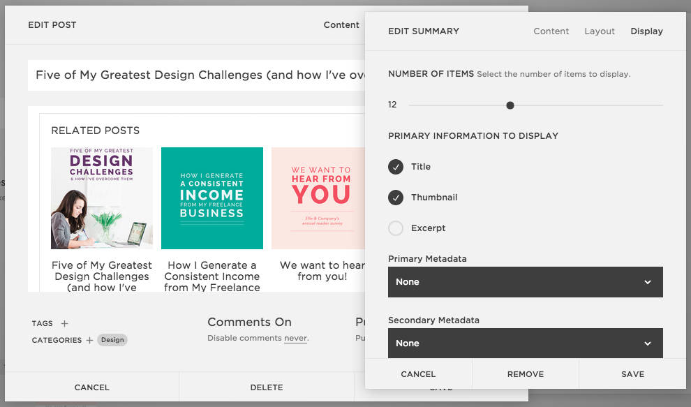
This is by far the most popular Squarespace question I receive! While Wordpress allows you to add plugins to your site that automatically incorporate related posts at the end of each blog post, you have to manually add the summary block to each blog article in order for related posts. However, with Squarespace summary blocks you have control over which blog posts appear because you’re able to sort the posts by categories, tags, and featured posts. Here's how:
Click an insert point to add the summary block to your blog post.
Choose the carousel summary block.
In the block editing window that appears, select the Blog collection on the Content tab.
Next, click on the Layout tab. This section will allow you to customize the way that the block appears in the blog post, and a preview of the changes you make will appear in real time.
I've found it the most helpful to go in and play around with the settings until you find a design you like, but here are the options that I always choose:
Header Text: Related Posts
Text Size: Small
Aspect Ratio: 1:1 Square
Items Per Row: 4
Text Alignment: Center
Metadata Position: Below Content
The Display tab lets you select which information appears in the block and allows you to filter the items by category and tag.
Because I always share 4 items per row within the carousel block in my blow posts, the total number of posts that I show is usually a multiple of 4.
Squarespace allows you to choose whether you want to display the title, thumbnails, and/or an excerpt of your blog post, and I usually change the metadata to "none" so that the dates don't show up underneath each post (I think it starts to get too wordy).
The category and tag features allow you to sort your blog posts and get specific about which posts you want to highlight. I usually choose to pull from a category that corresponds to the post I'm prepping because chances are, if they made it all the way to the end of a post, they will probably be interested in other posts within the same category. For instance, if you're reading this right now, you'll probably be interested in reading more Squarespace posts. Not to worry - I've included a summary block that's sorted by my Squarespace category to make it easier for you!
Click save, and there you have it! While you do have to manually add the block to each blog post, the sorting features are great and allow you control which blog posts appear within the block.
Adding featured posts in a blog sidebar using the summary block
So what happens when you want to share a collection of posts that are in different categories? That's where Squarespace's featured posts come in handy. Within each blog post, you have the ability to mark a post as a featured post at the bottom of Options tab.
If you're planning on utilizing the featured post option within summary blocks I would recommend uploading a thumbnail photo under the Option tab, too; it will give you control over which image appears for each post within the block.
To highlight featured posts within your blog sidebar using the summary block, go into your sidebar editing settings and add a new block.
Choose the Blog collection again but select the grid summary block this time.
Again, I would recommend experimenting with the layout options to see what you like best, but here's how I set mine up:
Text Size: Small (it won't matter because I unselect the text option)
Aspect Ratio: 1:1 Squares
Column Width: 161
Gutter Width: 15
Text Alignment: Left (again, it doesn't matter because I unselect the text option)
Metadata Position: Below Content
Under the Display tab, I choose:
Number of Items: 10
Primary Information to Display: Thumbnail only
Primary & Secondary Data: None
Category & Tag Filter: None
Featured Filter: Checked - this will bring in all of those featured posts you set up
Click save, and you're done!
Adding a simple archive or category page using the summary block
Summary blocks are also helpful for setting up archive and category pages within your website. I go into more detail with summary blocks and archive pages within this previous post, How to Set Up Blog Archives in Squarespace, and you can see a firsthand example of category pages that utilize the summary block on the newest Elle & Company client website for Real Food Whole Life here.
The summary block is a great, simple solution for displaying content within blog posts and pages within your website. With all of the options available to you for customizing the summary block, you have the opportunity to get really creative with how you make use of it!
For all of you Squarespace users, how do you utilize summary blocks?


