I put a lot of emphasis on branding your business. After all, I am a brand designer.
I’ve written several posts on branding, I created a course on the topic a couple years ago, and I started a 1-month Brand Challenge earlier this year.
But what I haven’t covered quite yet is creating a “sub-brand” for your offerings. That is, until now.
Because while each product, service, or course should take on the overall aesthetic of your business’s brand, each one should have it’s own distinct style so it’s easily recognizable.
Striking that balance can be a little bit tricky, but it can also be a lot of fun.
So in today’s post, I’m guiding you step-by-step through how to brand your course, product, or service.
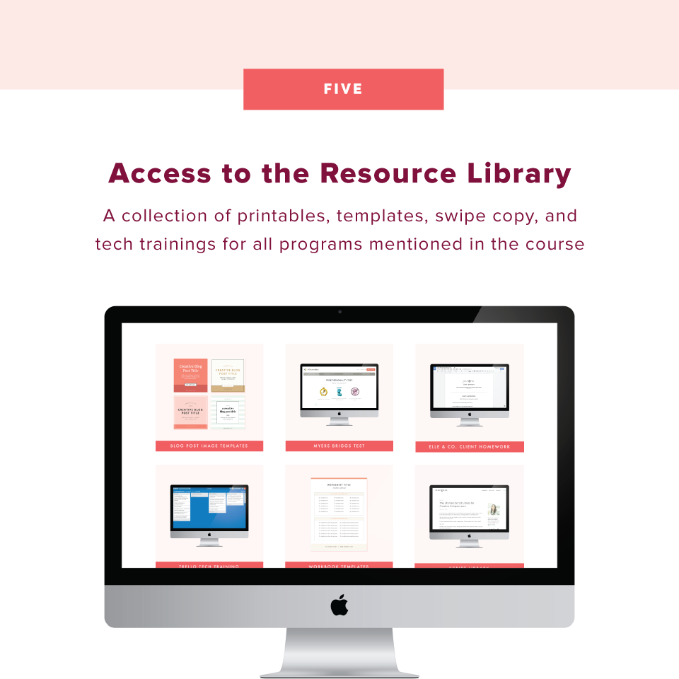
Before you dive into the post, hop on over the Library where there's a new worksheet available to help guide you through these steps!
You'll have space to record your color palette, fonts, sketch a logo, jot down some ideas on how to add some "flair" to your offering, and list out the collateral items you need to create all in one place.
1 | Choosing a color palette
Good news!
You don’t have to (and shouldn’t) start all over when you’re creating a color palette for one of your offerings.
In fact, you should use your brand’s color palette as a jumping-off point for this new sub-brand.
This will create consistency and make your sub-brand feel like a part of a greater whole, especially if you create separate sub-brands for each one of your offerings.
First, highlight one specific color in your brand’s color palette.
Because your brand colors are recognizable and specific to your business, it’s helpful to choose one or two colors from your current color palette.
For example, I chose to highlight the light blue of the Elle & Company brand as the primary color for my Adobe Illustrator Basics course...
...and the red-orange as the primary color for my Freelance Academy course.
Then, add a couple tints and shades of the main color.
A great way to maintain consistency but create versatility in your sub-brand is to pull tints (lighter values) and shades (darker values) from your primary color.
For my Adobe Illustrator course, I chose some lighter and darker blues as accent colors.
For my Freelance Academy course, I chose some lighter and darker shades of orange and pink as accent colors.
Finally, consider adding one complimentary color to set the sub-brand apart.
Now that you’ve created some consistency with your overall brand by choosing from the same color palette and adding tints and shades to the main color, adding a complimentary color into the mix can differentiate your sub-brand and set it apart.
This complimentary color can be in your brand’s existing color palette, or you can pull from outside of the existing palette.
I chose not to add a complimentary color to the Adobe Illustrator Basics palette.
But for the Freelance Academy course, I added a pop of color to the orange/pink palette through the citron green.
For help choosing colors, visit this Elle & Company post:
How to Create a Distinct Color Palette for Your Brand
2 | Choosing fonts
The “same but slightly different” approach that we took to choosing a color palette also applies to choosing fonts.
Creating a completely different set of fonts for a sub-brand will be confusing to those who are familiar with your overarching brand.
You’ve already created recognizability and memorability with your current brand fonts, so stick with them! Especially for any clean, simple brand fonts.
However, you can make this sub-brand unique by adding one new, distinct font that pairs well with your pre-existing fonts.
For example, I kept my simple Raleway brand font for the taglines and subtext of my Adobe Illustrator Basics course to keep it consistent, but I added in the Selfie font to make the sub-brand more distinct.
I chose to use that same Selfie font for my Freelance Academy course to create some consistency among the brands for each of my courses.
You may choose to use a different “feature font” for each of your offerings to differentiate them, but I would encourage you to keep the other fonts consistent with your current brands so everything still looks familiar and recognizable.
For help choosing fonts, visit these Elle & Company posts:
Finding, Choosing, and Pairing Brand Fonts
My Top 23 Favorite Fonts
3 | Creating an inspiration board
Inspiration boards help provide visual direction for a design project.
Instead of trying to pull ideas out of thin air, you can pull patterns, shapes, and designs from the photos in an inspiration board for your sub-brand.
This will come in handy as you design a logo for your offering, icons, collateral items, and more.
You might choose to use some photos from your overall brand’s inspiration board to create consistency and pull in some outside images that represent your product/service/course well, or you might choose to pull all new images.
You can also incorporate the colors of your new sub-brand’s color palette.
If you’ve never created an inspiration board before or need help utilizing an inspiration board, check out these Elle & Company posts:
How to Create a Clean & Cohesive Inspiration Board
How to Utilize an Inspiration Board to Design a Consistent Brand
4 | Designing a logo
Creating a logo for your courses, products, and services creates recognizability and memorability.
It also differentiates your offerings from others in your industry and makes it appear more professional.
It’s very easy to overcomplicate the design of a logo by adding a ton of features, but it’s best to keep it simple. Especially when it’s a logo for a sub-brand.
Stick to the fonts you’ve already set to your brand, and consider adding one design element to set it apart.
For example, the Freelance Academy logo sticks to the fonts chosen earlier; I simply added a “crest” feature to make it appear more academic.
Logo design can be a little tricky. If you need more help on this topic, check out these posts:
5 Characteristics of an Iconic Logo
The Do's and Don'ts of Logo Design
My Process for Creating Custom Client Logos
5 | Adding some “flair”
This is my favorite part of the entire process.
Now that the colors, fonts, and logo are out of the way, it’s time to add some “flair” to your sub-brand through icons, patterns, borders, etc.
These seemingly minor details make your brand more memorable and engaging to potential clients and customers.
The fun is in the details.
So spend some time creating these small design elements.
If you have a course, consider creating a unique icon for each of your modules.
If you have a service, consider creating a unique icon for each step of your process.
Or if you have a product, consider creating a unique icon for each feature or benefit.
Also consider how you’ll use patterns and borders and come up with a design style for them. This will come in handy in step 6...
For more help creating some “flair” for your brand, check out these posts:
How to Create Custom Icons for Your Brand
The Ultimate Icon Dictionary for Creative Entrepreneurs
6 | Creating collateral items
Now that you’ve created your sub-brand, it’s time to put all of the components together.
But before you do, make a list of all the collateral items you’ll need to create for your brand.
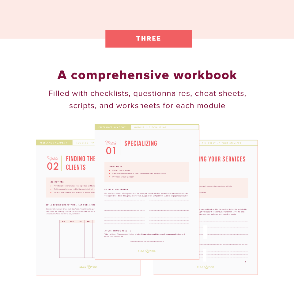
Like header images for the course pages…
...promotional graphics...
...social media graphics...
...workbooks and welcome guides…
...timelines, infographics, testimonial graphics, and more.
Then, get to work designing them by pairing together the colors, fonts, logos, icons, and borders of your offering’s new brand!
By following the similar steps of a normal branding process and borrowing from your overall brand, you can create a sub-brand for each offering that’s recognizable and engaging.
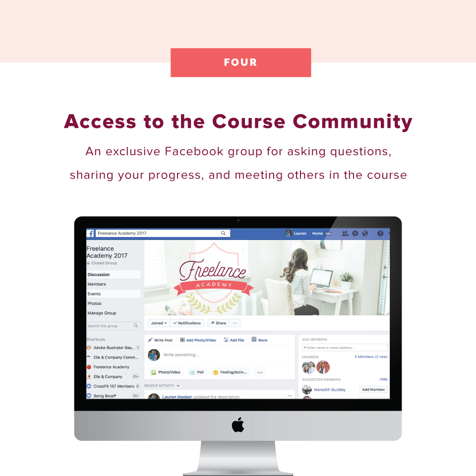
Be sure to share your progress and get feedback on your sub-brand in the Elle & Company Community.
I’m excited to see what you come up with!
Don't forget to download the Brand Your Offering checklist available in the Library!
Have you branded a product, service, or course before? What were your greatest struggles? What are you most excited to implement from this post?


