Much of the branding process takes place before my clients send me their initial design inquiries. The design direction isn’t developed in the inspiration stages when I pull images from their inspiration board or even when I look over their client homework; it’s developed far earlier.
Brands are developed at the start of a business through their interactions with their audience. They’re developed through every point of contact, whether it’s through an Instagram post, product offering, or the copy on their website.
My job as a designer is to identify the existing brand and display it visually.
Which is why designing for Olivia Purvis was an exciting opportunity.
Olivia Purvis, the blogger behind What Olivia Did, has been building her brand for the past 5 years.
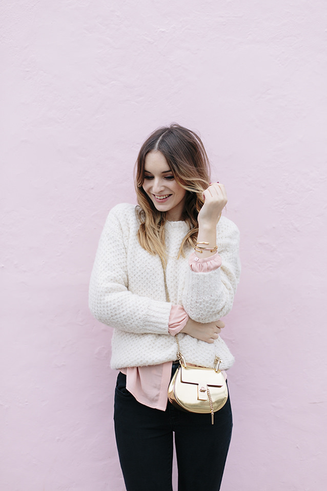
Olivia has a distinct, charming writing style, a classic fashion sense, and gorgeous photography that are all distinctly her own. I could identify a tweet or Instagram post from her a mile away (as well as her lovely English accent) because of her brand’s aesthetic and tone; she’s already developed an identity for her online presence.
The only thing missing? A logo, style guide, and website to tie it all together. And that’s where I was honored to come in.
Honored, excited, and a little nervous, if I’m honest. Honored because Olivia trusted me with the design of her blog and brand. Excited because she had already put in the work to develop her brand, which makes the end product much more effective and one-of-a-kind. And nervous because Olivia already has a large, loyal following who knows her well; I wanted to provide her (and them) with an accurate representation of her brand.
Oh, and one more little nerve-wracking detail: the site design would be taking place in Blogger.
So in today’s post, I’m taking you behind the scenes to show you a step-by-step of how everything came together, from the decisions I made in designing the inspiration board to how we were able to get her site up and running in Blogger.
Step 1 | Inspiration board
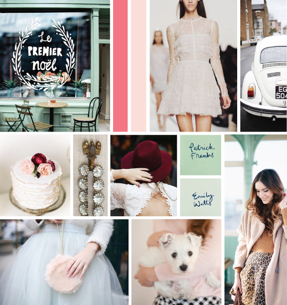
Because Olivia already had a distinct visual identity through her photos, finding images to include in her inspiration board was a fairly easy task.
One of the challenges, however, was coming up with a distinct color palette that would fit her brand and also compliment the photos on her website. And because Olivia is a fashion and lifestyle blogger, the colors within her photos are always changing.
So I searched for colors that had character but could also be toned down. Olivia and I settled upon a few shades of pink, burgundy, and some soft minty greens.
Pastels with some rich, warm neutrals.
The color palette changed and evolved a little throughout the project (we didn't follow the normal 2-week timeline on this one), but the overall feel and aesthetic of the board didn't change much. This phase, as always, was a helpful starting point for the rest of the process.
Step 2 | Logo design
Olivia was drawn to images with that included hand-drawn lettering, so my original logo concepts for What Olivia Did included some stylized script.
All 3 concepts had a good mix of feminine and classic elements, and we originally went with concept 1 for a large majority of the project, keeping it black and white.
But there were a few small hangups with that choice. First, while the script was fun and had some character, the concept in and of itself wasn't very distinct and different. Second, it was difficult to come up with alternative logos for it because of the script and the negative space around it. And third, it was a little on the trendy side; we were looking for a logo that was a little more timeless.
So I went back to the drawing board. With some help and input from Olivia, we came up with an option that solved all 3 problems above.
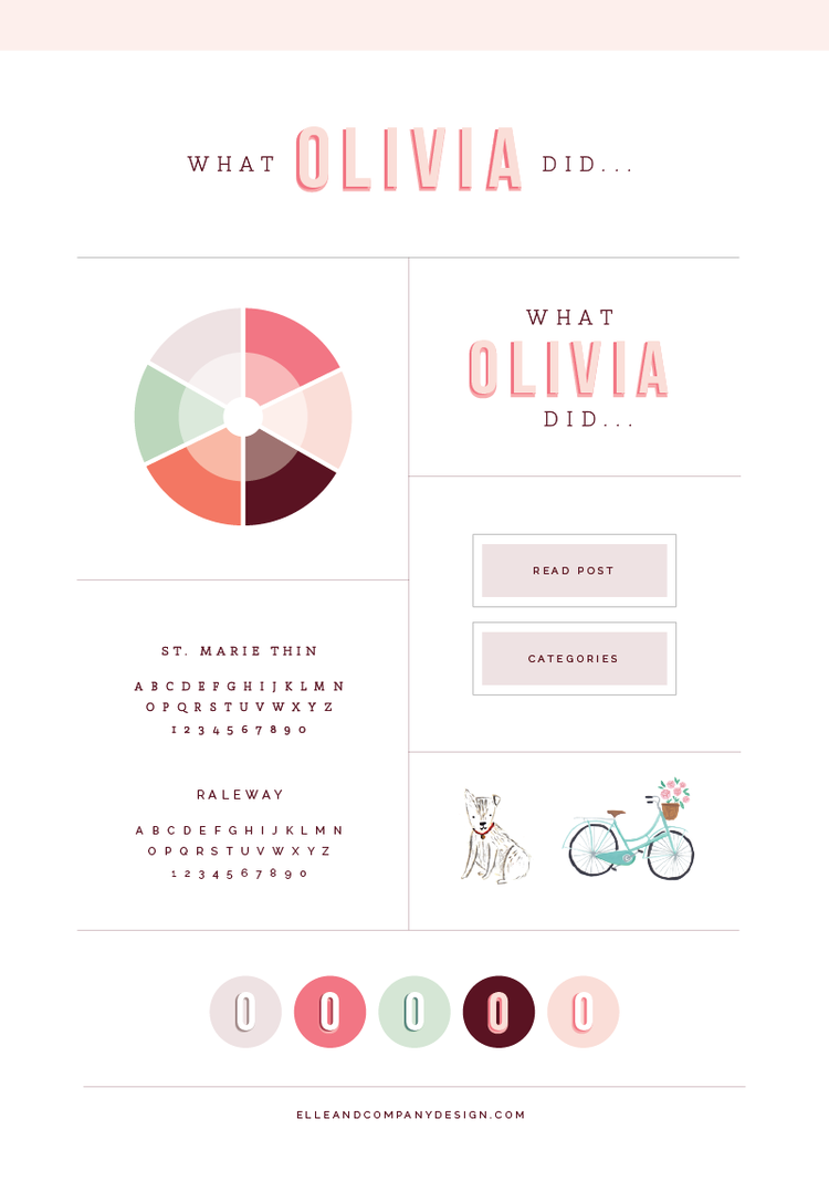
Classic, distinct, and feminine. This option also works well as a secondary logo...
...and provided an opportunity to create some fun icons.
I added a soft, neutral purple to the color palette along the way to break up all the pink and create a little more balance. It pairs well with Olivia's photography, suits the feminine aesthetic of the brand, and works well for elements of Olivia's brand and website that don't need to be the focal point of the design.
SIDE STEP | ILLUSTRATIONS
Olivia's old blog header included a few illustrations from Emma Block.
Because Olivia's audience had come to identify those illustrations as a large part of her brand, we didn't want to lose them. So Olivia partnered with Emma again to come up with some new illustrations for the site that fit the new color palette and maintained the same aesthetic that her readers had come to know and love.
These illustrations are another reason why the second logo concept was a better option. The style of the "Olivia" text pairs well with the colors and aesthetic of Emma's illustrations.
It was a treat to have Emma contribute to the overall design of Olivia's brand; her work really helps the new website and collateral items stand apart (while adding a fun, personal touch).
STEP 3| Website
I usually jump straight from the logos and the brand style guide to collateral items, but because Olivia's site was the largest piece of the project (and we were creating it on Blogger), we prioritized the website design first.
Olivia started her site in Blogger and had years of experience and posts on that platform, so she asked if it would be possible to implement the new site design in Blogger. And while I work in Squarespace the majority of the time I made a special exception for Olivia, knowing that I could recruit the help of my friend, Chaitra, who is a coding genius and had worked with the Blogger platform in the past.
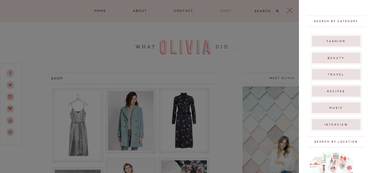
And after working with Chaitra, I'm certain that I wouldn't have been able to pull it off without her. She was able to take our ideas for an interactive site map, a drawer menu, and category menus and work her magic to get them up and running on the site.
Here's what Olivia's website looked like before...
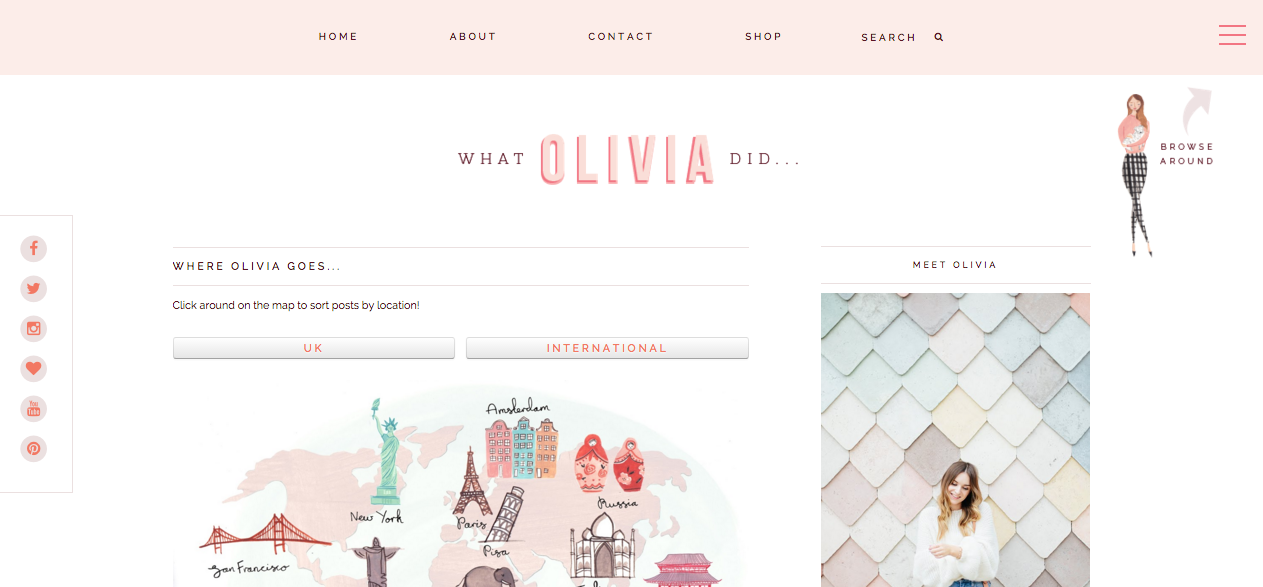
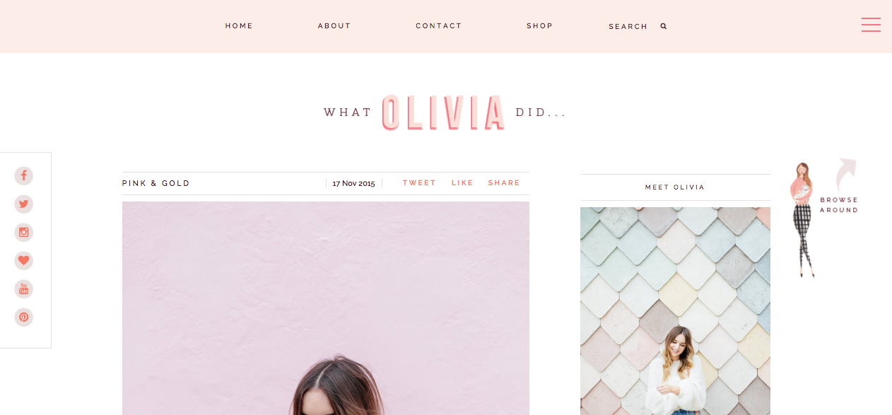
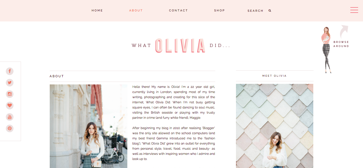
...and you can see her finished site here (screenshots don't quite do it justice!).
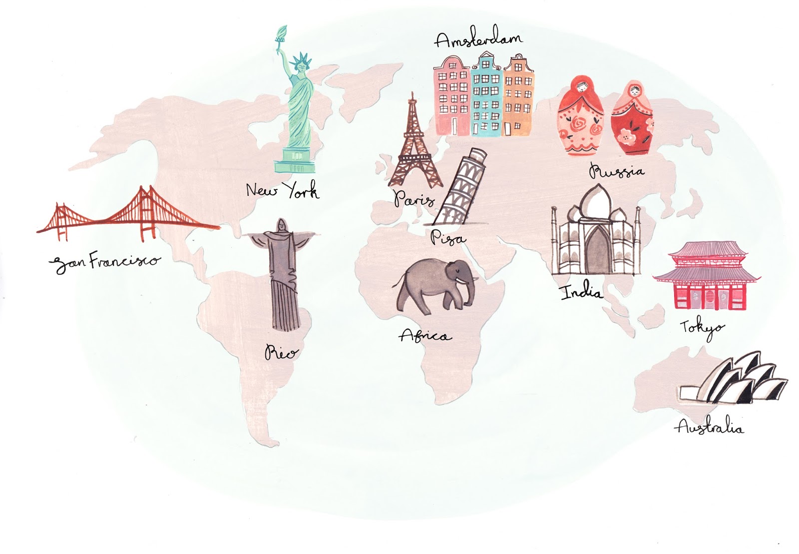
My favorite features are the interactive maps, the illustrations on her about page, and the "browse around" drawer menu on each page. I'm thrilled with how it all turned out!
4 | Collateral items
While Chaitra was hard at work coding the site, I got to work on Olivia's collateral items. I designed a media kit with Olivia's bio, awards, stats, and demographics for potential partners and sponsors...
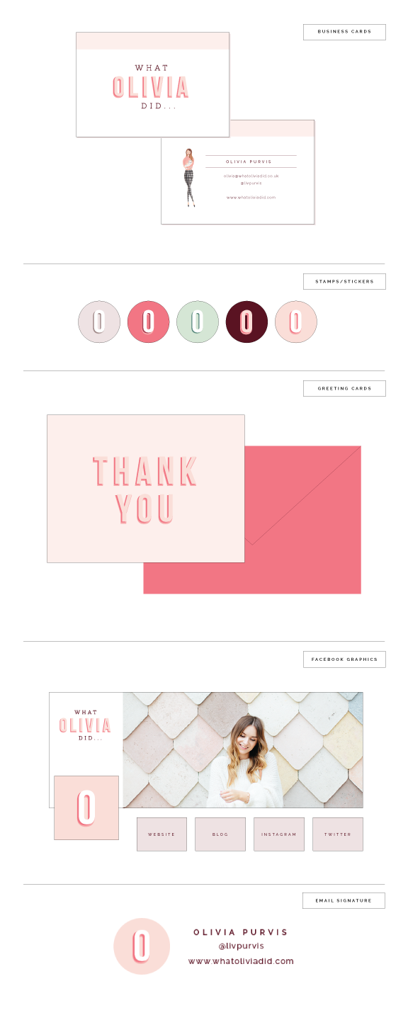
...and stationery items like business cards, stickers, thank you cards, and an email signature.
Because Olivia had already put effort into developing her brand at the outset, this project was one that was different from anything I've done in the past. With custom illustrations, gorgeous photos, and a an aesthetic already in place, my job was to tie it all together with a color palette, a logo, and a functional, interactive site design. I'm thrilled with how it turned out!
What do you think of Olivia's new site? What are your favorite aspects of this project?

