It’s no secret that I love Squarespace. Not only is it easy to customize, easy to use, and easy on the eyes, but it makes the client process so simple for designers who use it to create client sites.
Because Squarespace is still relatively new and there aren’t as many designers using it as there are on Wordpress, I receive several emails each week regarding about the ins and outs of how I design client sites using the platform.
I get asked everything from how I handle billing to how I choose a template, so today I’m sharing an inside look at my Squarespace client design process from start to finish.
For those of you who are already designing sites in Squarespace, I hope you’re able to take something away that makes things simpler and more efficient on your end. And for those of you who are considering trying your hand at offering Squarespace site design in the future, I hope this post convinces you to take the leap and try it out.
1 | Create a trial site
Squarespace offers a 14-day free trial to anyone interested in creating a site on their platform, which is helpful from a designer perspective because it allows me to create a website draft without my client having to purchase anything at the outset. And because my client process is only 2 weeks long, the trial period suits the timeline perfectly.
So once I’ve designed my client’s brand and collateral items during the first 6 days of my client design process, I create a new trial site under my own Squarespace account to create a mockup of my client’s new website.
I set it up using my own Squarespace account for a couple reasons.
First, using my account allows me to access all of my client sites at a glance instead of having to remember each client’s password and login for their individual sites. And second, I like to steer clear of asking for passwords and logins when I can, just to protect my client’s privacy and maintain trust.
Squarespace allows you to see all of the sites you have access to at a glance, too, and you can access them by clicking on your profile image at the bottom of the main menu.
When I’m working with clients who already have a Squarespace site, trial sites allow me to experiment with the layout and change up the design without messing up or taking down their current site in the meantime.
And for the clients who are transferring over to Squarespace from other platforms like Wordpress or Blogger, trial sites allow me to demonstrate what Squarespace is capable of before they make the switch.
2 | Customize the design
Choosing a template
Once you create a new trial site, you’re asked to choose a template.
This step took me a while when I first started designing sites in Squarespace, but as I’ve become more familiar with the templates I’m able to narrow down the options fairly quickly. I usually have a template in mind from the very start, based on the information my client has provided in their client homework.
Squarespace has different categories for templates (businesses, portfolios, restaurants) which allows you to sort through them, but I never let those suggestions hinder me from using one of the templates (if a template is listed under “restaurants,” I won’t rule it out). I focus more on the layout and functionality of each template and take a peek at the feature index of each one to see what it’s capable of and determine whether it would be a good fit.
Squarespace also provides examples of other sites who’ve used the platform, which is helpful for seeing the versatility of the template and gaining ideas for how you might be able to use it for your client’s site.
While Squarespace allows you to switch templates at any time, I try to choose a great option from the outset to save time and more importantly, save the design. You’re able to keep all of your content when you switch templates but you aren’t able to save the customizations you’ve previously made to colors, fonts, and spacing. It’s worth doing a little bit of homework and finding a good fit from the start.
Mapping out the content
Because many of the Squarespace themes determine the spacing and no coding is required, I don’t sketch website concepts when I’m designing client sites in Squarespace (like I would if I were designing and coding a site in Wordpress). Instead, I jump right into the design. I view the trial site as an “interactive rough draft” and use it to work through the layout and functionality of the site.
I do, however, map out a wireframe beforehand - based on the information my client provides in their client homework - to work through how the site will function. I list the pages, determine which ones will be included in the main navigation and which will be unlinked, and come up with calls to action on each one to create a flow for users moving through the site.
Related post: 8 Ways to Enhance Your Website's User Experience
So once I’ve chosen a template, I get to work setting up the pages and navigation. I delete all of the sample pages included in the original template and add in the content my clients have given me beforehand for each page.
Receiving content from clients
In the client homework, I also ask my clients to create folders either in Google Drive or in Dropbox for the content they want me to include on their website.
Within the large folder, I have them create subfolders for each individual page and ask them to label the folders accordingly (about, services, contact, etc.). Within each subfolder they can upload images and text files. Not only does this make things easier on my end, but it helps my clients organize the information on their end, too.
Customizing the template
When I have a framework laid out with the pages and navigation, I add my client’s logo to the site and make adjustments to sizes, fonts, and colors in the Style Editor.
Squarespace allows users to preview the changes they’re making as they’re making them, which is extremely helpful and saves a lot of time.
After the site is mapped out and adjustments are made to the Style Editor, I’ll often go back through and add buttons and other graphics to customize the site a little more and make it feel less like a standard template.
3 | Client approval
Once I get to a good stopping place on the design, I give my clients a preview by sending them a link to the trial site.
Squarespace automatically gives each trial site a unique Squarespace URL, but I prefer to customize the Squarespace domain to make it a little easier to remember. By choosing Settings from the main menu and clicking Domains, I’m able to update the built-in domain to my client’s business name instead.
After I receive feedback from my client, I continue to make revisions and tweaks until they approve the final design.
4 | Add client as a site administrator
If my clients are making the switch to Squarespace from Wordpress or another content management system, I add my client as an administrator once they approve the site by clicking Settings > Permissions > Invite Contributor.
After they create a Squarespace account, they can login to the backend of their site to upgrade it from a trial site to a paid site and set up the billing information.
If my client already has a Squarespace site, I ask them to add me as an administrator (following the same directions above) so I can implement the new design on their preexisting site.
5 | Transfer content and reroute domain
For the clients making the switch from Wordpress, I offer to transfer their existing blog posts into Squarespace and reroute their domain for them. I’ve found that it’s often easier to do that on my end to save them the time (and anxiety) of doing it themselves. If they opt to have me help them with the transfer, I ask my clients for their login information for their hosting platform and domain provider and transfer the blog content before rerouting the domain.
For those interested, Squarespace has some helpful tutorials for transferring content and rerouting domains:
Connecting a Domain to Your Squarespace Site
Importing and Exporting Content
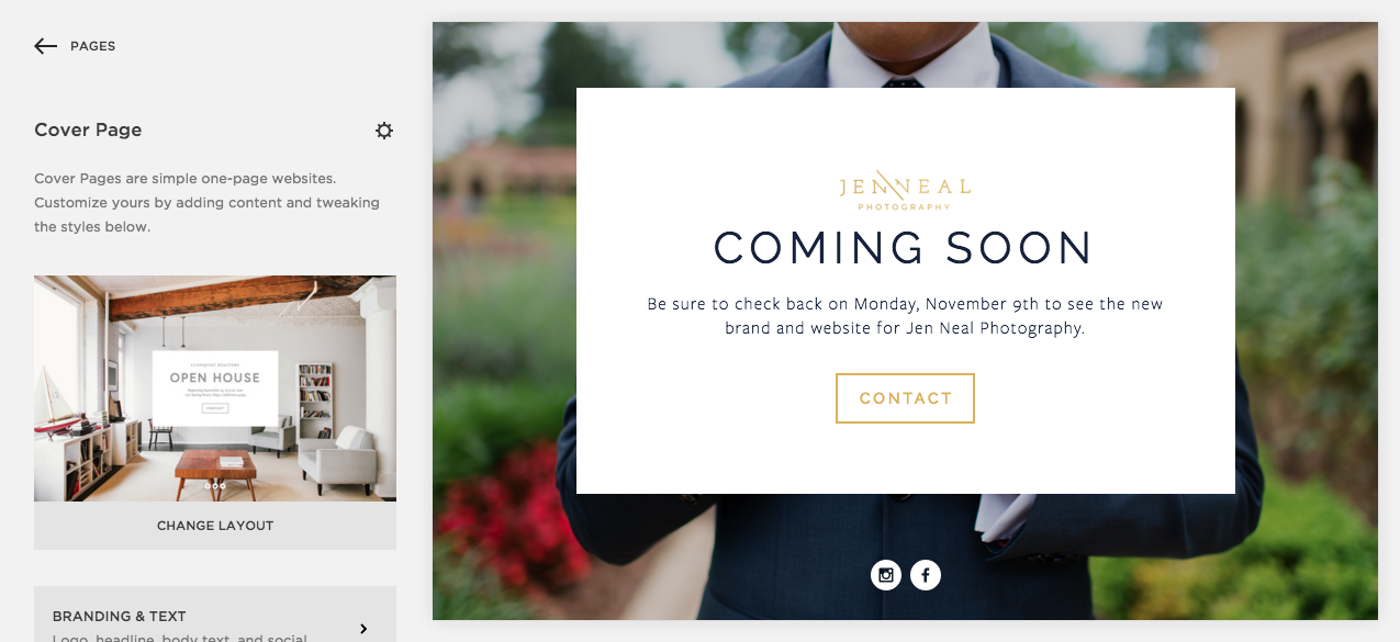
Before I link my client’s preexisting domain to their new Squarespace site, I create a cover page and set it up as the homepage ahead of time to create some suspense before the new site officially launches.
For the clients who already have a preexisting Squarespace site, I put up a cover page before I start changing the design to mimic the trial site.
5 | Client tutorial
After the website is all set up and ready to go, I meet with my client over Skype or Google Hangouts to share my screen and show them around the backend of their new Squarespace site.
I demonstrate how to update the images and text on each page, add and edit blog posts, connect their social media accounts, view their site metrics, and add items to their shop. And because Squarespace is so user-friendly and intuitive, the final consultation takes me no longer than an hour.
Once we get off the call I send a final invoice and transfer the site ownership over to them. All that’s left is a celebration on launch day!
Squarespace is a great option for designers who want to provide their clients with an efficient, user-friendly experience and a professional, streamlined website. While my process isn’t the only way to go about creating client sites in the platform, I hope it comes in handy for those of you who design Squarespace sites in the future.
Do you design client sites in Squarespace? If so, what does your onboarding/offboarding process look like?


