While branding has many benefits for a business, some of the greatest are differentiation, recognizability, and memorability. So whenever I approach a new project, I challenge myself to push the limits and design a brand unlike any other I've designed in the past and unlike any other I've seen from other designers.
My 2-week design process has made this challenge easier by allowing me to focus solely on one client at a time and pour into all the fun details. Today's new brand and website for Magnolia Media PR is no different, and I'm excited to show you the final designs!
Magnolia Media Public Relations is a wedding and lifestyle boutique public relations agency that provides brand development, social engagement and management, consultation, promotion, and press publication. It's the new venture of Alyson Pugh who is taking the leap into business after having been in the industry for years, and I was thrilled when she contacted me about her brand and website last January.
Before we started the 2-week process, Alyson worked through the Elle & Company branding questionnaires. One of the sections asks for 10 adjectives that best describe the direction that my clients want to go with their new brand, and Alyson used words like savvy, modern, inspired, engaging, personable, and honest. I took all of them into account throughout the design process, starting with the inspiration board on Day 1.
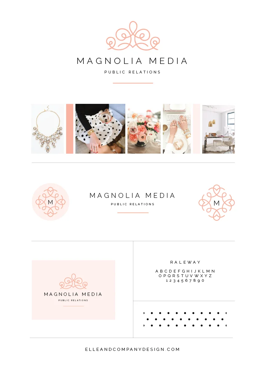
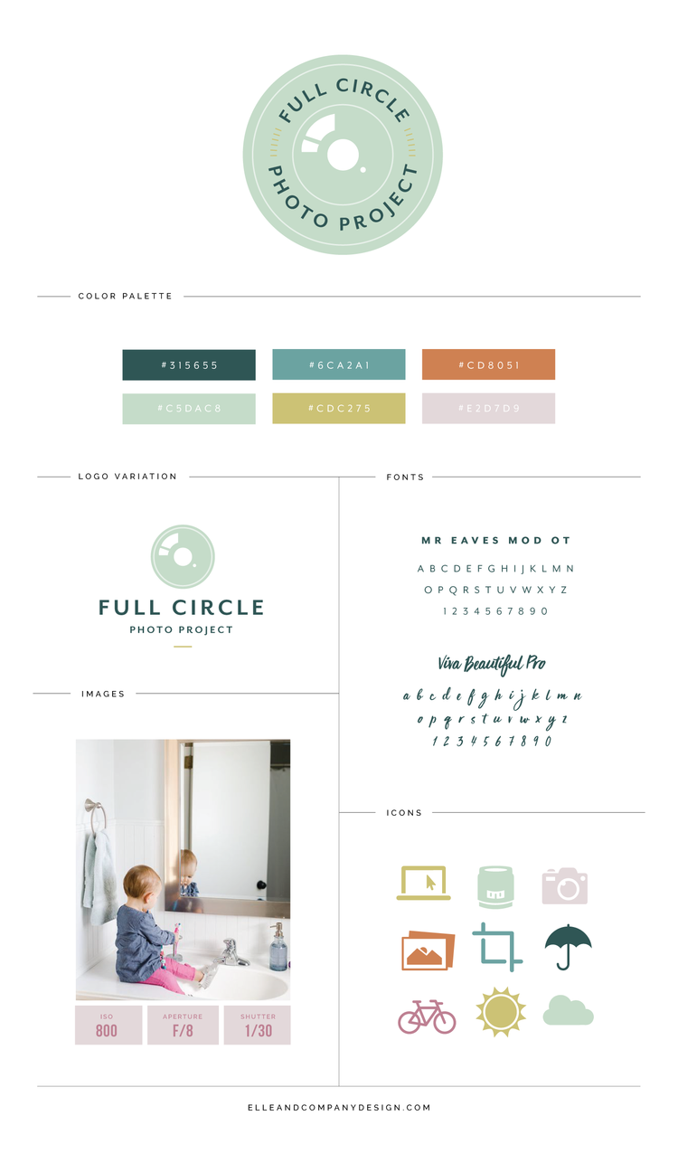
Because Magnolia Media works primarily with businesses within the wedding industry, we aired on the feminine side. The color palette of peachy pinks, gold accents, and classic black and white lends itself adds lends itself to a soft, almost regal, aesthetic, and the metallics add a touch of glam. I brought it bold patterns like the polka dots and the geometric gold diamonds, which are a nice contrast to the florals and curved lines in the black and gold design. It feels sophisticated, savvy, and professional, all of which measured up with the direction Alyson outlined in the branding homework.
Once we finalized the inspiration board, we loved onto the logo.
The logo we chose continues the contrast of clean lines (the simple, sans serif typeface) with the more organic, curvy lines of the pink detail. I carried that through to a couple alternate logos to give Alyson versatility.
A strong visual brand is seen throughout all of the details of a business, from their Facebook cover image to their email signature, which is why I provide each client with 4 collateral items with their brand and website design package. Among Magnolia Media's collateral items, I designed business stationery (letterhead, business cards, notecards, and greeting cards), social media designs, and a PDF pricing guide.
After working on the collateral pieces, I moved onto the website design. We focused on keeping things simple with a streamlined navigation, a lot of white space, consistent typefaces (I love the contrast between the clean sans serif of the logo with the italicized serif of the navigation), and the pink framed buttons/headers. I'm thrilled with the result! Here are a few snapshots.
Click here to see the Magnolia Media PR website for yourself!
In a matter of 2 weeks, Alyson and I partnered together to create a one-of-a-kind, classy brand for Magnolia Media Public Relations. I'm thrilled for her launch today and I'm honored that I was able to play a part in her new business venture through design!
What do you think about the new Magnolia Media PR brand and website?

