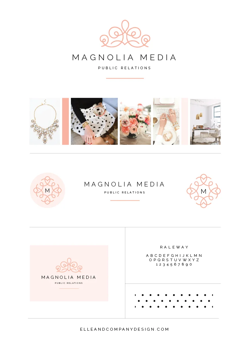
The scary, exciting thing about entrepreneurship is that business is always changing and evolving. When you're first getting things up and running, you might have a general idea of the services you want to offer and the clients you want to work with, but as you gain experience in your industry you begin to refine your offerings, your processes, and your brand.
It's always a treat to work with creative entrepreneurs who've spent a few years in business; they have a better idea of the clients they're trying to appeal to, the items they need to have designed, and the overall visual identity they're trying to achieve through their brand and website.
So when Amanda Jameson approached me for design work, I was thrilled. Her previous brand and website weren't cohesive with the quality and style of her work, so we spent 2 weeks partnering together to create something more fitting for her photography business.
The final product is one that I'm thrilled to reveal today (as well as a behind-the-scenes look at how it all came together)!
Before the 2-week design process began, I asked Amanda to complete a few questionnaires to gain a better understanding of what she wanted to portray through her new brand and website.
One of the questions I leaned on heavily, especially as I pull together her inspiration board, asked for 10 adjectives that best described her business. Welcoming, delightful, joyful, inviting, refreshing, warm, intentional, invested, professional, and authentic were among the words Amanda used.
So how do you take those words and translate them visually into a brand and website?
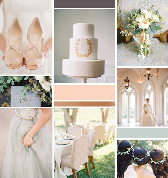
I start with an inspiration board, gathering images and pairing colors to create a "feel" and an aesthetic to work from throughout the entire project.
Amanda did a great job pulling these images together in a secret Pinterest board, and the color palette of the photos blended in perfectly with those 10 adjectives listed above. The peachy pink lends itself well to "delightful" and "joyful." The soft blue/green is "refreshing" and "authentic." And the shades of brown are "warm" and "invested."
Fun fact: This was the first design project where I didn't pull in any outside images other than the photos Amanda included in her Pinterest board. She had her aesthetic down to a T!
Aside from color, there were also other similarities between the photos in the inspiration board: the movement in both gown photos, leaves, a touch of sparkle, soft light, and structure in the chairs, portico, and even the layers of the cake.
I kept all of those qualities in mind as I moved onto the next step: sketching logo concepts.
You can see many of those inspiration board similarities within my sketches; I focused on incorporating leaves, movement, and structure.
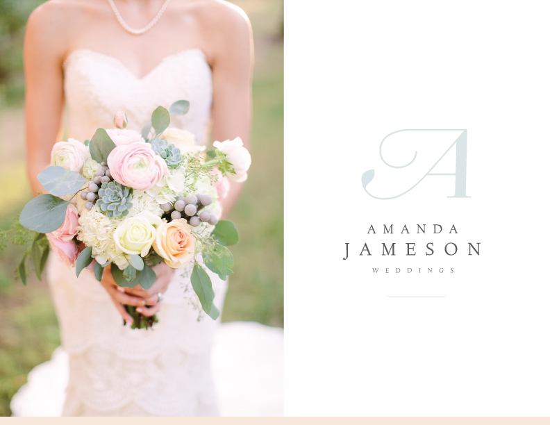
After digitizing the concepts and presenting Amanda with 3 distinct logo options, she chose the one below, which also happened to be my personal favorite. Not only does it include an A and a J - the initials of Amanda's name - but it also includes structure (the right side of the A), movement (the round, fluid lines of the J) and a little leaf detail.
I chose a classic serif font, which lends itself to a more professional feel, and stacked the words to create more structure. The faint blue line below adds balance and a little more color.
There are many variables to consider when designing a logo, but versatility is one of the key things I focus on. Many elements of Amanda's logo, like the text and the "A" icon, can be used on their own or rearranged into alternative logos to give her more versatility.
These other logo options are often a better fit for things like email signatures, watermarks, page footers, etc. (which you can see below in Amanda's collateral items).
But a brand is much more than just a logo. It really starts to come to life when elements like borders, text, and colors enter the mix during the collateral design phase.
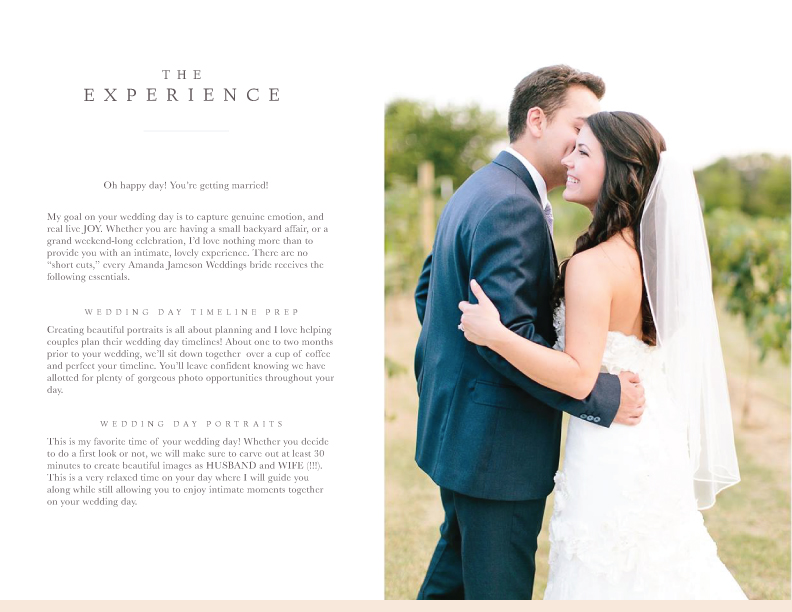
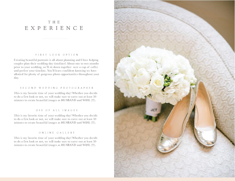
For Amanda, I designed business cards, stickers, greeting cards, social media items, an email signature, and a pricing guide.
Click through the images below for a sneak peek at Amanda's new pricing guide.
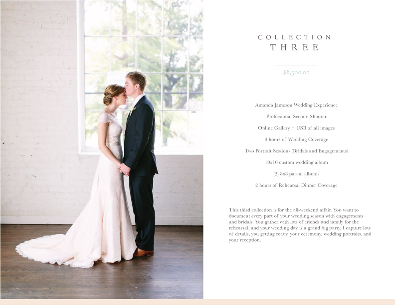
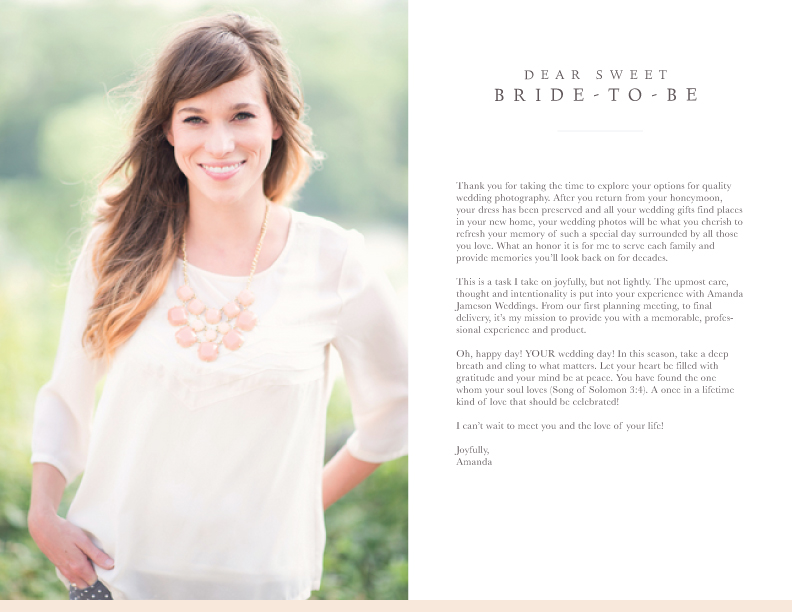
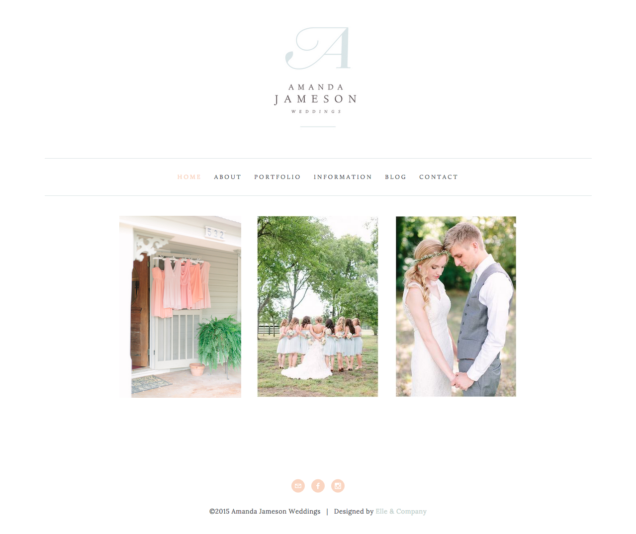
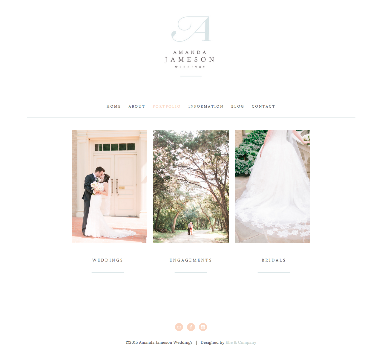
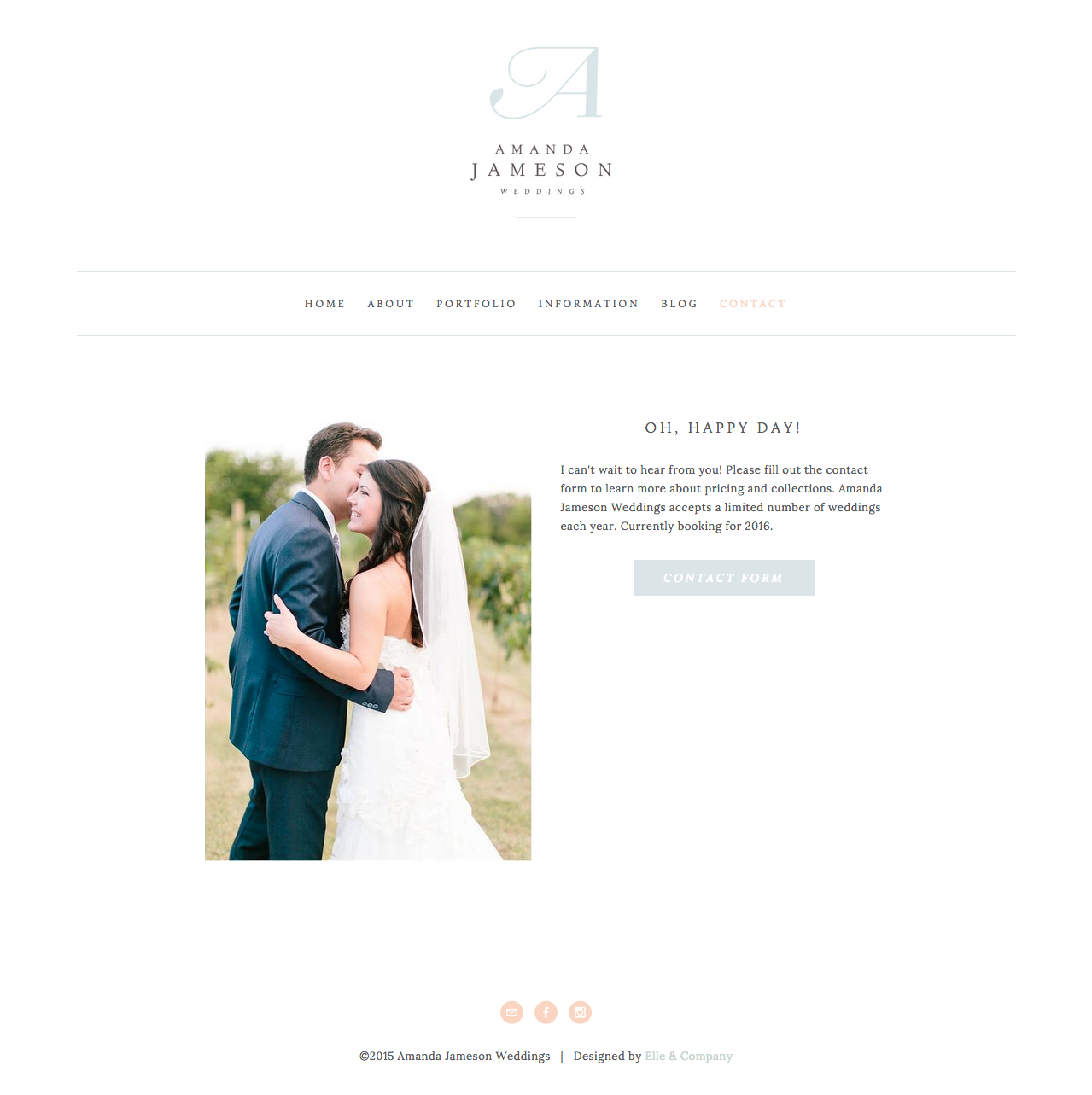
After the collateral items were finalized, I spent the last 4 days of our 2-week schedule designing Amanda's new website. I used consistent fonts and colors, kept the navigation simple, and chose a classic layout to highlight Amanda's gorgeous photography.
Click through the images below for a sneak peek at her new Squarespace website.
The images above don't quite do it justice. Click here to visit the new website for Amanda Jameson Photography.
Amanda was a dream client and I'm honored that she trusted me with her new brand and website. While I'm slightly biased, I think we achieved the welcoming, delightful, professional, and authentic brand she was seeking at the outset. I'm thrilled to add this project to the Elle & Company portfolio!
What do you think of the new brand and website for Amanda Jameson Weddings? Which aspect of the new brand and website is your favorite?


