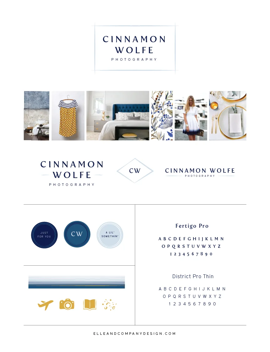
Before my 2-week design process begins, I have each of my design clients fill out a series of questionnaires about their brand, process, and website. One of my favorite, most telling questions seems so simple, but I refer to their thoughtful responses throughout the entire design process. What are 10 adjectives that best describe your brand?
Lori Hedrick described hers as real, close, caring, happy, familiar, easy, rich, and true. I'm excited to show you how those seemingly simple words have played out into Lori's beautiful new brand and website!
Along with the questionnaires, I ask each client to pull together photo inspiration in the form of a secret Pinterest board. It helps me see which colors and styles they're drawn to, and I often pick up on trends that my clients may not have been aware of (stripes, watercolor, script). I then take those photos and compile them into an inspiration board, along with some other photos I bring in, which acts as a starting point. I keep that inspiration board beside me as I design the logo concepts, collateral items, and website, and it's fundamental to my creative process.
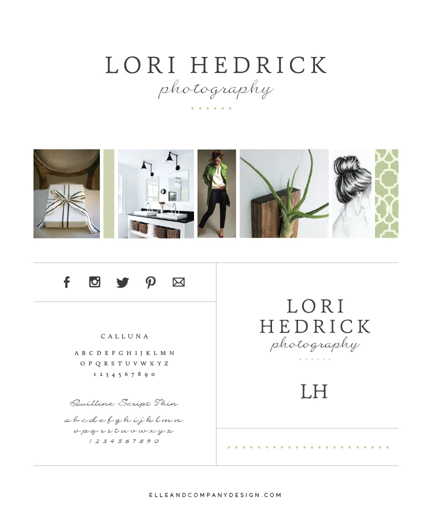
Lori's Pinterest board was chocked full of great inspiration. Sage greens, earthy wood-tones, charcoal lines - all which reflected the "rich," "familiar," and "true" adjectives she had mentioned in her homework. So I started there.
And it just may be one of my favorite boards to date.
To reflect the rich simplicity of this group of images, I knew that I needed a clean, sophisticated font (mimicking the clean lines) to contrast against a more organic, hand-drawn element (mimicking the plant, artwork, and movement in the board). So I went with a classic, slightly feminine serif font for "Lori Hedrick," and found a personable script for "photography."
I also like to bring in a personal element to each logo, even if my client and I are the only ones who are aware of its significance. That's where those 6 green dots come in; one for each of Lori's 6 children. The dots were also a fun, simple way to bring in a little pop of color and add some interest.
From there, I created a couple alternate logos to give Lori versatility (because a horizontal layout doesn't always fit best within a square profile picture).
Once we settled on the logo and visual direction of the brand, I got to work on the collateral items. For Lori, these included business cards, stationery, greeting/thank you cards, an email signature, and social media designs.
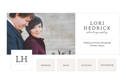
Lastly, I took all of these elements and created a custom Squarespace site for Lori's business. Her site plays off of the clean lines and classic fonts of her new brand. You can click here to see it live!
My hope is that this new brand and website for Lori Hedrick Photography captures those keywords she mentioned at the very start. I'm honored that Lori trusted me with the visual identity of her business and I'm thrilled with the final result!
What do you think of the new brand and website for Lori Hedrick Photography?

