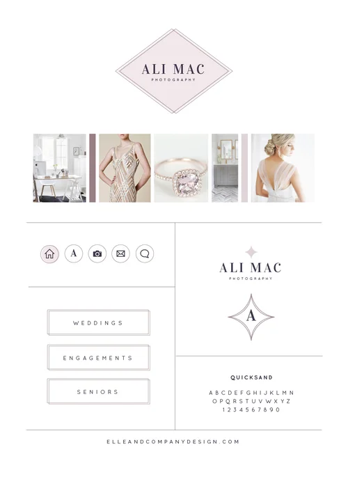
A brand is like a person; it has a distinct style and character that's all it's own. It has a unique tone of voice, it uses certain words more often than others, and it has its own unique way of "dressing itself" to make a great first impression.
My job is to help with that last part - "clothing" a business through its visual identity.
I've worked with a handful of photographers this year on their brand and website. But because each business has its own distinct character, it's been easier than you would expect to differentiate their visual appearance through colors, fonts, and design details.
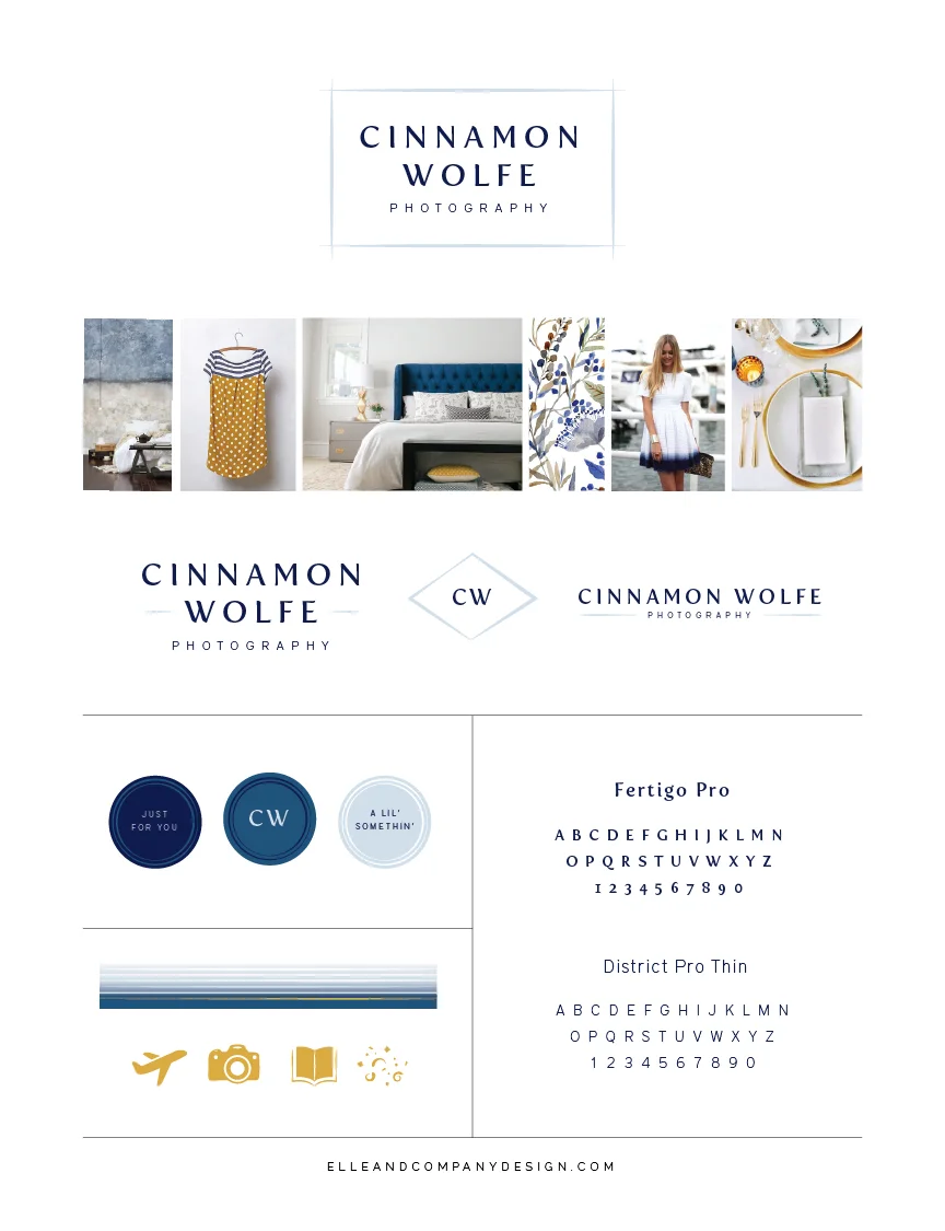
This new brand and website for Cinnamon Wolfe Photography is no exception, and I'm excited to take you behind the scenes today and show you how we reflected her business's distinct personality through her new visual identity.
Through an uncanny sequence of events, Cinnamon contacted me last January about the redesign of her brand and website. From our first conversation I was certain of two things: Cinnamon is well-prepared and very friendly. I knew those characteristics would need to be included in her new brand from the start, and I was excited when she booked a 2-week time slot in my design queue.
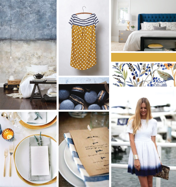
When I took a peek at her Pinterest board before the project began, I was excited to see shades of blue, a little bit of texture, and pops of saffron yellow. Because Cinnamon is a wedding and portrait photographer, I loved that I hadn't seen this color palette used very often in her industry; it would be a way to differentiate her brand from the start, and if used correctly, appeal to her ideal bride, too.
I used those photos from Cinnamon's board along with some I found to create a starting point through an inspiration board.
The board incorporated navy, soft blues, imperfect lines, ombre, and a little bit of pattern. It's classic, clean, fresh, and detailed, and the saffron yellow adds a touch of fun (all words that Cinnamon used to describe her brand at the outset of the project).
I kept all of those details in mind as I created concepts for the new logo, and after a couple revisions we landed on this one.
Simple, classic, and versatile. I used the imperfect lines as a way to add in a little bit of character while keeping the font professional and slightly feminine. And come to find out, Cinnamon draws boxes around everything. It was meant to be.
I took the type and simple lines and came up with a couple different variations for Cinnamon to use as alternative logos.
From there I designed Cinnamon's collateral items, which included business cards, greeting cards, packaging stickers, and blog post templates. This is where the brand really came to life, and we seemed to strike that balance Cinnamon was looking for between professional and fun.
I especially love the linear details and the ombre in the business cards, as well as the imperfect lines in the packaging stickers. We also captured tiny glimpses of Cinnamon's personality in the wording of the stickers, too. Like I said, she has a great eye for the details!
Last, but not least, we worked together on the website. Cinnamon wanted to differentiate her homepage from other photographers in her industry by making it longer and bringing in sections that highlighted the different pages on her site. We also brought in some of the fun icons that we used in the collateral items as well as those lines that are seen throughout her entire brand.
Although I share a lot about my side of this process, a lot more preparation and hard work goes into a new brand and website on the client end of every project. Cinnamon went above and beyond on her homework, was always very prompt in her responses, and was a joy to work with. So when you visit her site, be sure to leave her a comment and participate in the giveaway on her blog (she has some fantastic items up for grabs!).
Through simple lines, a classic font, a distinct color palette, and some fun icons, Cinnamon and I were able to give her business a visual identity that better suited the personality of her brand. I'm thrilled with the outcome!
What do you think of the new brand and website for Cinnamon Wolfe Photography?

