Squarespace is a great website option for business owners who want a lovely, professional website that’s mobile friendly and easy to update.
I chose Squarespace for the Elle & Company website and I highly recommend it to all of my design clients because of the beautiful templates, intuitive user experience, and compatibility.
But with all of those great benefits come limitations on customization.
Unlike Wordpress where the possibilities are endless, Squarespace isn’t as flexible; you have to work within the parameters of their templates and features.
This might be a problem for you if you’re seeking a website that has all of the bells and whistles, but it isn’t an issue for those of you who are seeking to create a simple, intuitive site.
With these 6 tips (and a little creativity), you can customize your Squarespace site to fit your brand and make it memorable.
1 | Fonts
The fonts you choose for your website can make a large impact on the way your website is perceived.
Through headers, body text, navigation, and even button fonts, you can make your website look consistent with your brand and create a more memorable experience.
Egg Shop is a great example of how your font choices can play a big role in the overall appearance of your website:
Notice how consistent they are with their font choices.
They used the same font throughout their headers and navigation and chose a simpler, complementary font for their body text to create hierarchy and help organize all the content for their viewers.
The end result is streamlined and professional.
Squarespace allows you to set font choices for headers, body text, and buttons in the Style Editor (from the main menu, click Design > Style Editor).
Their collection includes over 600 Google Fonts and 1000 Typekit fonts.
But if for some reason your brand fonts aren’t included, you can add them to your site with Typekit by following this helpful Squarespace tutorial.
Do you need help choosing and pairing brand fonts? I’ve got you covered in this Elle & Company blog post: Finding, Choosing, and Pairing Brand Fonts
2 | Colors
Color can also make an enormous impact on the overall appearance of your website.
Especially if you’re willing to go bold like Fast Company:
Or designer Derek Boateng:
Text, buttons, lines, backgrounds - you can utilize them all to add pops of your brand colors to your website and set it apart from other businesses in your industry.
There are a couple key ways to effectively use color when you’re branding your website:
1 | Keep it simple - Don’t go overboard trying to use every single primary and secondary color in your brand’s color palette. Notice how Fast Company was able to make a big impact by using yellow, black, and white. Less can be more, especially when you’re creating a website.
2 | Use neutral, dark colors for text - Don’t sacrifice legibility for the sake of adding a fun brand color to your website. Choose a dark, neutral color (black, dark gray, navy) to help viewers easily read your content.
3 | Add pops of color through buttons, headers, and borders - Use the brighter colors in your brand’s color palette sparingly to give them an even greater punch. Color is a great way to call attention to certain features on your site (like buttons, headers, and links), so be intentional and use pops of color to your advantage.
4 | Create consistency - Squarespace’s Style Editor makes this one pretty easy, because you can’t change up the header colors on each page. But whatever colors you choose, make sure they’re consistent across every page of your website.
You can make changes to the colors of your Squarespace site directly in the Style Editor.
Just click on the page you want to edit, open the Style Editor (from the main menu, click Design > Style Editor), click on the feature you want to edit, and the options for customizing it will pop up in the lefthand menu.
Struggling to choose brand colors? Take a look at this Elle & Company blog post: How to Create a Distinct Color Palette for Your Brand
3 | Layout
Most Squarespace templates have several sleek, professional page layouts for you to choose from when you’re setting up your website.
But you aren’t confined to those layouts!
Squarespace’s drag and drop features allow you to think outside your template and get creative.
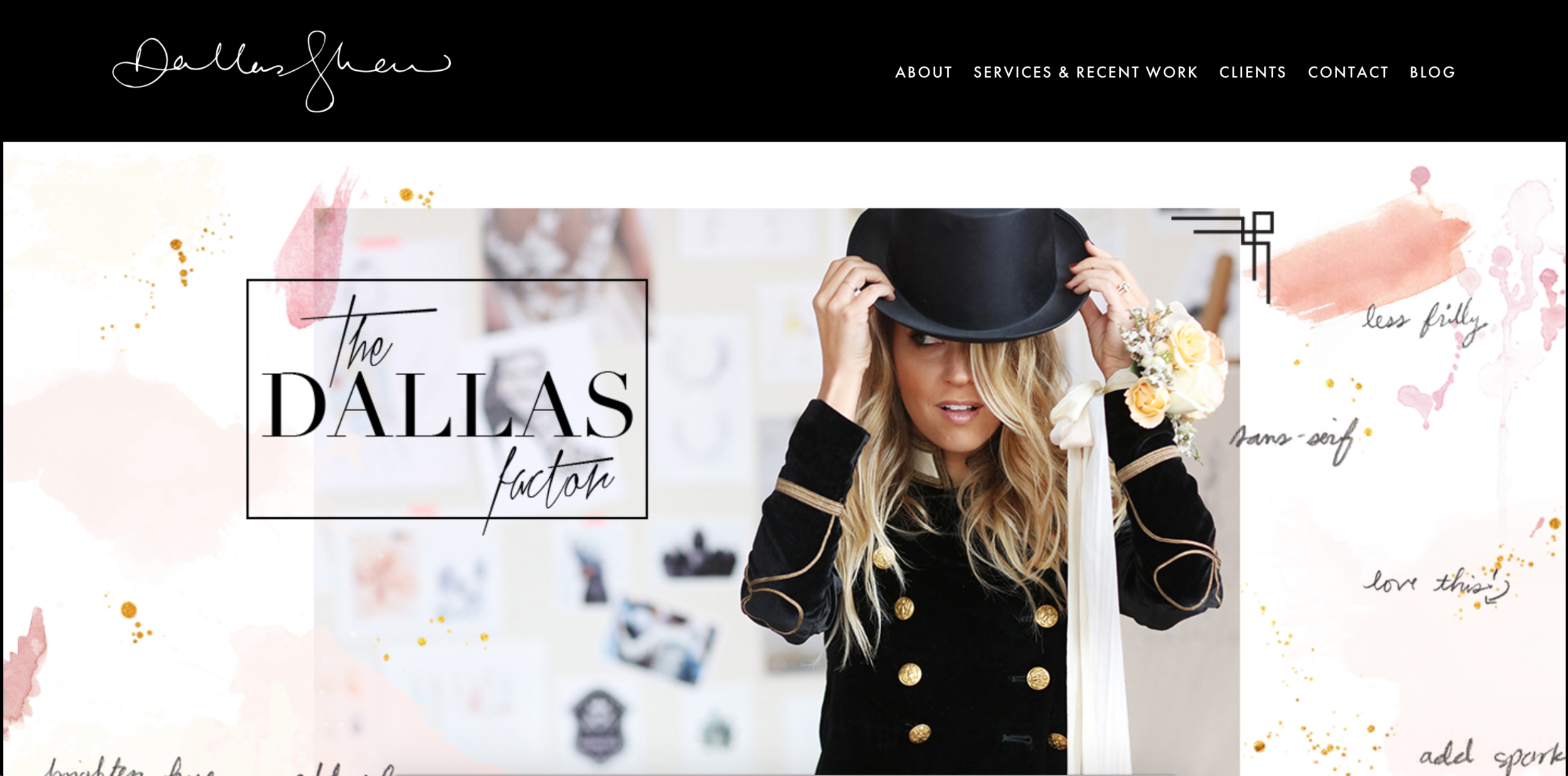
Dallas Shaw’s website is a beautiful example of how something as simple as the layout of your homepage can reinforce your brand and set your website apart:
So before you ever set up a page in Squarespace, think about all the content that needs to be on it and sketch out a concept for the layout that fits the style of your brand.
For example, if your brand is minimal, you’ll want to create a simple layout with plenty of negative space.
Or if your brand is bold and wild, you might want to include full-width images and large headers.
Once you’ve accounted for all of the content and graphics you want to include on the page in your sketch, use Squarespace’s blocks to bring your vision to life.
Most of your ideas can be set up with image, text, and button blocks, but the summary block can be a huge help for featuring and organizing blog posts, shop inventory, and events.
A few disclaimers, though:
- Some page layout options depend on the template you’re using (like sidebars, full-width image headers, and indexes). So be sure to do your research before choosing a template to know which features are available to you.
- Some page layout options aren’t going to be set up in Squarespace without a little bit of code (like Dallas’s). You might have to either find a workaround or recruit the help of a web developer to bring your vision to life.
4 | Logos + favicons
This may seem like a given, but don’t overlook the impact the size and placement of your logo can have on the overall appearance of your website.
Squarespace teamed up with Jeff Bridges a year or two ago to promote his new album, and I love the way they highlighted the logo:
Instead of placing it in a conventional location at the top middle or left hand side of the window, they blew it up and placed it front and center.
How can you highlight your logo on your website?
Maybe you don’t need to blow it up to take up the whole screen when someone lands on your site. Perhaps a smaller version in the top left corner would work best.
But wherever you choose to place it and feature it, make an intentional decision about why you placed it there.
Also be sure to add a favicon (that little icon that appears on a browser window) by selecting Design > Logo + Title and uploading a transparent, square PNG file under the Browser Icon section.
Little details like that can add to the overall professionalism of your site!
5 | Photos
Photos are one of the best ways to create consistency and brand recognition with your website.
And thankfully, Squarespace has some great options for showcasing your photos through full-width headers, image blocks, and galleries.
So if you’re trying to showcase your work, your products, or your content, consider how you can highlight your photos across the pages of your website.
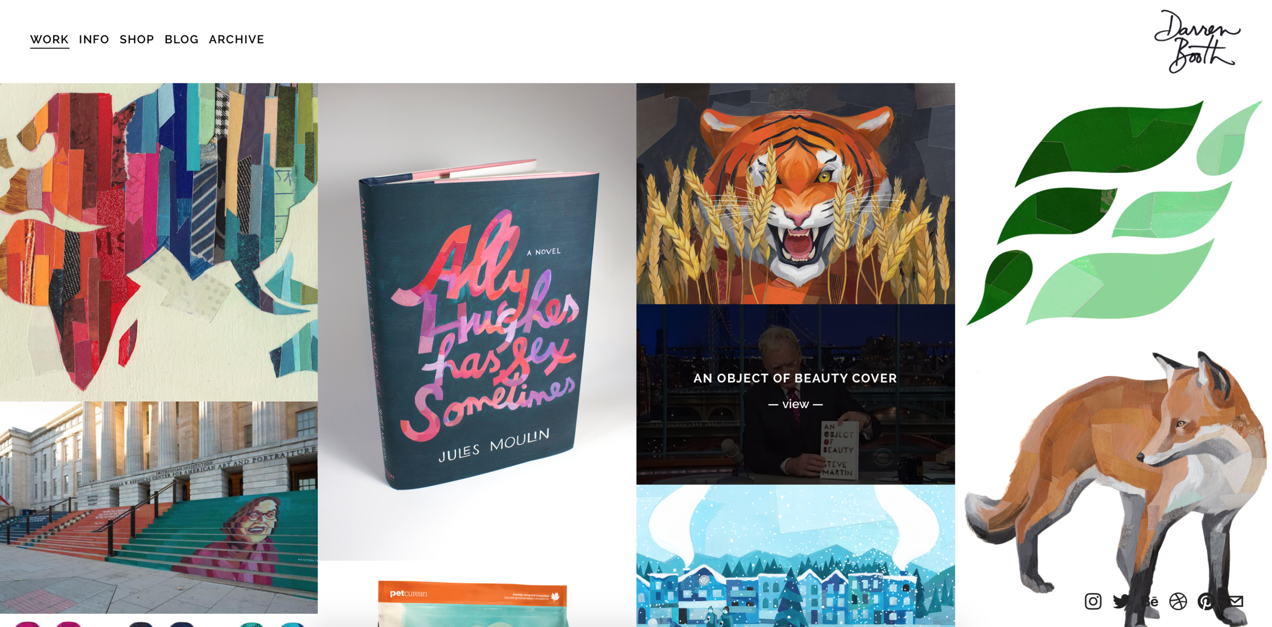
Darren Booth’s homepage is eye catching because of his colorful portfolio images...
...Tian Studios uses large, bright images with a lot of movement to highlight their products...
...and Lumio gets extra credit for using video to make their landing page more interesting and interactive (visit their site to get the full effect!).
You can spend all kinds of time and resources creating a beautiful logo, color palette, and graphics, but if you don’t have cohesive photography, your website will come up short.
Do you need help coming up with consistent imagery for your website? Watch this Ellechat replay to learn 3 simple steps for taking better brand photos.
6 | Graphics
This is where your site really starts to come into its own and stand apart (especially if you don’t have many photos to add to your website just yet).
Graphics like icons, buttons, patterns, and illustrations are a great way to infuse your brand into your website and help it stand apart from other businesses in your industry.
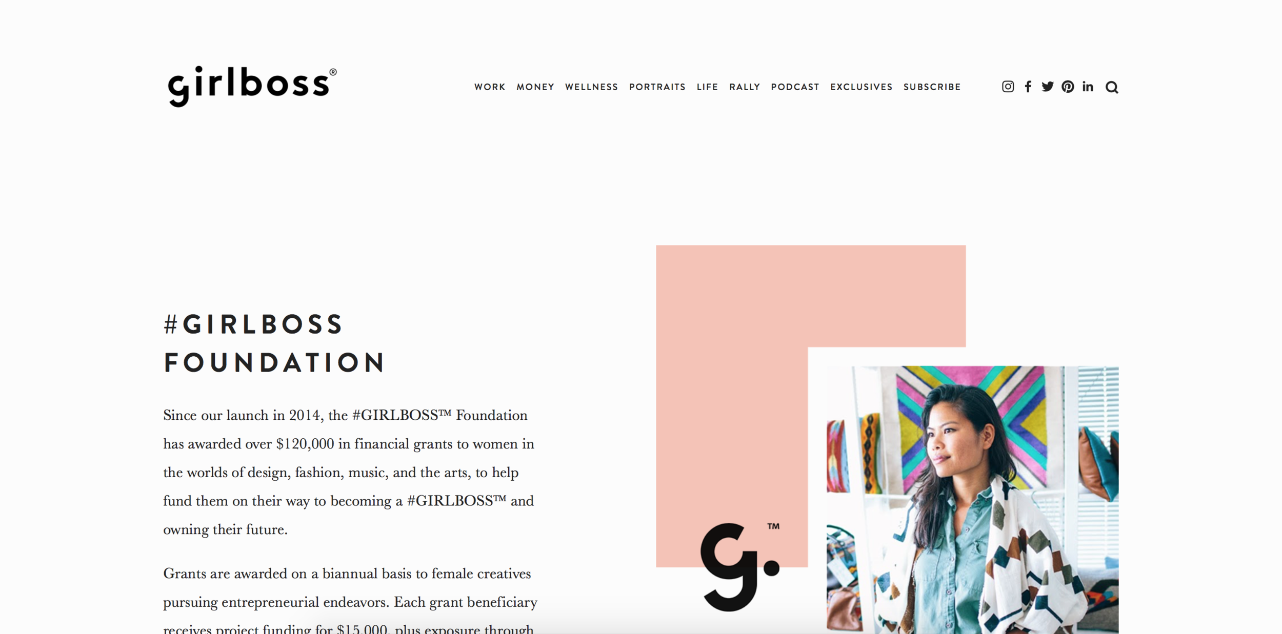
Girlboss’s foundation page is a great example of how graphics can bump your website up to the next level:
Not only do they add a pop of color and their logo to a simple photo…
But they also include illustrations and colorful buttons to call attention to information and link to other important pages.
Do you see how much more fun and interesting this makes a simple page?
The same could be true for your site. Consider how you might be able to add some color and interest to the pages of your website through icons, infographics, or illustrations.
Interested in creating one-of-a-kind graphics for your business but don’t know where to start? The 5th round of my Adobe Illustrator Basics course is coming up in one month!
Sign up for the waiting list below with your name and email address to learn more details and be the first to register.
Join the Adobe Illustrator Basics course waiting list
One of my favorite benefits of using Squarespace is that you don’t have to go to great lengths to customize it and make it your own.
By following the 6 steps above, you can set your site apart and make it consistent with the rest of your brand.
How have you customized your Squarespace website? Let me know and share a link in the comments!

