Most people don’t struggle to come up with their brand keywords or identify their ideal client. Or at least that isn’t their greatest branding struggle.
The biggest challenge in creating a brand comes at this stage of the process, when you’ve written your mission statement, identified your ideal client/customer, made a list of brand keywords... and now all that’s left to do is to take all of that information and create some visuals that reflect it.
No big deal, right?
Psh. That’s an overwhelmingly big deal. And if you’ve never branded a business before, you’re probably at a loss for where to start.
That’s where Week 2 of this month’s Brand Challenge comes in.
If this is the first you’ve heard about Elle & Company’s February Brand Challenge, hop on over to my Week 1 blog post to learn more.
Elle & Company Brand Challenge, Week 2
Oh, how awesome it would be if I had the time and resources to work with each and every one of you on the creation of your brand.
I could simply take all the work you’ve done in Week 1 and hit the ground running to create all the visuals of your brand for you.
But that’s not very realistic. So this Brand Challenge is a close second to me taking all of you on as clients.
I might not be able to do all of the work for you, but I can certainly walk you through all the steps I take to create one-of-a-kind brands, including the steps you need to take to come up with visuals that are creative and unlike all the other brands out there.
So don’t be overwhelmed. I’m going to show you exactly how to put a “face” on your brand.
All you have to do is follow the 5 action steps below, just like you did last week.
These steps build upon the foundation you laid in Week 1 of the Brand Challenge, so if you haven’t read that post yet or filled out the workbook, take some time to go back and get that done before moving forward.
And just like before, I have another free workbook to help you work through these steps:
Download the free Brand Challenge workbook!

Subscribe with your name and email address to access to the in-depth workbook for Week 2 of this month's Brand Challenge.
6 | Develop your tone and terminology
I know, I know. I promised to help you come up with a visual direction for your brand this week.
But before we get into inspiration boards and logo designs, remember that your brand isn’t simply a logo and a color palette; it’s an experience.
There are two key components to a brand: tangibles and intangibles.
We often think about the tangible components, like logos, color palettes, and fonts.
But intangible components, like the words you use in your social media captions and the names of your products, can have a big impact on how your brand is perceived.
Consider the tone of the Nike brand.
Their tagline is Just Do It, and they carry that straight-to-the-point, do-work attitude throughout their marketing materials, the names of their products, and their social media accounts.
Contrast their driven tone with the tone of the Anthropologie brand.
Upon landing on their website, you’ll find headers that read “a laid back lightness and plenty of sunshine,” “soft texture and neutral hues,” and “set a striking table for friends and family.”
Even apart from the visuals on the site, you get a sense of Anthro’s casual, feminine, slightly artsy vibe through the tone and terminology they use throughout their brand.
Right down to that #wanderlust hashtag:
You can create beautiful visuals for your brand all day long, but if the tone of your social media captions and website copy doesn’t match, your brand won’t feel consistent and cohesive.
So take some time to describe the tone of your brand.
Refer back to those 10 adjectives you listed during Week 1 and consider what type of tone would appeal to your audience.
Decide if your tone should be short and witty, casual and inviting, or slightly sarcastic. Details like this can go a long way in differentiating your brand and business from those around you.
I left space for you to describe your brand’s tone and make a list of more keywords and terms that you can consistently use for social media, blog post copy, etc. on page 2 of this week’s workbook.
You might also find it helpful to recruit the help of a creative friend who’s good with words to help you flesh this out more, and you’ll probably continue to add to this list over time.
Don’t overlook the large impact non-visuals can have on creating a professional, memorable brand.
7 | Utilize a Pinterest board for inspiration
Now that you’ve considered some non-visual aspects of your brand, it’s time to take all of the work you’ve done up to this point and create some visuals.
But here’s the thing: It can be difficult to create visuals for a brand solely off keywords and a mission statement.
What does “vibrant, authentic, refreshing, and bold” actually look like?
Well, it can look like a lot of things. And that’s why it’s helpful to have a visual starting point.
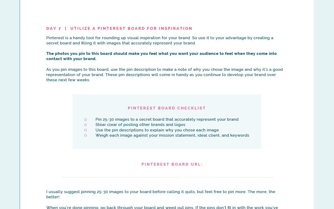
Pinterest is a handy tool for rounding up visual inspiration for your brand. (And if you have a creative business, you should be very familiar with the social media platform.)
So use it to your advantage by creating a secret board and filling it with images that accurately represent your brand.
The photos you pin to this board should make you feel what you want your audience to feel when they come in contact with your brand.
As you pin images to this board, use the pin description to make a note of why you chose the image and why it’s a good representation of your brand. These pin descriptions will come in handy as you continue to develop your brand over these next few weeks.
You can find images for this new Pinterest board by exploring your pre-existing boards, typing in some of your brand keywords into Pinterest’s search bar to see which images pop up, or by looking at the boards of pinners whose style mesh well with the style you’re trying to achieve with your brand.
A few tips as you pin to your new board:
- The related pins section underneath each Pinterest image is helpful for finding images of the same subject matter, color, or style. This is often the first place I go when I'm in need of other images for the board.
- I try to use a variety of image compositions and subjects to give myself a range of inspiration as I'm working on a project.
- I never pin a photo just for its color; it's important that the subject matter and style of each photo matches the direction of the brand.
- I always advise my clients to steer clear of pinning other brands and logos. It’s too easy to get hung up on pre-existing designs, which defeats the purpose of branding, You want to come up with a brand that’s different and distinct; not a brand that blends in with or rips off other brand designs out there.
After you’ve pinned 25-30 images, weigh them against your mission statement, ideal customer, adjectives, tone, etc.
If the pins don’t fit in with the work you’ve already done up to this point, remove them from the board. This will come in handy for the next action step, which is to…
8 | Create an inspiration board
Now that you’ve rounded up some visual inspiration, it’s time to clean it up a bit and compile your images onto an inspiration board.
An inspiration board is simply a graphic compiled of photos, colors, and patterns that provides visual direction for a design project (in this case, your brand).
You’ll come back to this board in the coming weeks for visual reference.
You’ll be able to weigh all of the visual components of your brand (like your logo, color palette, patterns, fonts, icons, etc.) against this board to ensure your entire brand stays consistent.
You can take an old-fashioned approach and cut out images from magazines, collect fabric/pattern samples, and pin them up on a bulletin board like this beautiful board from MaeMae & Co:
Or you can use a tool like Adobe Illustrator to pull the images from your Pinterest boards and arrange them into a digital board like this one I created for my client, Sincerely Amy Designs:
If you aren’t familiar with Adobe Illustrator, I have great news for you: Registration for the fifth round of my Adobe Illustrator Basics course opens on March 7th!
I’ll be walking students through how to use this helpful design software step-by-step, which will not only come in handy for creating inspiration boards, but for creating your logo, custom patterns, icons, and the remainder of your brand!
Adobe Illustrator Basics is only offered once a year, so join the waiting list to learn more details and have first access to the course:
I will also be adding some new inspiration board templates to the Elle & Company Library later this week:
Simply login to the Library, download the templates, open them in Adobe Illustrator, add your images, and you’re good to go!
However you go about it, keep this inspiration board in a convenient place, because you’re going to be referring back to it in the very near future.
I even left space for you to print it out and paste it in your workbook for easy reference on page 4:
And if you find yourself struggling to create a cohesive, well-designed inspiration board, be sure to register for this week’s Ellechat! I’ll be walking you through exactly how to create an inspiration board from start to finish:
Can’t tune in live? No worries! Register here and return to the same URL anytime after the webinar is over to catch the replay.
When you’re done creating your inspiration board, share it with the Elle & Company community in our new Facebook group and post it on social media with the hashtag #elleandcobrandchallenge.
Not only would I love to see what you come up with, but I know others participating in the challenge would enjoy seeing your board and providing feedback.
9 | Refine your logo
While a logo isn’t a brand, it is one of the most memorable and recognizable components of a brand.
If you don’t have a logo quite yet, this Elle & Company blog post will walk you through the process I use to create custom logos from start to finish (don’t worry about the variation part just yet - we’ll get to that in a moment!).
I’ve left plenty of space for you to sketch out your logo concepts on page 5 of your workbook, as well as space to place your final logo on page 6:
If you already have a logo, weigh it against these 5 characteristics of iconic logos to see if a revision might be necessary.
I’ve added them to your workbook, too. If your logo is in need of some edits, feel free to use that sketch space in your workbook and place your edited logo in the designated space on page 6.
Don’t worry about color quite yet; it can be too big of a distraction from the more important features of your logo.
Instead, develop your logo concept in black and white to focus on the form and composition of the logo. We’ll worry about color next week.
If you’re struggling with your logo, I have another free Ellechat webinar coming up that will come in handy for you:
I’ll be walking through all of the steps above in more detail and share a lot of examples with you. You can register for the Ellechat here and return to the link anytime after February 16th to catch the replay.
When you’ve landed on a solid concept, make it digital by using a tool like Adobe Illustrator and keep it on hand. You’ll be coming back to it and adding color next week.
10 | Design logo variations
Whenever I’m creating a logo, I’m constantly thinking about how each element (like fonts, colors, and illustrations) can be pulled apart and used elsewhere in the brand to create consistency.
Especially for logo variations.
Chances are, the logo you just created in step 4 either fits well in a horizontal format or a perfect circle; but not both.
By creating logo variations (also called alternative logos), you’re able to create more versatility for your brand and account for different formats where your logo will be used (like website headers, profile photos, and favicons).
For example, this primary logo for Bulloss Photography works really well in a horizontal format…
...but it doesn’t work quite as well inside a perfect square or circle. So I created an alternative logo that can be used for square and circle formats:
The font and colors are consistent, but the format makes the Bulloss Photography brand a little more versatile.
The same goes for Amanda Jameson’s logo. Her primary logo works great vertically…
...but it doesn’t work quite as well horizontally. So we rearranged the elements of her logo to create a secondary option and provide more versatility:
Have you created logo variations for your brand?
If not, get creative! Use monograms, icons, crests - just stay consistent and make sure that whatever alternative logos you create will be easily recognizable by your audience.
I’ve left space for you on pages 6 and 7 of your workbook to sketch out ideas and place your final logo variations:
Remember to get feedback on these!
It’s easy to second-guess yourself and work in circles during steps 4 and 5 of this week’s Brand Challenge, so share your logo concepts with the Elle & Company Community to get helpful feedback on which option you should choose for your logo or how your logo can be revised and simplified.
Download the free Brand Challenge workbook!

Subscribe with your name and email address to access to the in-depth workbook for Week 2 of this month's Brand Challenge.
Whew! There’s a lot to do this week, but this is where you’ll begin to see tangible progress on the key items of your brand.
I’m excited to see what you come up with!
Which of these 5 steps are you most excited to work on? After you work through them, share your progress with me in the comments below!


