It isn't every day that I'm asked to create a brand and website for an author and speaker, so when Melissa Kruger asked me to design her blog months ago, I jumped at the opportunity! While Melissa had been writing for The Gospel Coalition and Christianity.com for years, she was seeking to have a 'home base' for her blog posts, books, and speaking engagements. She named this new venture Wit's End.
"Slowly I'm learning that being at my wit's end isn't really the end of a thing, but the beginning. The end of thinking I can rescue myself is the beginning of crying out to the Lord for deliverance. The most secure place might just be at the end of my rope, clinging to Jesus, watching Him calm what I cannot control."
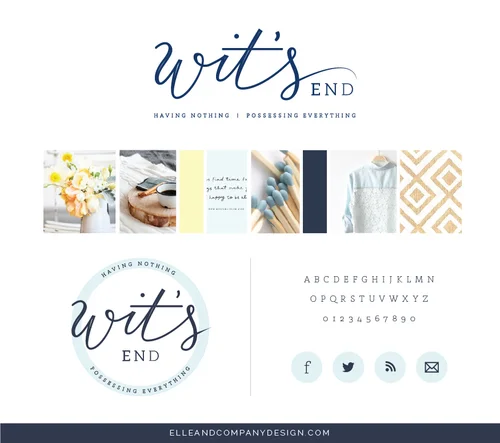
During our initial consultation, Melissa told me that she was a big fan of navy blue, soft yellows, and neutral colors. She also wanted to stick to a very simple aesthetic. Both are perfect for Melissa's niche - 20-50 year-old women. After our initial consultation, I created an inspiration board to make sure that both Melissa and I were visually on the same page before the first logo concepts were drafted. The final result is one of my favorite inspiration boards to date!
From there, I began coming up drafts for the logo. While I was brainstorming and sketching, I couldn't shake Melissa's words about being at the end of her rope. I began to think about "unraveling" and how that could be incorporated into the Wit's End logo.
Melissa and I agreed that the first 2 concepts were strongest, but it was difficult choosing between them; so we compromised. I brought the fading aspect of concept 1 into the handwritten character of concept 2, and then I added the tagline. Voila! Brand new logo.
When the logo was finalized, I also designed a secondary logo to give Melissa more versatility.
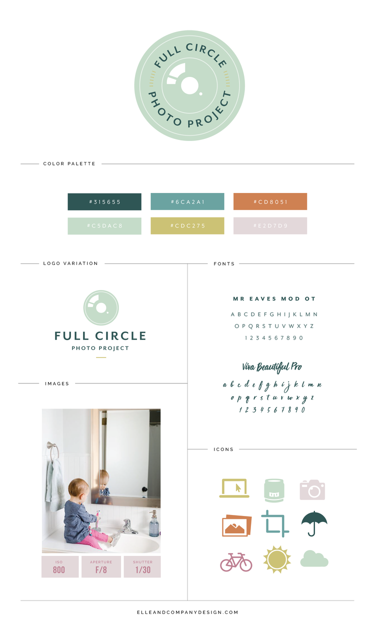
After the logos were complete, we added in branding elements - like typefaces and colors -and brought it all into Melissa's site. We kept the pages and the navigation very simple and straightforward, and I love the way it turned out:
(While the website looks pretty in a screenshot, it's not the same as taking a look for yourself. Visit her blog to see more of the design details!)
This design was not only fun to work on, but Melissa was great to work with. Melissa, thank you for trusting me with the design of your new blog. Best wishes with Wit's End - I'm looking forward to following along!

