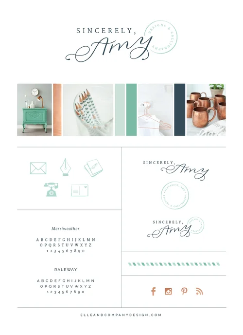
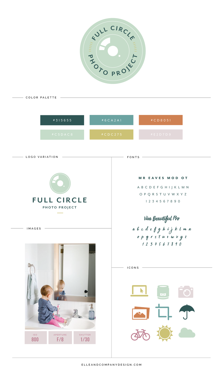
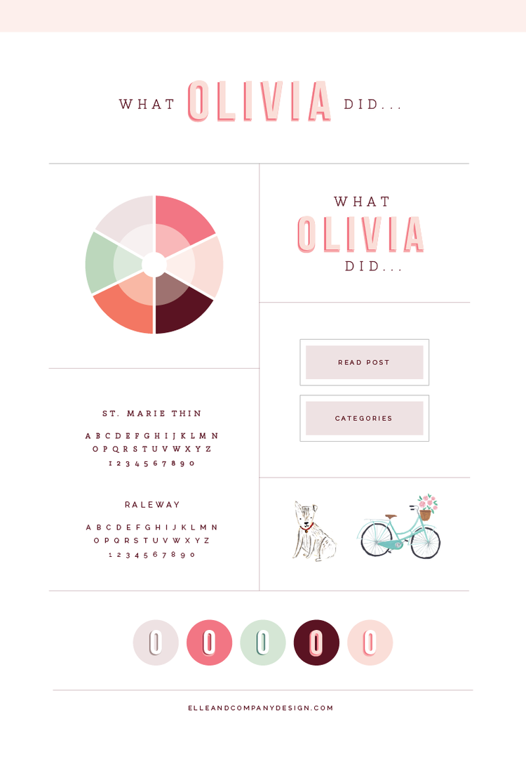
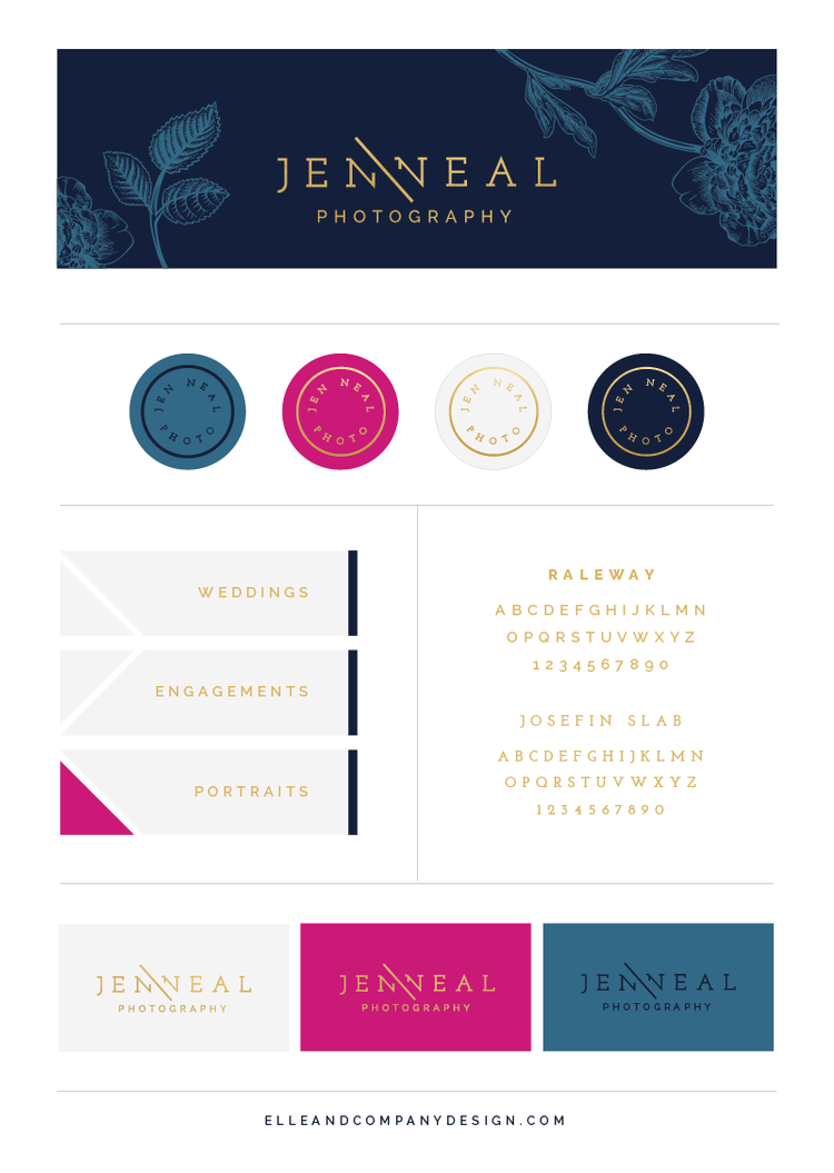
One of the biggest compliments you can receive as a designer isn't from a client; it's from their friends and family. So when my recent client and talented calligrapher, Amy Webber, told me that those who know her best looked at her new brand and thought it fit her to a T, I was honored. Not only am I thrilled to reveal this new brand and website design with you today, but I'm excited to walk you through how we arrived at a finished product that both suits the amazingly talented lady behind Sincerely Amy Designs and appeals to her ideal clients.
During our first client meeting, Amy and I discussed her hopes for both her business and the direction of her new brand. While calligraphy is a luxury item, Amy wanted her brand to be sincere, detail oriented, comfortable, and charitable. She told me of her love of all things snail mail related - postal stripes, stamps, envelopes, ribbon - and I thought that it would be a relatable, appropriate direction to take the brand, especially with Amy being a calligrapher. She also told me about her love of copper, which I knew would add just a touch of class and sophistication. With other metallics like gold as a current trend, I knew copper would also set Amy's brand apart.
On Day One of the design project, I pulled together images and colors into an inspiration board, which acted as a starting point and a reference throughout the remainder of the project. To keep with that comfortable, professional feel, I pulled in a dark neutral (navy), two mid-tones (green and gray), and a light accent color (mint). I also incorporated classic, simple images that had a lot of white space, a little texture, and pops of copper. The result is one of my favorite inspiration boards to date!
I spent Day Two and Day Three coming up with three different logo concepts. Because I was designing the composition before we incorporated Amy's actual calligraphy, this was a little trickier than normal. And with so many calligraphy logos out there at the moment, I strived to come up with a logo that was distinctly different and one-of-a-kind. I also wanted to incorporate the snail mail theme without being too literal and cheesy. The final logo not only accomplishes both of those goals, but it also plays off the name of Amy's business and how you would sign a letter. The postal stamp reference is one of my favorite additions!
On Day 4, I used the elements of the primary logo to design a couple alternative logos to give Amy versatility. I also began to pull in other brand elements like illustrative buttons, a postal stripe, and some copper social media icons.
Day Five and Day 6 were spent incorporating all of these new brand elements into collateral items. Business cards, letterhead, postcards, a PDF guide for addressing envelopes, an infographic for Amy's process page, notecards, an email signature, and greeting cards were all custom designed to match the new Sincerely Amy brand.
And then it got even more fun on Day Seven, Eight, Nine, and Ten as I built out the Sincerely Amy website and incorporated the gorgeous photos and headshots that Andrea Pesce Photography styled around Amy's new brand. As always, Andrea went above and beyond and nailed the new Sincerely Amy visual identity to a T! Here's a sneak peek of the homepage:
Screenshots don't quite do the website justice - this is one that you need to see for yourself! Amy is also doing a giveaway on her blog to celebrate her new brand and website launch today, so be sure to enter while you're there. Visit the new Sincerely Amy website!
I'm honored that Amy trusted me with her brand and website, and I'm excited to add this project to my portfolio. It was a joy to partner with her, join in the excitement of her growing business, and provide her with a new visual identity that suits her well.
"I could fill up pages and pages about my experience with Lauren! Branding is not a small investment and it's an understatement to say I was nervous to take the leap. After day two, I was convinced it was the best money I had ever spent on my business. As people have seen sneak peeks of the new brand, I've been hearing over and over, "This is SO you!" I was amazed by how Lauren seemed to know me and Sincerely Amy Designs better than I did. My business felt like a jumbled mess when I first booked her. Lauren was able to take my that mess and turn it into something so beautiful that I still can't believe is mine. I am beyond thrilled to finally have a home base that reflects me and my brand so well and that I can be proud to show potential clients." - Amy Webber, Sincerely Amy Designs
What do you think of the new Sincerely Amy brand and website?

