Around the first of the year I received a design inquiry from the blogger behind Real Food Whole Life, Robyn Downs. After our initial consultation, it was clear that Robyn and I would work well together. Not only is she extremely organized and intentional, but Robyn has a great amount of drive behind what she shares on her blog; her passion for nutrition and leading a healthy lifestyle is contagious (so much so that I've been following along with her helpful meal plans). Our 2-weeks together resulted in a new brand and website that reflects her passion for healthy living and attention to detail, and I'm excited to share the process and final design in today's post!
I begin each design project by gathering inspiration from my client's Pinterest board. I also pull in other images that fit the aesthetic I'm striving for and in this case, I also included a couple of Robyn's headshot photos.
Although professional images aren't a requirement for my clients, it's always an added bonus to have branded images that fit the new aesthetic. Robyn worked with a photographer before our 2 week design process began, and we discussed a color palette ahead of time to ensure that the photos would blend well with the new design of her brand and website. I was thrilled be able to use those photos in the inspiration board.
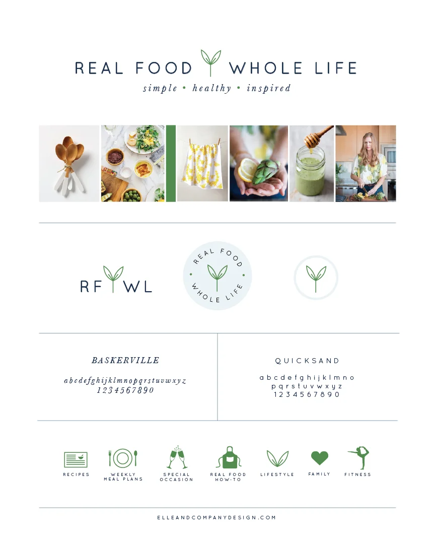
The direction we chose is fresh, bright, simple, clean, healthy, and relatable - all words that Robyn had emphasized in her client homework. The yellow is a cheerful, motivating color, the green adds freshness and alludes to health and growth, and the soft touches of blue add an authentic, clean feel to the board. The subtle wood tones add warmth, and the patterns in Robyn's top and the dishtowel add an illustrative, personal touch to the board.
I took all of those colors, patterns, and textures into account as I designed Robyn's new logo.
I chose a simple, clean typeface for the logo and pulled in some contrast with an italicized sans-serif font for the tagline. The green sprout adds a fun pop of green and alludes to health and nutrition, and there's also a little hint of green in the circles dividing "simple," "healthy," and "inspired.
The horizontal layout takes up more real estate within her blog header, which is the primary location of the Real Food Whole Life logo, but it's a little more difficult to use for profile pictures on social media and other collateral items. That's where these alternate logos come in.
Days 5 and 6 of the 2-week process were spent using all of these new colors, fonts, and illustrative elements in Robyn's collateral items. Among these items were category icons...
...an email signature...
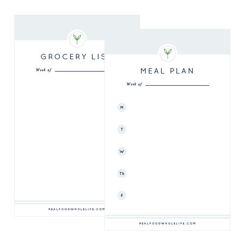
...and printables for those who follow along with Robyn's weekly meal plans!
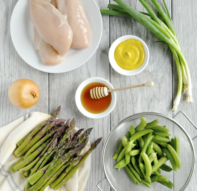
Robyn also spent time developing a photography style for her new brand, and while I can't take any credit for this portion, these images are worth highlighting. They fit in so perfectly with the new Real Food Whole Life brand!
The last 4 days of the project timeline were spent designing the RFWL website in Squarespace.
These sneak peeks don't quite do the website justice. Head on over to the new Real Food Whole Life blog and see it for yourself!
It takes a large amount of trust and an even greater amount of work behind-the-scenes on the client-end of each design project, and Robyn went above and beyond to ensure that no detail was overlooked. It was a joy to get to know her, learn about her goals for Real Food Whole Life, and build a new brand and website around it all. I couldn't be happier with the final product!
"Working with Lauren and her team is one of the best business decisions I have ever made. Lauren has an amazing sense of design and keen eye for detail. Everything she produces is not only gorgeous, but also of the highest quality. On top of all of that she stays on deadline and accomplishes an incredible amount in a very short period of time. And even though I am in love with my new brand and website, what impresses me the most about working with Lauren is how she listened to me and my vision for my business.
During the entire process she was right there next to me, strategizing and planning, taking the time to understand who I am and what I want. Then she helped me to dream big and executed the vision into a brand and a website. I just don't know of many other designers out there that can do all these things so well. She is one in a million and I can't recommend her enough."
- Robyn Downs, Real Food Whole Life
As of this week, my design services are officially booked through the remainder of 2015! If you're interested in working together, stay tuned - I'll be sharing my new 2016 services in the upcoming weeks. Until then, be sure to visit the Portfolio page for a look at my most recent design projects.
What do you think of the new brand and website for Real Food Whole Life?

