

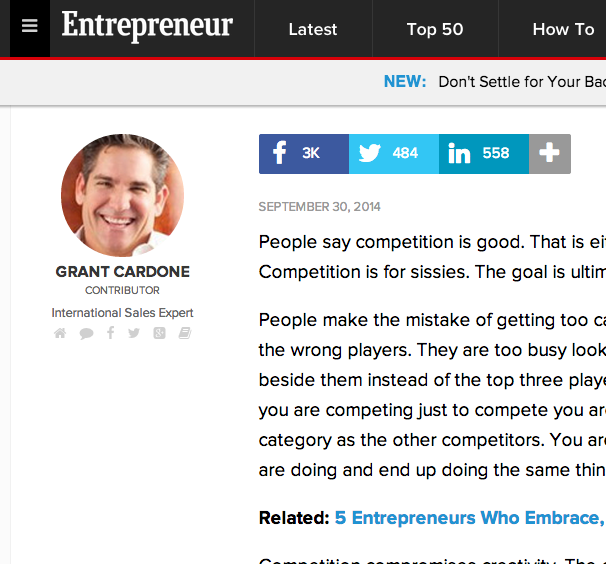
My husband reads Entrepreneur.com like most people check Instagram. He often comes across helpful reads and sends them my way, and the majority of them have given me great tips and insight on running my business. One article in particular has changed the way I approach a common obstacle in the day-to-day operations of business and blogging: handling competition.
Top 10 Design Mistakes to Avoid
You've probably heard the popular quote "creativity is allowing yourself to make mistakes." Or perhaps you've heard "mistakes are proof that you are trying" or "every mistake can create a beautiful solution." While there is an element of truth in each of those sayings, it's wise to be well-informed and intentional about design if you're a blogger or a business owner. Visual mistakes have the potential to make you appear unprofessional and untrustworthy to your audience.
Today I rounded up my top 10 design mistakes that everyone should be aware of. While some of these rules have been broken and the result wasn't terrible, it's best to be educated on why these mistakes are bad and make them on purpose instead of by accident.

My Branding Field Guide

Create a streamlined visual brand with my free Branding Field Guide!
1 | Comic Sans
This is the number one no-no among graphic designers. Comic Sans is never ever ever a good idea. Why? Read this entertaining article.
2 | Too many typefaces
Using too many typefaces in a logo, website, etc. can make a design appear busy, non-cohesive, and unprofessional. Play it safe and stick to the KISS principle on this one; settle on 2-3.
3 | Lack of hierarchy
Hierarchy determines which items you see first in an image. Designers pay attention to hierarchy and use it to their advantage by varying the size of their fonts (titles and headers should always be more prominent than body text), using color wisely (pops of color draw attention to text and images that should stand out), and paying attention to shapes (which give a design movement and lead your eyes around the design). The use of several different fonts, colors, and shapes have the potential to mess with hierarchy, resulting in an image that is visually displeasing and complicated.
4 | No Contrast
Contrast also helps with hierarchy. A lack of contrast can alter legibility and make an image appear washed out and undefined. A mix of both light and dark colors creates balance.
5 | Dizzy color pairings
When objects with similar color values are placed near one another, it can sometimes have a dizzying, vibrating effect. Use contrast and be cautious of color pairings, especially when you are layering colors on top of each other.
6 | Lack of negative space
The negative space around an object is often just as important as the object itself; it provides a cushion and a place for your eye to rest. Avoid cramming objects and text into a design and be aware of the entire composition, not just the main components. Check out these 25 clever and creative uses of negative space!
7 | Centered paragraph text
Large amounts of text should never be center aligned. It alters legibility, making text harder and more frustrating to read.
8 | Failing to align objects/no grid system
Haphazardly placing objects on a page without rhyme or reason is never a good idea; it has the potential to make a design seem random and unintentional. Use a grid system and align objects to create order.
9 | Using display fonts as text fonts
Again, this is a legibility issue. Script, hand-drawn type, and other display fonts should be used for headers and small amounts of text. It's always a good idea to use a simple font for large groups of text.
10 | Upside down text
It's simply hard to read. Don't do it.
My Branding Field Guide
Create a streamlined visual brand with my free Branding Field Guide!
It's your turn! What are some of your biggest design pet peeves?


Today's Top 3 - Helpful Blog Posts for Blogging, Design, and Business
I'm starting this new week with another roundup of my favorite things in Today's Top 3! Today I'm sharing some of my favorite articles about 3 of my favorite things: blogging, design, and business.


Top 3 helpful posts for blogging
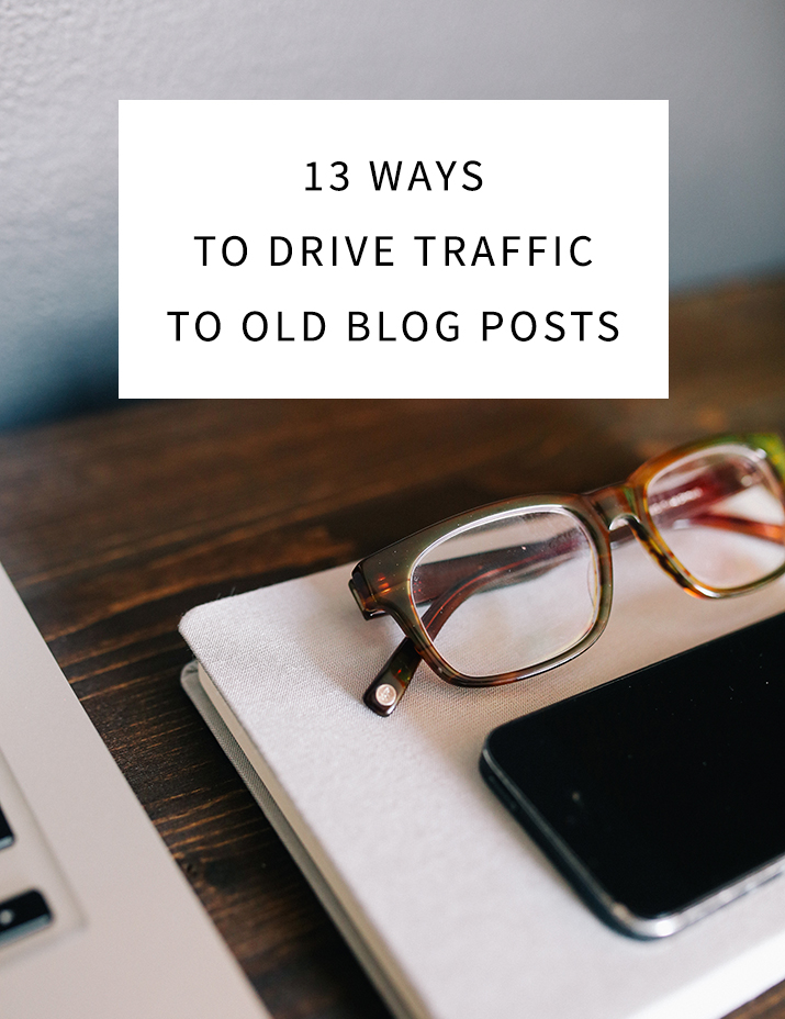
- 13 Ways to Drive Traffic to Old Blog Posts - Oh, the archives. Mine contain over 200 posts from this past year, which means that all of the posts I spent hours writing are now laying dormant, buried behind new content. Are you in the same boat? This post by Nectar Collective is full of great ideas for driving readers to your older posts.
- 10 Things I Have Learned Along the Way - The ladies from iHeartOrganizing share what they've learned about blogging and mistakes they've made along the way, including overcommitting, comparison, checking stats, moderating comments, and more. This is definitely worth reading if you're a blogger or you're hoping to become one in the future!
- Five Things to Watch in Your Blog Analytics - Keeping up with the analytics of your blog is useful for finding out which posts your readers enjoy, how many people keep coming back to your site, how long they stick around, and more. This post from Blog Clarity simply explains the 5 things you should be looking for when you check your analytics.
Top 3 helpful posts for design
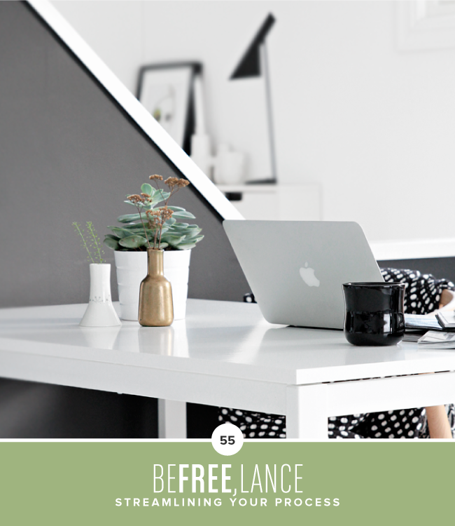
- Streamlining Your Process - I love this post on creating shortcuts by one of my favorite designers, Breanna Rose. While I've been sharing about how to define your creative process these past couple weeks, this article provides some great tips on where you can scale back and save time.
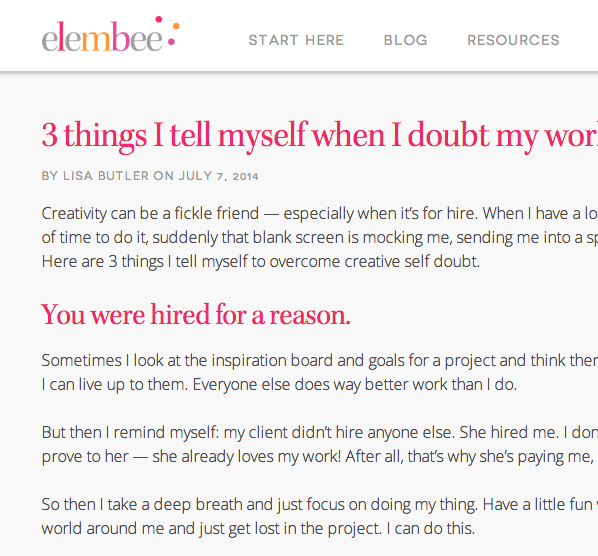
- 3 things to tell yourself when you doubt your work - When you work full-time in a creative field, you're expected to have an unlimited amount of creative ideas. But what do you do when you don't feel inspired and ideas are hard to come by? Lisa's post is a helpful reminder for those days when you're feeling frustrated and your creativity is at an all-time low.
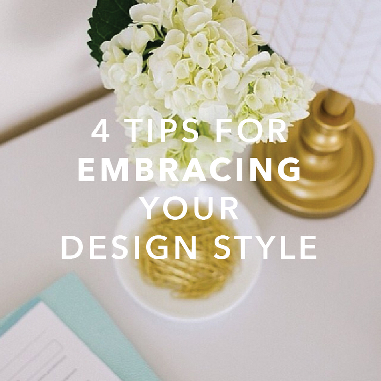
- 4 Tips for Finding and Embracing Your Design Style - Is it terrible to link back to one of my old posts in a roundup? I hope not! This post continues to be one of my favorites; I'm passionate about playing up your strengths as a designer and highlighting your own individual aesthetic.

Top 3 helpful posts for business
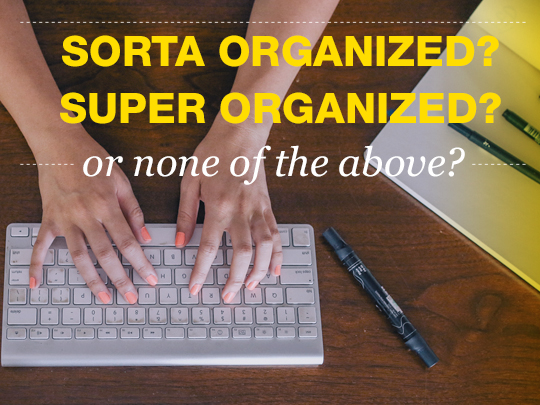
- Organization for Creative Entrepreneurs - If you're a designer and you aren't keeping up with Braid Creative, you need to add them to your Favorites bar today. These tips for organizing email, project management, timetracking, scheduling, and virtual assistants are practical and useful. [Insert hallelujah chorus here]
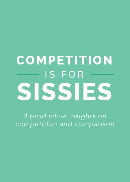
- Competition is for Sissies - If you only visit one link from today's post, make it this one. This article provides a refreshing change of perspective on competition and turned my business world upside down.
- Freelance Finances - A quick, helpful post from Jay Adores on how to manage your finances when you work for yourself. It seems almost too simple!
Now it's your turn! Which blogs and blog posts about blogging, design, and business have been helpful for you?
