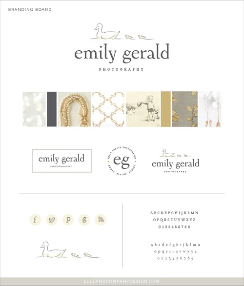
Emily Gerald contacted me the same day I officially announced my branding services, and her brand and website launch is the first "whole package" reveal that I've done around here. From the logo to the website and collateral pieces, we've touched every part of her business and added her brand to it in some shape or form.
Home Suite Home Updates!
If you've been following along with Elle & Company over the past few months, you know that I've been really excited to work with my friend, Michaela of Michaela Noelle Designs, on the design of our cozy home that we lovingly refer to as "The Suite." Each week Michaela has been sharing her inspiration and design plans for each room in our space, and we've been asking your feedback for some of the design decisions. While we're still in the process of transforming the Suite, we thought it would be fun to show you a couple sneak peeks of our progress. And oh my, it's already so different!
Just in case you missed it, here is a peek at the before photos:
And now for a couple progress photos!
A new soft gray on the walls, some new pieces of furniture, and a new layout in the bedroom have made such a big difference! I smile and pinch myself each time I wake up in the morning, walk into the living room, and make a cup of coffee in our new coffee nook. Our bedroom feels so much more cohesive, and the new kitchen table and chairs make me excited to work from home. We still have more pieces of furniture and accessories on the way so the transformation isn't complete, but the space already feels so different and much more "us." Michaela has done such a wonderful job! I can't wait to reveal the finished product with you.
Sources
West Elm Scribble Curtains
West Elm Parson's Table
Dining Chairs
Entry Wall Chalkboard
Coffee Table
Paint color: Agreeable Gray
Visit Michaela's blog today to learn more about her design plans and see her past posts in this series. What do you think about these changes?!
More posts in the Home Suite Home series
Coffee Date with Ashley Slater
Today's Coffee Date is with talented photographer, blogger, and co-founder of the Bloom Workshop, Ashley Slater. I had the opportunity to hang out with Ashley in Atlanta a couple months ago at the Bloom Workshop, and she's even more gorgeous, funny, and quick-witted in person! I knew that you would love getting to know her as much as I did, so she's joining me for a Q&A today. Find out what her normal day looks like, how she simplifies, the advice she has for other business owners, and, my personal favorite, how many jobs she had before becoming a professional photographer. This one is so fun. Meet Ashley!
What's in your coffee cup this morning?
Coffee, always! Usually with flavored creamer.
What does a normal day-in-the-life of Ashley Slater look like?
I have to laugh at this one because since welcoming my little boy Caleb to the family, my day to day is rarely the same! Often though, we wake up around 8am and have breakfast and watch Good Morning America. The rest of the day is dedicated to Caleb; playing, going to the park, fun projects at home. During his naps I try and stay up to date on e-mails and phone calls. Once my husband arrives home and we have had a family dinner, I head upstairs and my "work day" begins. Once Caleb is asleep for the night I stay up until the wee hours busting out edits and any other work I need to get done. It's not the most ideal schedule, but for now it works!
How did you get started in the photography industry? What business advice has been the most helpful for you?
I took an interest in photography shortly after I got married. My husband is a physical therapist and after our wedding we began "travel therapy" (which just means he filled in at a hospital or clinic somewhere around the country) and we would move every 3 months. I began blogging so our families could keep up with our travels and see where we were living. Pretty soon after starting this blog, I started getting readers who weren't just my family members. I discovered this crazy world of blogging and wanted to be as professional as other blogs I was reading. Naturally, I decided to work on creating beautiful photos and read my camera manual and practiced a lot. I started falling in love with photography and once I started practicing with people I really fell head over heels with the art of storytelling through photos. I was hooked, and launched my business the summer of 2011 while living in California. That was two and a half years ago and it is crazy to say that I am currently in the midst of wrapping up a wedding season that included over 28 weddings!
The best business advice I ever received was from a friend who pushed me to "just ask." This advice applies to everything -- from asking for advice or mentoring, to meeting up with someone you admire for coffee, or sending an email to an industry peer about collaborating. The worst someone can tell you is "no," but most of the time I have found that most people are more than willing to share their knowledge and work with me which has been an incredible blessing! So my advice to anyone starting a business is to reach out and just ask for whatever it is that you may need!
Your style posts are some of my favorites on The Sweet Season blog. What are your favorite shops and fashion staples?
I was a really late bloomer when it came to figuring out what my style was. And I mean late as in: I was 20 and didn't know the difference between concealer and foundation, had virgin unplucked brows and considered simply putting my hair into a ponytail as a style victory. It was bad, and sometimes I still feel like an awkward 15 year old when I get dressed in the morning. I have found that I am most comfortable in jeans and a t-shirt. I so admire girls who wear dresses and heels on the daily, but for me it's just not practical. My favorite jeans are a pair of distressed skinnies from Gap, and I practically live in basic tees from J.Crew. When I do dress up, I love pieces from Banana Republic, Anthropologie, and lulus.com. I just snagged a pair of seychelles booties from Lulu's and I am in love with how comfortable they are! I also love adding a statement necklace to add some glam. And yes, I have since learned how to curl my hair, which helps... just don't ask me to braid! I re-wear a lot of the same things in my style posts because I feel like the average girl is like me and uses the same pieces in a lot of different ways.
Between being a mom, wife, and business owner, I'm sure life can get busy. How do you simplify and keep it all together?
I promise I am not saying this because I am writing for Lauren's blog -- but my Elle & Company planner has been a huge lifesaver for me this year. When I had Caleb I knew he would be my number one priority before anything else. My days are dedicated to being a mom, but when he goes to bed I put my business hat on. It is essential that I am focused and on task so I can make the most of limited work hours. I use my planner to schedule blog posts, client meetings, and stay on track with sending out photos and products. I also suggest setting office hours for anyone who works from home. Being your own boss makes it really easy to push work aside and maybe slack off a bit, so it is critical to set aside time that is dedicated to the business. Another huge thing for me this year has been learning how to say no. I found my niche is in weddings, boudoir and fine art portraitures but when I was contacted for a family or newborn session I had such a hard time saying no even though I was miserable shooting these types of photo sessions. I finally realized that I can't do it all, and saying no and taking on limited work has been so huge. As important as it is to make time for your business, it is equally as important to make time for your family and yourself!
What is something you've been loving lately?
Ooh, I have a few things that I am into right now. First, lavender Epsom Salts! Especially after working a long wedding I LOVE filling the bath with scoops of these salts. It is so relaxing and helps me get to sleep at night! I also have taken a recent interest in food and product photography and have been loving the book Plate to Pixel. Finally, with Christmas right around the corner I have been burning my Balsam and Cedar Yankee Candle every single day. I LOVE the way it makes my house smell!
And lastly, I head through the grapevine (ahem, Michaela) that you had your fair share of jobs before you became a photographer. What were some of your favorite off jobs and why?
Haha! Yes, I have worked just about everywhere, it is true. I think being a creative is a blessing and a curse; I get distracted easily and want to try my hand at different ways of expressing myself artistically. I also just really love learning and trying new things which played a role in the crazy random jobs I had. This is going to be embarrassing but here it goes:
At 16 I started working at Limited Too and quickly became an assistant manager (yes, at 16!) Through that job I ended up being hired as visuals director and was in charge of creating window displays and holiday set up for Bath and Body Works, Banana Republic and Ann Taylor Loft. I followed my boss from Limited Too to IKEA and worked as an assistant manager in the textiles department. I got to build the Atlanta IKEA as well as one outside of Chicago. For extra money I also worked at Chik-fil-a and at a little shop in Atlanta selling Vespa's. Once moving to Michigan I worked for a short time at a Starbucks in the Grand Rapids airport. I couldn't cut waking up and opening that store at 3am everyday so I found a new job at a nutraceutical company as a sales rep. I worked my way up to shipping manager and eventually to a copywriter and marketer all while going to school. After that company went under I started working at Macy's at the Clinique counter and met my husband during that time. Once we were engaged I took a server job at Longhorn to make extra money for our wedding. Thankfully, I think photographer is going to be a lasting profession! HAHA!
Recent Coffee Dates
Top 10 Design Mistakes to Avoid
You've probably heard the popular quote "creativity is allowing yourself to make mistakes." Or perhaps you've heard "mistakes are proof that you are trying" or "every mistake can create a beautiful solution." While there is an element of truth in each of those sayings, it's wise to be well-informed and intentional about design if you're a blogger or a business owner. Visual mistakes have the potential to make you appear unprofessional and untrustworthy to your audience.
Today I rounded up my top 10 design mistakes that everyone should be aware of. While some of these rules have been broken and the result wasn't terrible, it's best to be educated on why these mistakes are bad and make them on purpose instead of by accident.
My Branding Field Guide

Create a streamlined visual brand with my free Branding Field Guide!
1 | Comic Sans
This is the number one no-no among graphic designers. Comic Sans is never ever ever a good idea. Why? Read this entertaining article.
2 | Too many typefaces
Using too many typefaces in a logo, website, etc. can make a design appear busy, non-cohesive, and unprofessional. Play it safe and stick to the KISS principle on this one; settle on 2-3.
3 | Lack of hierarchy
Hierarchy determines which items you see first in an image. Designers pay attention to hierarchy and use it to their advantage by varying the size of their fonts (titles and headers should always be more prominent than body text), using color wisely (pops of color draw attention to text and images that should stand out), and paying attention to shapes (which give a design movement and lead your eyes around the design). The use of several different fonts, colors, and shapes have the potential to mess with hierarchy, resulting in an image that is visually displeasing and complicated.
4 | No Contrast
Contrast also helps with hierarchy. A lack of contrast can alter legibility and make an image appear washed out and undefined. A mix of both light and dark colors creates balance.
5 | Dizzy color pairings
When objects with similar color values are placed near one another, it can sometimes have a dizzying, vibrating effect. Use contrast and be cautious of color pairings, especially when you are layering colors on top of each other.
6 | Lack of negative space
The negative space around an object is often just as important as the object itself; it provides a cushion and a place for your eye to rest. Avoid cramming objects and text into a design and be aware of the entire composition, not just the main components. Check out these 25 clever and creative uses of negative space!
7 | Centered paragraph text
Large amounts of text should never be center aligned. It alters legibility, making text harder and more frustrating to read.
8 | Failing to align objects/no grid system
Haphazardly placing objects on a page without rhyme or reason is never a good idea; it has the potential to make a design seem random and unintentional. Use a grid system and align objects to create order.
9 | Using display fonts as text fonts
Again, this is a legibility issue. Script, hand-drawn type, and other display fonts should be used for headers and small amounts of text. It's always a good idea to use a simple font for large groups of text.
10 | Upside down text
It's simply hard to read. Don't do it.
My Branding Field Guide

Create a streamlined visual brand with my free Branding Field Guide!
It's your turn! What are some of your biggest design pet peeves?
Back to the Drawing Board (Step 4 of my Creative Process)
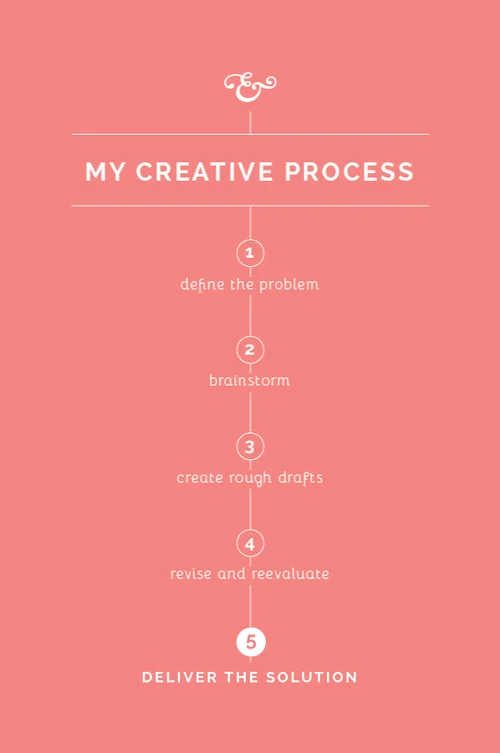
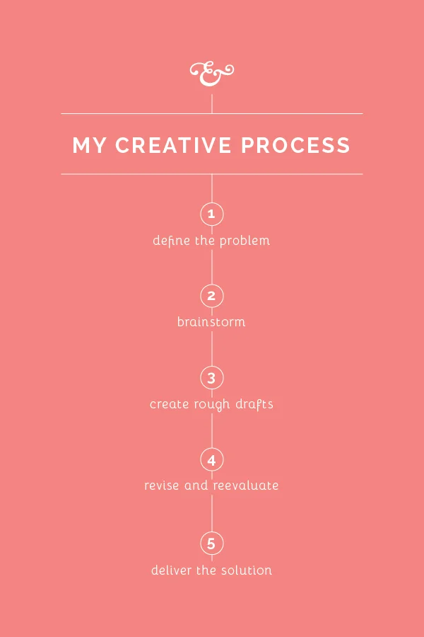
Like most occupations, it's helpful to have a process in place as I go about my work. I haven't seen many creatives approach this subject, so I thought it might be helpful to spend the next few weeks sharing my own creative process. While my method may not work for everyone, my hope is that these posts will encourage you to streamline your own process and think through the steps you take as you go about your work.
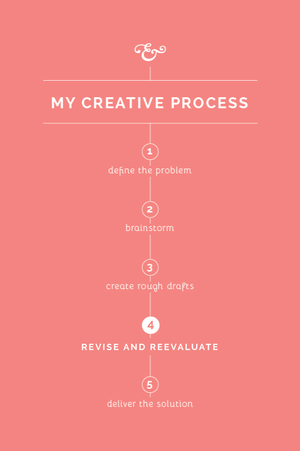
In a perfect world, first drafts would be the only drafts and no revisions would have to be made. But that isn't usually the case in the design world. It isn't always the most fun step, but revising and reevaluating allows me to refine my work, challenges me to become intentional in making design decisions, and results in an even better solution for my client. Here's a look at how Step 4 plays out for me in my creative process.
Self-edit
Before I reveal any work to my clients, I spend some time making revisions to my rough drafts. It's important for me to take a step back and evaluate so that I'm giving my clients the best representation of my work right out of the gate. I check for errors in spacing and composition, I double check colors in my Pantone book, search for any typos, etc. If this step is overlooked and mistakes are seen in the client meeting, it can make you look careless and unprofessional. Self-editing is a strong trait of any good designer.
Separate yourself from the project
In college, I dreaded critiques with a passion. I would walk into the studio after having spent countless hours working on a project, pin my design on the board, and shrink in my chair when my professor and classmates critiqued it to pieces. I can probably attribute my misery to my people-pleasing and perfectionist tendencies, but I think that every person struggles somewhat with taking criticism.
It's easy to get wrapped up in your work and become attached to what you create, especially when you've spent time and energy coming up with a great solution. But I've learned that in order to give your client your best work, you have to emotionally detach yourself and receive feedback and criticism with grace. As much as I hate to admit it, taking the feedback to heart from those class critiques in college always made my work stronger and challenged me to think through my design decisions.
Clearly communicate with your client
I wrote on this subject a couple weeks ago in Step 1, but it's important throughout the entirety of each project. When I reveal drafts to my clients, I walk them through my thought process and explain why I made each design decision. I've learned that educating my clients is a large part of communicating well.
Then it's my turn to listen and receive feedback. I take it to heart and ask a lot of questions along the way for clarification, just to make sure we're on the same page.
Go back to the drawing board
Once I've met with the client and discussed what they like and don't care for about my first drafts, I go back to the drawing board. I make small edits, change one typeface for another, explore other options - whatever needs to be done to meet the needs of my client while staying true to the elements of good design.

