When it comes to building a website, there’s no denying the simplicity and user-friendliness of Squarespace.
For those of us who want a well-designed site without the hassle and learning-curve of using code and plugins, Squarespace is the perfect option.
But because it’s so easy and each template is gorgeous, it can be hard to determine which template would be the best fit for your website. Out of all the questions I receive about Squarespace on a regular basis, the majority of them revolve around choosing a template.
And that’s where this post comes in. I’m walking you through choosing the perfect Squarespace template for your creative business, step-by step.
1 | Determine the scope of your website
Before you ever begin browsing through Squarespace templates, it’s important to consider how your site will function and which pages and features need to be included.
So what is the main purpose of your site?
Is it to show off your portfolio? Sell products? Book clients? Is it to house your blog or provide more information about a cause?
Whatever it is, I would encourage you to take some time to determine that purpose ahead of time. Then, on a scrap piece of paper or in a Google Doc, create an outline of the pages and functions your website needs to include.
It’s easy to get overwhelmed by and wrapped up in the look of some of the Squarespace templates upon first glance. But outlining your needs ahead of time will help you narrow down your choices and find the best fit.
2 | Browse template categories
The 3 overarching categories for a Squarespace website are cover pages, websites, and online stores.
Cover pages are single-page sites that can be created as a standalone site or added to an existing website as a landing page or introductory page.
Websites are made up of multiple pages and can include galleries, a blog, etc.
Online stores have all the capabilities of a Squarespace website, but they also allow you to sell your products online with fully integrated ecommerce and payment features.
There are different templates for each of these 3 options, so you’ll start your search here. Squarespace lets you easily navigate between cover page, website, and online store templates with the 3 tabs at the top of the page.
Once you’ve selected the best option for your website, Squarespace has already made things easy on you by including template filters.
Depending on capabilities and features you outlined in Step 1, you can filter the templates to find which options would suit you best.
For example, the templates listed under the Portfolio filter under the Website tab include more advanced gallery capabilities for photographers, artists, and designers. Those listed under Restaurants are better suited for menus and reservations.
By clicking on each one, you’re able to see more details about the template like features, alternate views, and example sites.
3 | Check out example sites for each template
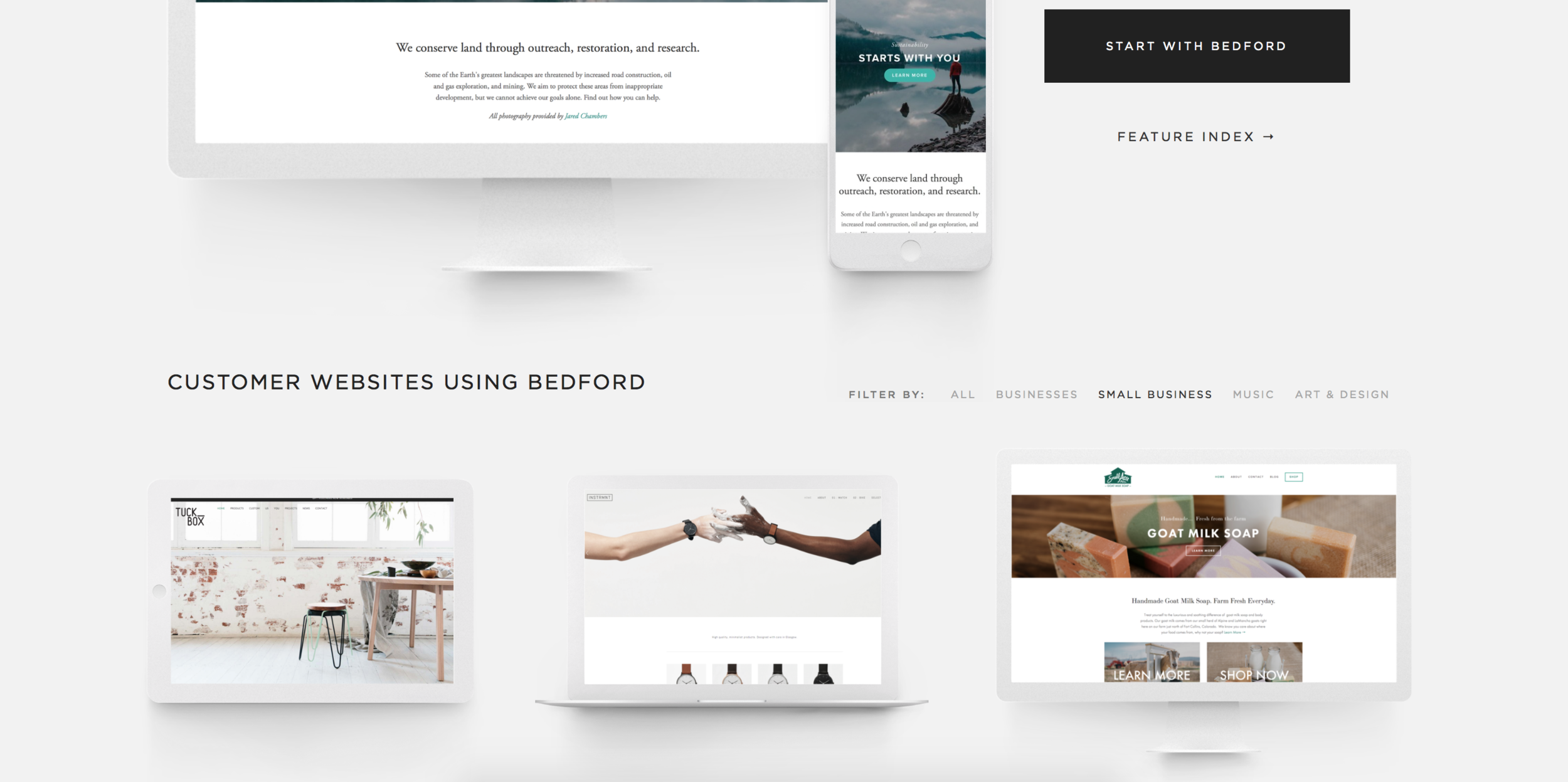
Each time I search for a template - whether it’s for the Elle & Company website or more often, a client site - I start by scrolling down to the bottom of the template page to look at customer websites that are already using the template.
While the preview at the top of the page gives me a good idea of what the template is capable of, the customer sites allow me to see the versatility of the template and how it can be customized.
Many of the templates also include another filter under the Customer Websites section based on the types of people utilizing the template.
For example, the Bedford template allows you to filter customer sites by Businesses, Small Businesses, Music, and Art & Design.
I’ve found it helpful to use these filters to see how other people in my niche and my client’s niche are utilizing these templates. It helps me not only see if the template is capable of meeting the needs of the site; it helps me brainstorm ideas for how I can customize the template and make it my own.
4 | Take a look at alternative views
More and more people are accessing websites from their mobile phone and iPads these days, so it’s important to keep that in mind when you’re choosing your Squarespace template.
All Squarespace templates are compatible for mobile and tablet views, but each one downsizes a little differently.
So when you’re looking at template previews and example sites, adjust the size of your screen to see what the template looks like on each platform before finalizing your choice, just to be sure it checks out okay on every device.
5 | Scroll through template features
Nothing’s more frustrating than choosing a template, customizing the design to your needs, and getting it close to perfect only to find that the template doesn’t have a key feature or function that you have to have, like a blog sidebar or excerpt image.
To save time and frustration and prevent that from happening to you, take a moment to browse through a template’s special features on the Squarespace Help page.
It’s important to note that the Feature Index listed on each Squarespace template page is the same; the capabilities they outline there are the same for each template.
So instead of clicking “Feature Index,” follow this link and search for your prospective template in the left-hand menu.
This page will give you a better idea of the template’s features and limitations before you settle on an option, and hopefully save you from some hassle and frustration down the road.
Keep the outline you created in Step 1 nearby as you scroll through the template’s capabilities and do a special search for non-negotiable features and functions if they aren’t listed on the Squarespace Help page.
A little research can go a long way, especially if you want to stick with this template long-term.
6 | Take your template for a test drive
One of the best perks of using Squarespace is having the ability to create a free 14-day trial site.
Use this to your advantage by taking your template for a “test drive” before you pull the trigger. Add your logo, customize the design and the pages, and see how it checks out.
If you’re starting your site from scratch, you can easily upgrade the trial site and your website will be ready to go!
And if you’re switching templates, you can use the trial site as a blueprint as you implement the new design on your existing site.
It’s free, it’s simple, and it can save you a lot of hassle in the long-run if the template you’re considering doesn’t end up meeting your needs.
If for some reason you end up changing your mind and switching up templates down the road, Squarespace makes that easy on you, too.
In fact, I’ll be sharing all the details of how I went about switching templates for the Elle & Company website as well as how to set up opt-ins, organize content, create better page layouts, customize a Squarespace templates, and create custom graphics for your site in my upcoming live Step-By-Step Site Redesign webinar this Saturday, February 27th from 12:30-3:00pm EST.
What was the biggest obstacle you faced when choosing your Squarespace template? Which one did you end up choosing and how has it worked out for you?

